Charting Area How-To Guide
Navigating the Charting Area on Wallstreet.io
The Charting Area is the central part of the platform, so in this guide we'll cover some chart basics to help you get started.
We recommend reviewing our Charting Area Reference Guide first to get familiarized with the concepts we’ll be using next.
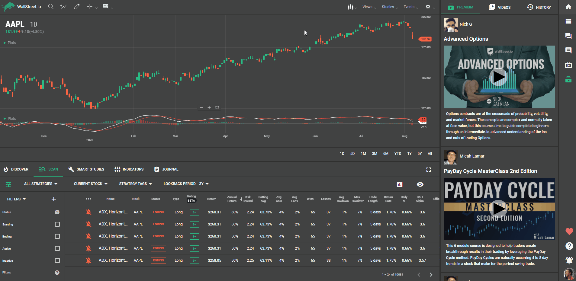
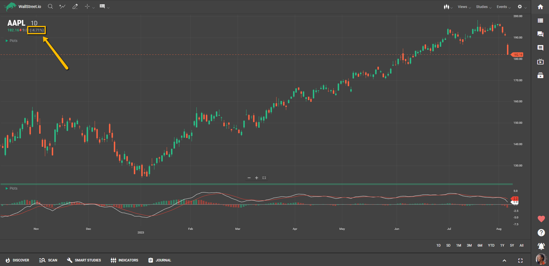
On the Charting Area at the top left, you'll see a symbol. This symbol represents the unique identifier or name of the financial instrument being analyzed. It helps track and display the price movement of the specific instrument on the chart.
You can click on it to open the Symbol Lookup pop-up window to look for a different Symbol.
The periodicity refers to the time interval or frequency at which data points are plotted on the chart. You can adjust the periodicity according to your preference from options like daily, weekly, hourly, or minute intervals.
The Price Value indicates the numeric value of the price level of the financial instrument at a specific point in time. The Net Change represents the absolute difference between the current price of the instrument and its previous closing price. Both of these data points provide a clear understanding of the current performance of the instrument.
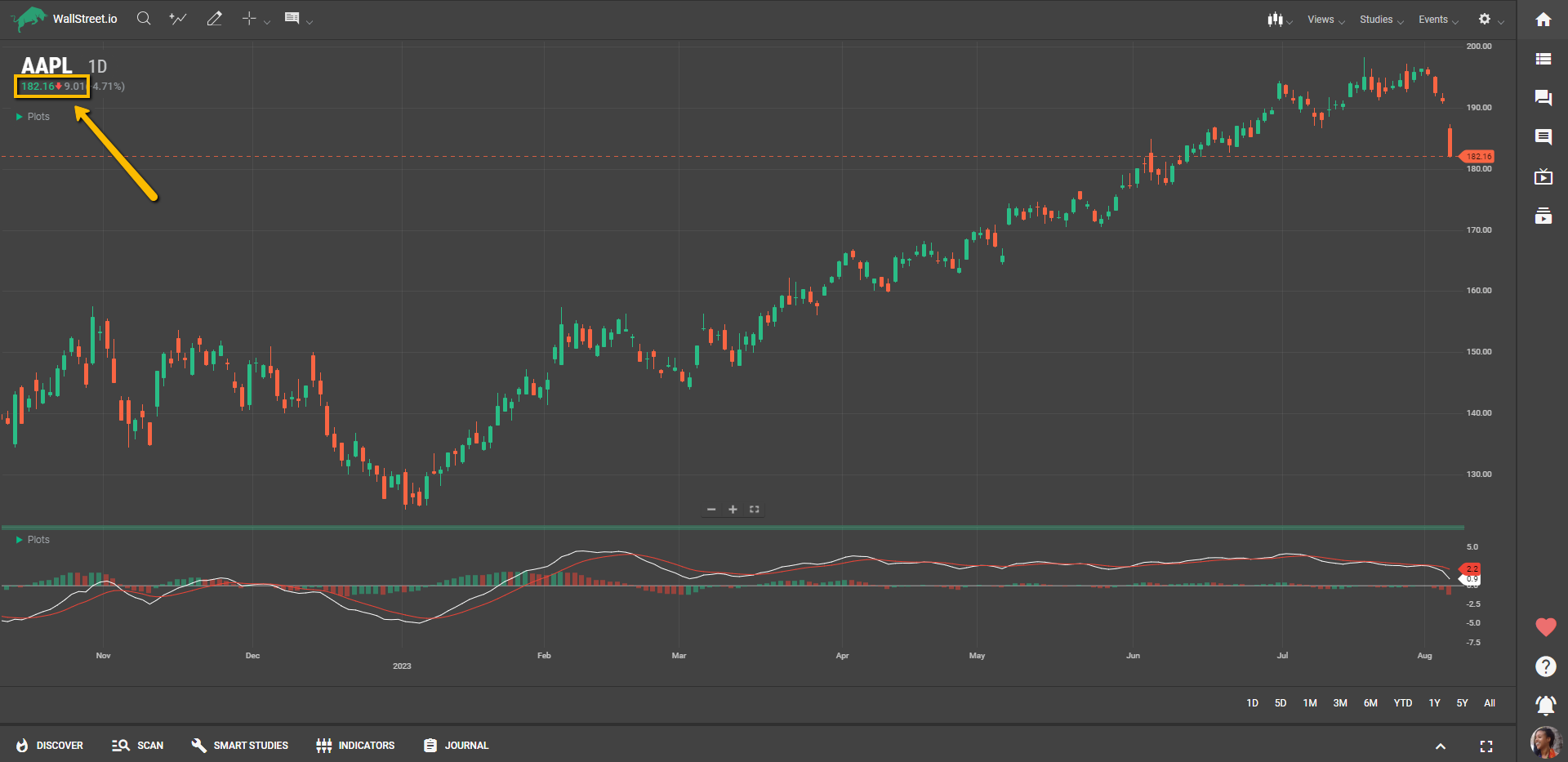
The Change Percentage shows the percentage change in the price of the instrument compared to its previous closing price. It's a useful metric to assess the relative magnitude of the price movement.
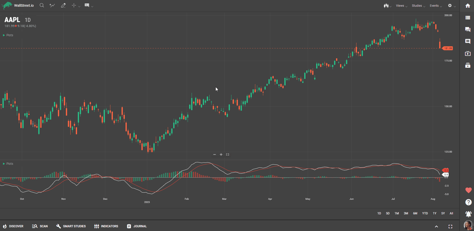
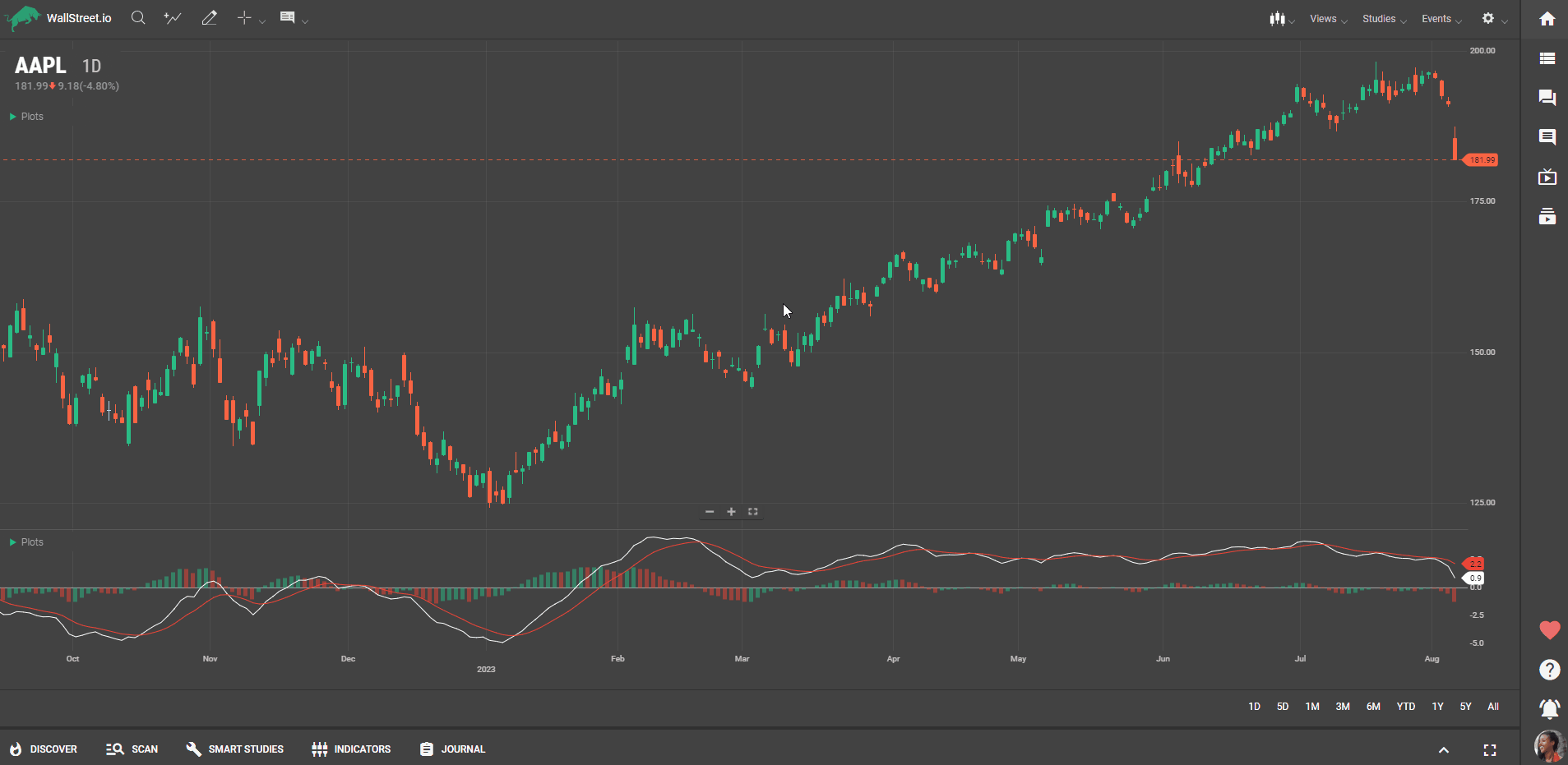
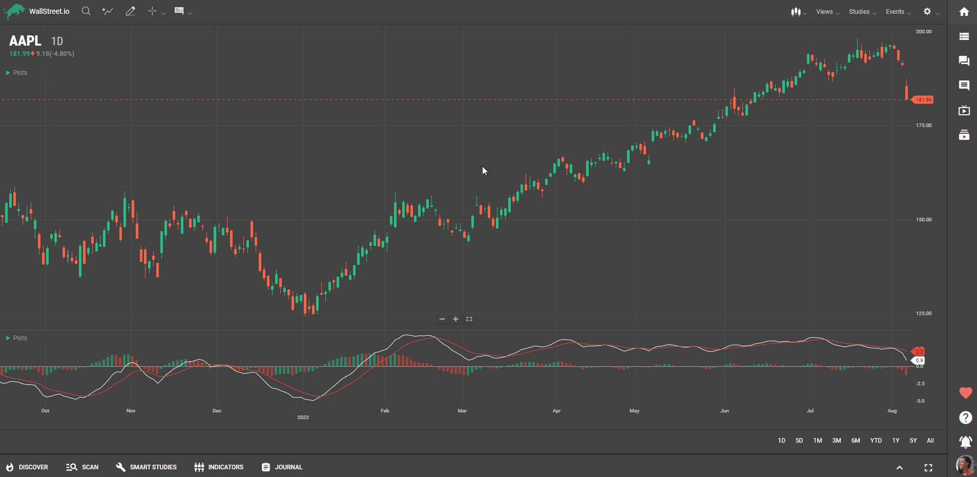
The X-Axis represents the time or date scale, indicating the progression of time from left to right. The Y-Axis displays the price scale, indicating the range of prices for the financial instrument.
You can change the size and view of the chart by clicking and dragging the value scale (Y-Axis) and the time scale (X-Axis). You can also use the zoom in and out buttons, or your scroll wheel, if you're using a mouse.
You can also long-click the Y-Axis and drag it from the right side to the left side of the chart, if preferred.
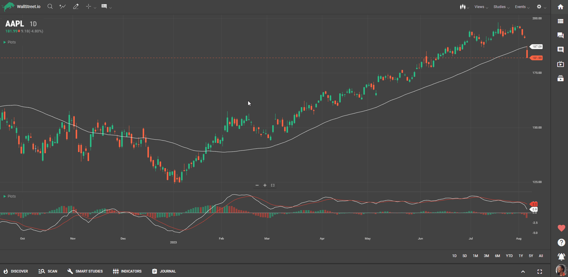
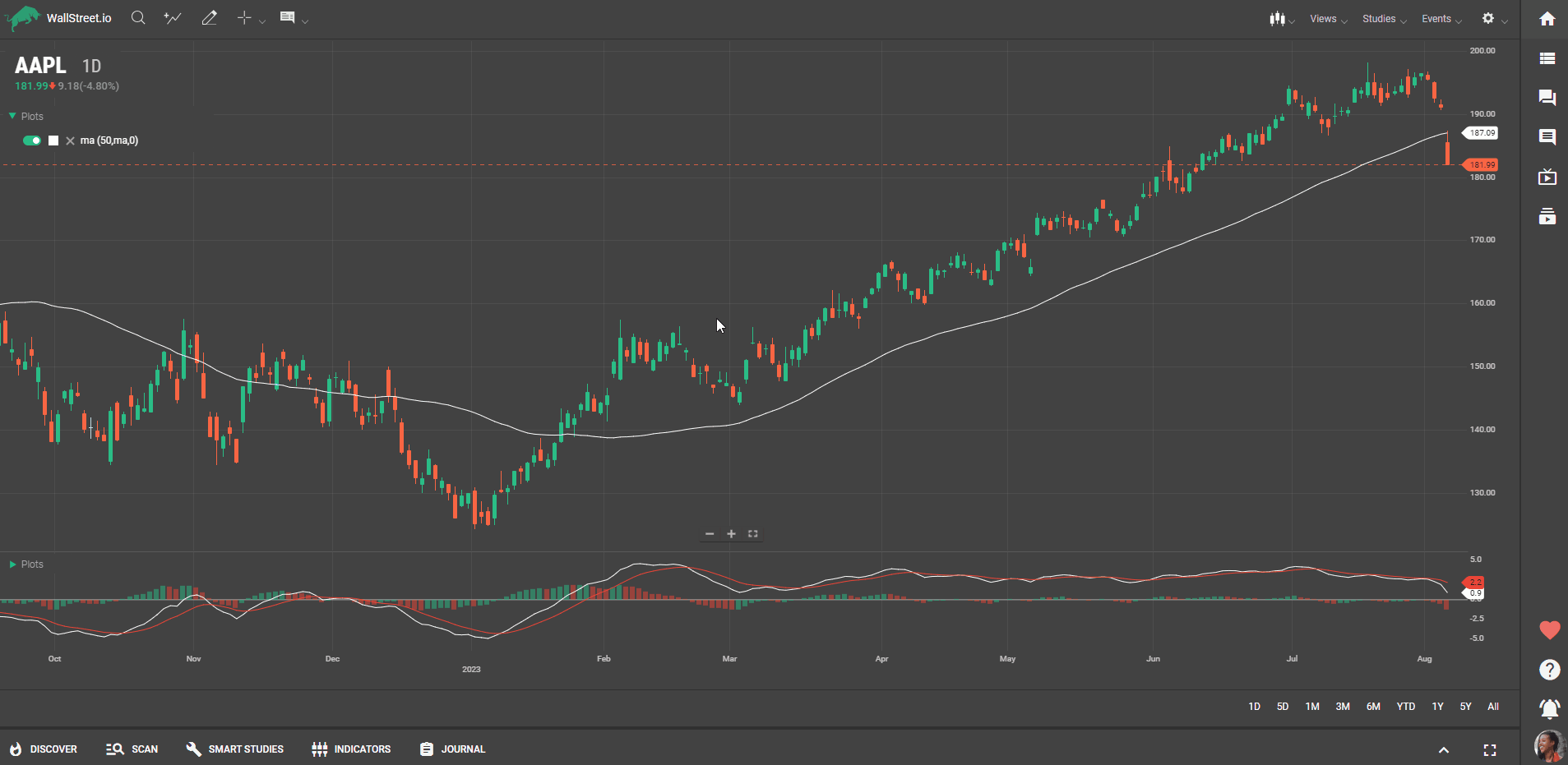
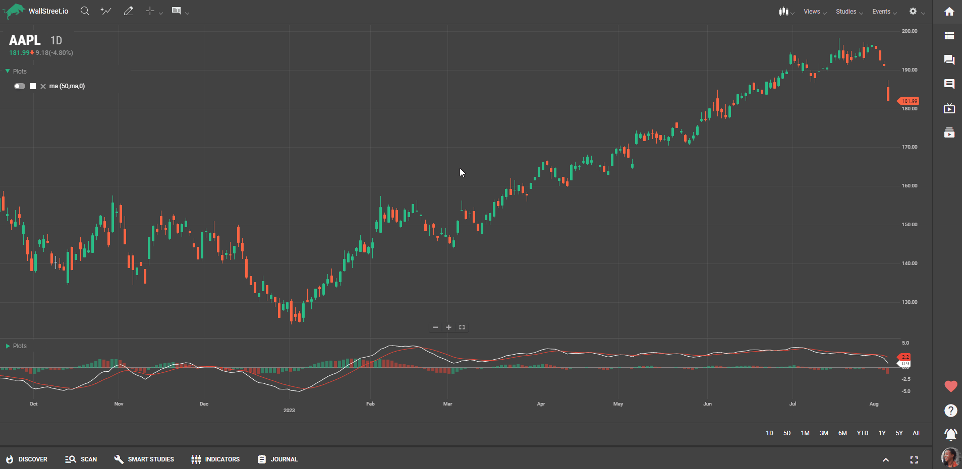
When you add Studies to your Chart from the Studies dropdown menu in the Chart Menu Bar, the Plots menu that appears provides options for toggling the Studies On or Off, change its color, delete it from the chart and also the formula used for this.
By clicking on the formula, you’ll see an Edit Pop-Up window appear. Use this feature to customize your Studies according to your trading strategies.
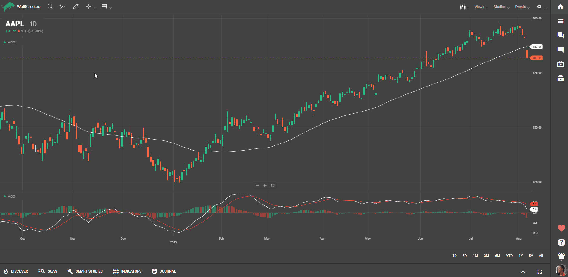
Panels are vertical stacks of visual components on a chart that are created when studies are added. Panels can be rearranged according to your preference. Each panel is associated with a specific study and has one or more Y-Axes for data display.
The Chart Timeframe specifies the duration or length of the data displayed on the chart. Adjust the timeframe according to your trading strategy and whether you want to analyze short-term or long-term price movements.
If you need a larger view of the Chart, click on any green widget icon on the Navigation Bar to hide the current widget. You can also click on the "Minimize strategy tabs" icon on the Tools Bar to gain more chart space.