We've created this guide to help you understand and fully leverage the potential of our platform's Charting Area. This key section of our platform is where you'll spend most of your analysis time, and having a solid understanding of its functionalities is crucial to enhance your trading strategy.
Let’s dive in!
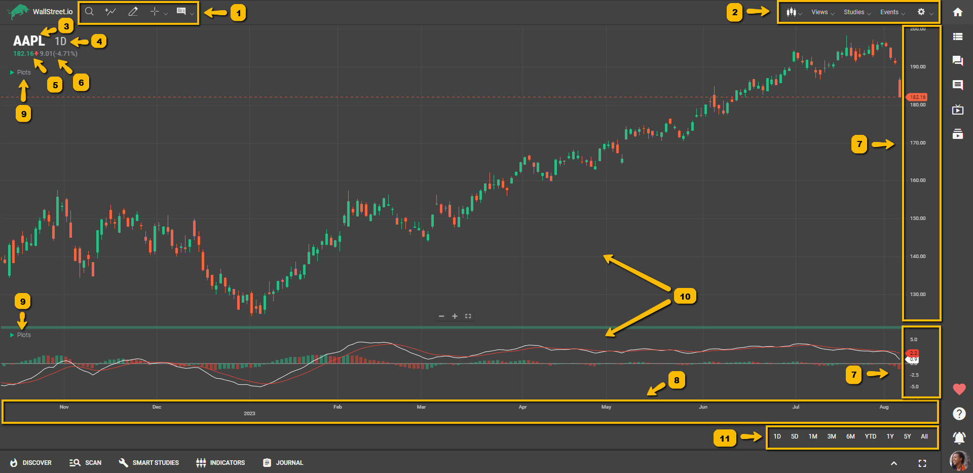
Charting Area
Here’s a list of definitions of the different parts of the Charting Area:
 1. Charting Tools: This refers to a group of icons at the top of the Charting Area designed to enhance your charting experience. Here's what each tool does:• Symbol Lookup: This tool allows you to quickly search and select the financial instrument you wish to analyze on the chart.• Add Comparison: This tool lets you compare the performance of the currently selected instrument with other assets directly on the same chart.• Drawing Tools: These enable you to manually draw and annotate the chart with various shapes, lines, and markers to aid in technical analysis and pattern recognition.• Crosshair/Pointer: A tool that provides precise price and time data as you hover over the chart. The crosshair mode gives you exact coordinates, while the pointer mode allows for general navigation.• Info: This button enables or disables a floating tooltip that provides detailed price action information for a specific point on the chart.
Check out our Charting Tools Reference Guide and How-To Guide to learn more about these features.
2. Chart Menu Bar: This menu bar contains key functionalities that let you modify and personalize your chart. The menus are:• Chart Type: Allows you to select the style of chart display (like Candlestick, Bar, Line, etc.) that best suits your trading analysis.• Views: Offers pre-configured chart layouts or lets you save your custom layout as a view for future use.• Studies: Provides access to a library of technical analysis studies that you can overlay on your chart to help inform your trading decisions.• Events: Enables the marking of important dates on the chart, such as earnings releases or dividends dates, to track how these events impact price.• Chart Preferences: Lets you customize the chart settings to your preferences, including aspects like color scheme, grid lines, zoom level, and more.You’ll find more information about these options in our Chart Menu Bar Reference Guide.
3. Symbol: Represents the unique identifier or name of the financial instrument being analyzed, such as a stock, currency pair, or commodity. Used to track and display the price movement of the specific instrument on the chart.
4. Periodicity: Refers to the time interval or frequency at which data points are plotted on the chart. Determines the duration of each candlestick, bar, or data point on the chart. Examples include daily, weekly, hourly, or minute intervals.
5. Price Value: Indicates the numeric value of the price level of the financial instrument at a specific point in time. It’s displayed on the vertical axis (Y-axis) of the chart.
6. Net Change: The absolute difference between the current price of the instrument and its previous closing price, providing a measure of the amount by which the price has increased or decreased, expressed as an amount or currency value and as a percentage.
7. X-Axis: Represents the horizontal axis of the chart. Displays the time or date scale, indicating the progression of time from left to right. Each point on the X-axis corresponds to a specific time period.
8. Y-Axis: Represents the vertical axis of the chart. Displays the price scale, indicating the range of prices for the financial instrument. Each point on the Y-axis corresponds to a specific price level.
9. Plots Menu: Refers to a menu or toolbar that provides options for adding various technical indicators, overlays, or drawing tools to the chart. Allows users to customize the chart by adding additional data points or visual elements.
10. Panels: A panel is a vertical stack of visual components on a chart. Panels are created when studies are added and can be rearranged by the user. Each panel is associated with a specific study and has one or more y-axes for data display. The chart has a single x-axis shared by all panels. Studies that don't need a separate panel are called "overlays" and are usually displayed on the main chart panel.
11. Chart Timeframe: Specifies the duration or length of the data displayed on the chart. Determines the overall view of price movement, ranging from short-term to long-term perspectives: • 1D (1 Day): This timeframe displays price data for each trading day. The system automatically changes the periodicity to 5 minutes, meaning each candlestick or data point represents 5 minutes of price movement.Best used for intraday trading, short-term analysis, and capturing smaller price movements within the trading day.
• 5D (5 Days): This timeframe shows price data for a span of 5 trading days. The system changes the periodicity to 1 hour, where each candlestick represents 1 hour of price movement.Suitable for short-term analysis, swing trading, and capturing medium-term price trends and patterns.
• 1M (1 Month): This timeframe presents price data for a month-long duration. The system adjusts the periodicity to 4 hours, with each candlestick representing 4 hours of price movement.Useful for medium-term analysis, identifying longer-term trends, and planning trades based on monthly price patterns.
• 3M (3 Months): This timeframe provides price data for a 3-month period. The system sets the periodicity to 1 day, where each candlestick represents 1 day of price movement.Ideal for longer-term analysis, trend identification, and making trading decisions based on quarterly price trends.
• 6M (6 Months): This timeframe shows price data for a 6-month duration. The periodicity changes to 1 day, with each candlestick representing 1 day of price movement.Suitable for longer-term analysis, identifying significant price levels, and capturing price trends over a half-year period.
• YTD (Year-to-Date): This timeframe displays price data from the beginning of the current year until the present. The system adjusts the periodicity to 1 day, where each candlestick represents 1 day of price movement.Useful for analyzing year-long price trends, tracking performance over the year, and making decisions based on year-to-date price patterns.
• 1Y (1 Year): This timeframe presents price data for a 1-year period. The periodicity changes to 1 day, with each candlestick representing 1 day of price movement.Helpful for longer-term analysis, assessing annual price trends, and making trading decisions based on yearly patterns.
• 5Y (5 Years): This timeframe shows price data for a 5-year span. The periodicity adjusts to 1 week, where each candlestick represents 1 week of price movement.Suitable for long-term analysis, identifying long-range price patterns, and making trading decisions based on multi-year trends.
• All: This timeframe displays the entire available price history of the instrument. The periodicity changes to 1 month, with each candlestick representing 1 month of price movement.Best used for long-term analysis, historical trend identification, and gaining a comprehensive view of the price history.