Charting Tools Reference Guide
Our Charting Tools are designed to elevate your chart analysis experience, contribute to a comprehensive and intuitive charting experience and supporting you in extracting meaningful insights from market data.
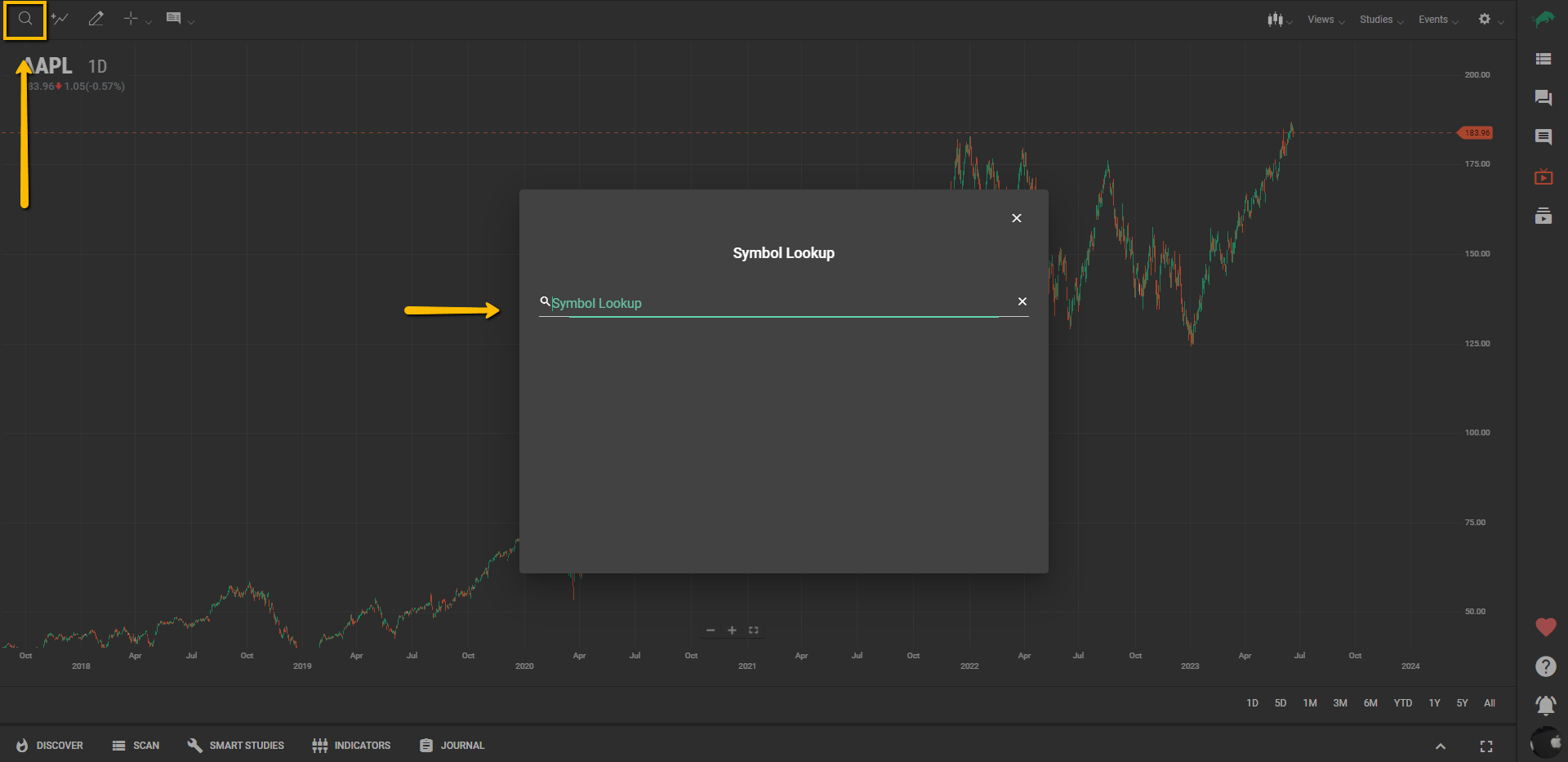
Symbol Lookup
The Symbol Lookup feature is represented with a magnifying glass icon, located at the top-left side of the Charting Tools bar. By showing a pop-up window, it allows you to type in and find instruments (stocks, indexes, etc.) by entering the symbol that represents the instrument to view its price chart.
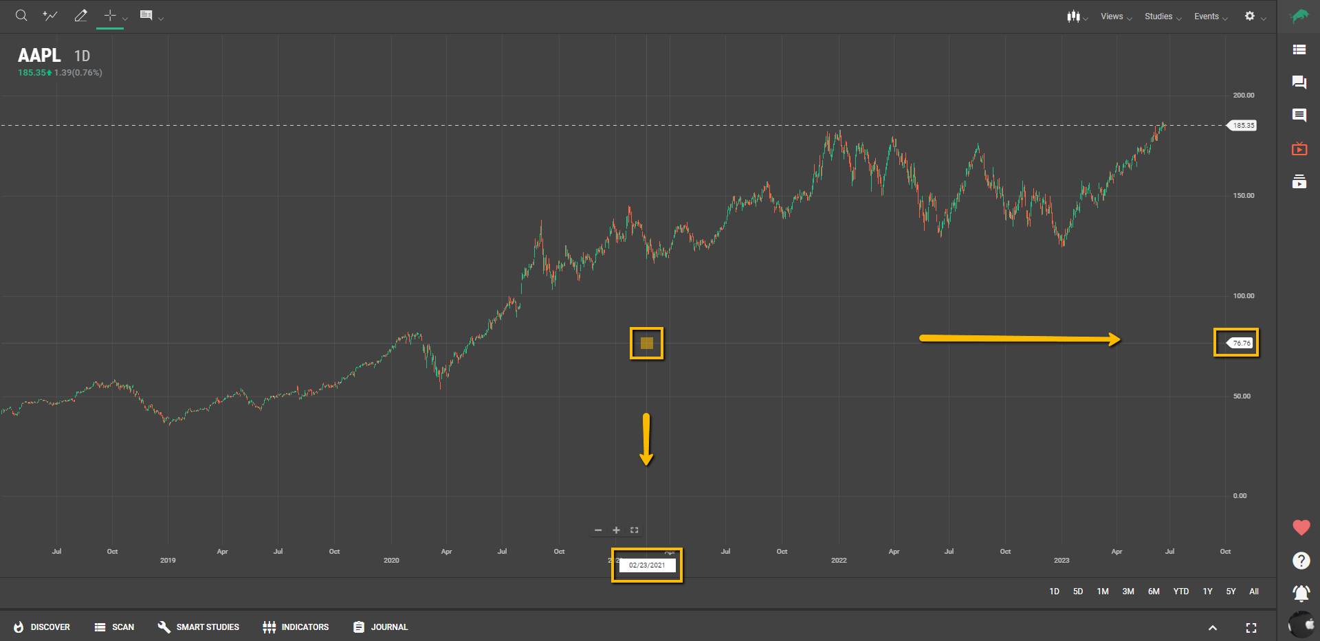
Add Comparison
The Add Comparison feature is represented by an icon with an ascending chart line and a plus sign, located at the top-left side of the Charting Tools bar.
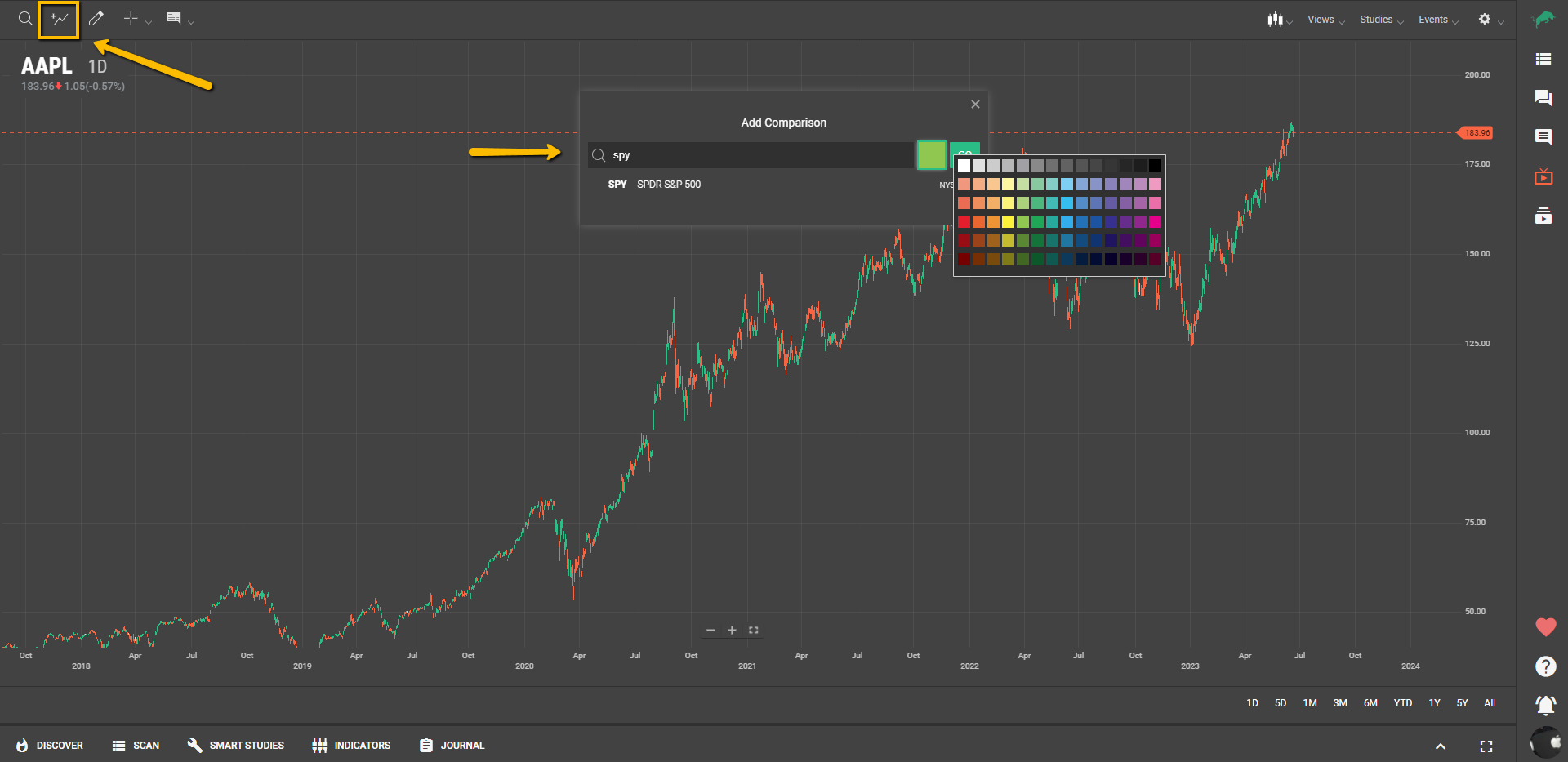
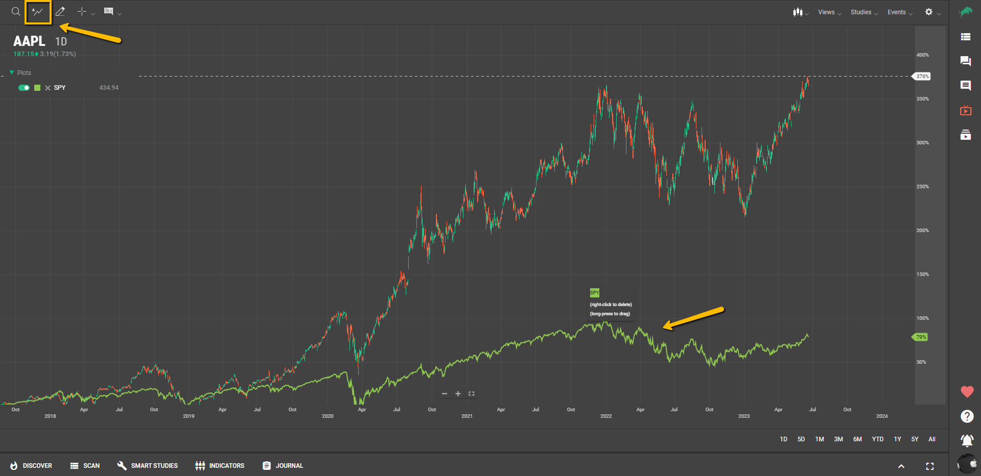
Comparisons provide a side-by-side look at different instruments. Comparison series are plotted over the same time frame, using the same periodicity as the main series, but are displayed in a different style or color. Your chart can include numerous comparisons.
It will show you a pop-up window that will allow you to look for symbols within our database, assign a predetermined color to it and load it as a Line Chart on your current price chart, so you can compare the price action from different symbols (represented by line charts) on a single price chart.
Note: Comparisons change the chart y-axis values to percentages. The time series plots and the y-axis are adjusted so that all plots start at 0% (at the left side of the chart). Succeeding data is plotted as the relative change from 0%. When all comparison series are removed from the chart, the y-axis reverts to its normal type of values.
Drawing Tools
Our extensive array of Drawing Tools has been thoughtfully designed to add another dimension to your chart analysis process. These tools offer the flexibility to annotate, highlight, and dissect your charts and studies, providing a canvas for your analytical insights.
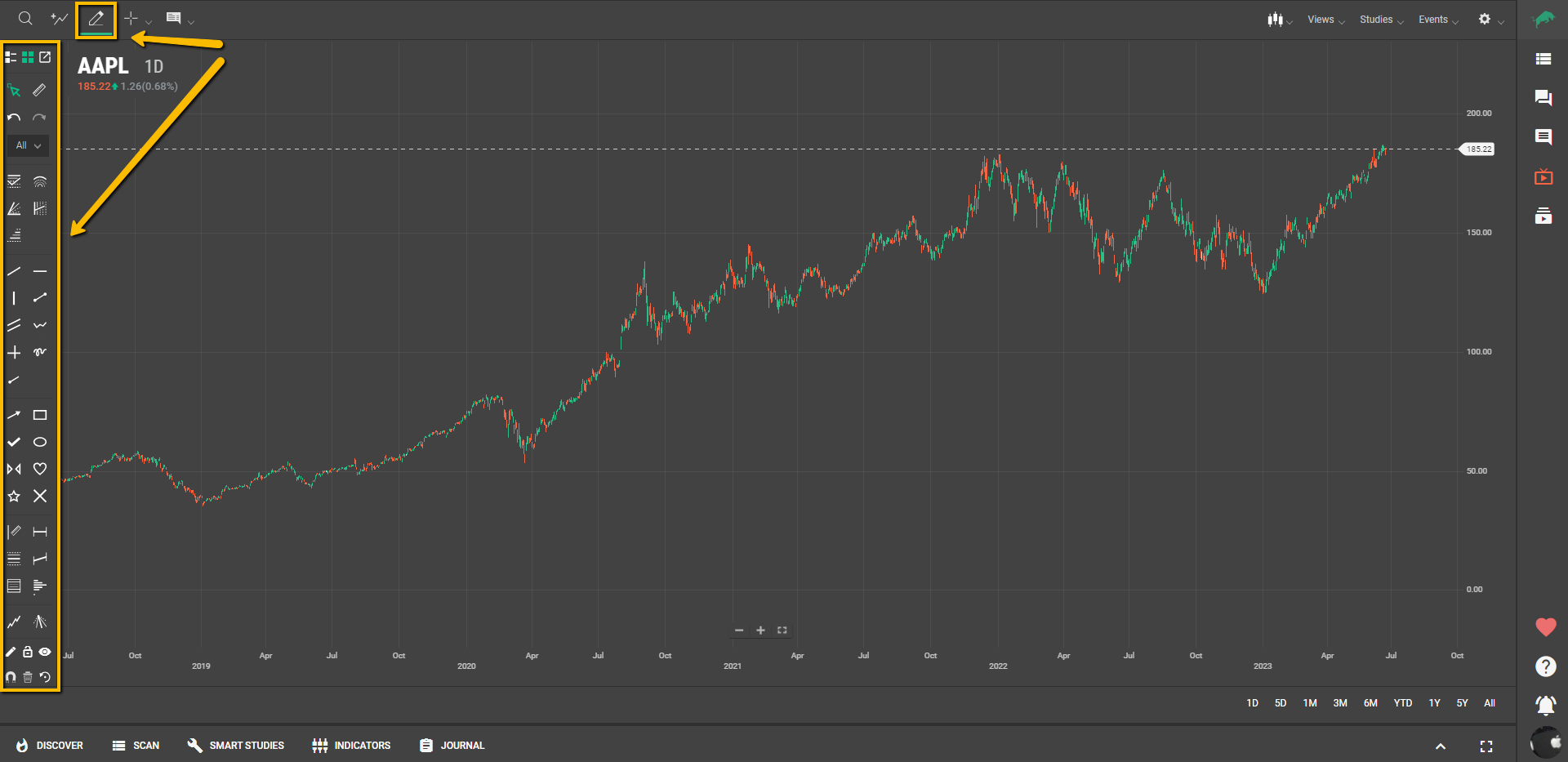
From basic line drawings to advanced Fibonacci retracements, these tools offer a range of capabilities. You can mark significant price levels, delineate patterns, or even illustrate potential future scenarios.
Moreover, the Styling Tools allow you to customize the aesthetic elements of your chart. Adjust the color, line style, and thickness of your drawings to match your preferences. Together, the Drawing and Styling Tools empower you to explore and represent your market interpretations in a visually engaging and personally meaningful way.
Crosshair/Pointer
By enabling the Crosshair pointer, it’ll show horizontal and vertical lines that follow the mouse.
Crosshairs enable you to easily identify values on the x- and y-axes.
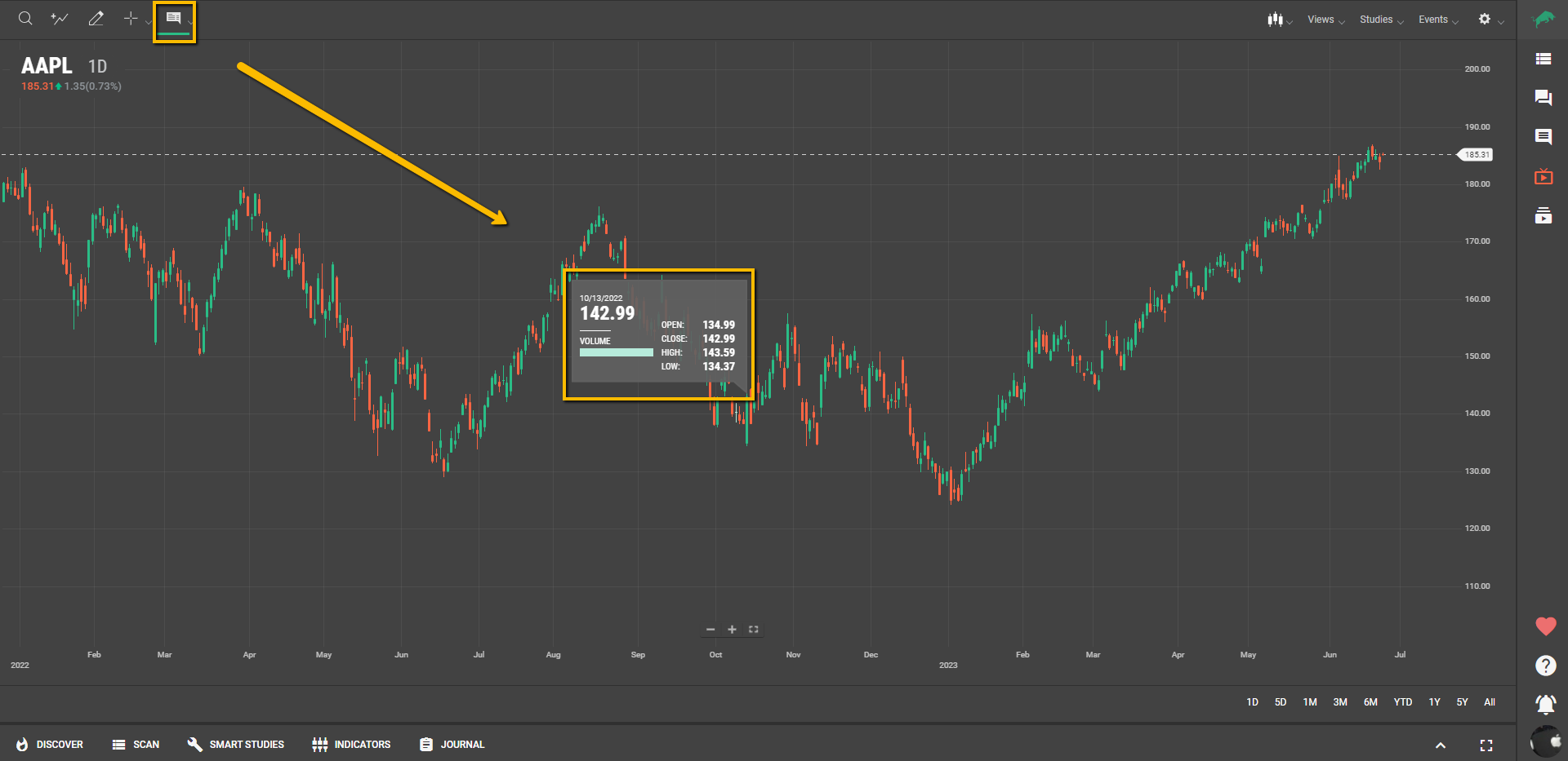
Info
The Info option provides detailed information about individual data points on your chart, displaying key metrics such as date, price, open, high, low, close, and volume. This data is easily accessible by moving your mouse over the chart, allowing for precise analysis of specific points in time.
To customize how this information appears, use the dropdown menu next to the Info button (represented by a dialogue bubble) in the Charting Tools area at the top right. Here, you can choose between Dynamic Callout and Floating Tooltip display options:
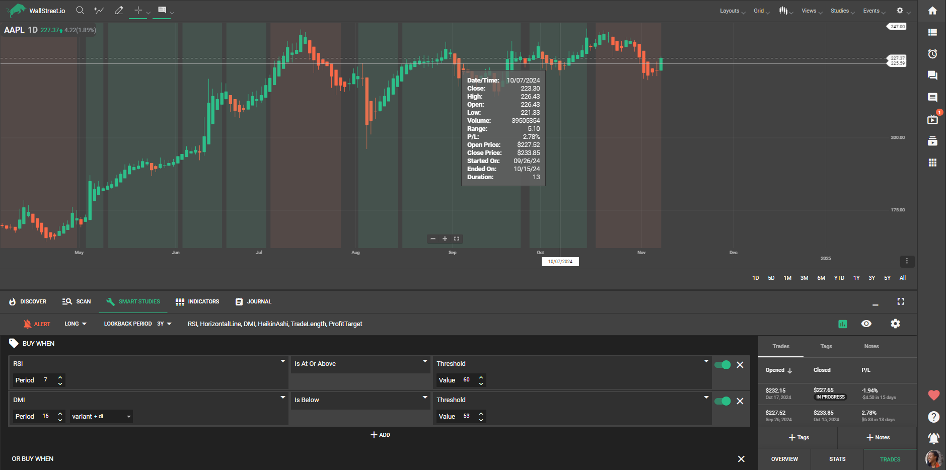
Additionally, the Tooltip feature enhances strategy review by displaying detailed trade information in shaded areas on the chart.
With "Show Tooltip" activated, you can hover over any shaded trading area to view trade details, such as start and end dates, duration, and percentage performance. To fully enable this view, ensure that Strategy Trades Shade is turned on under the Chart Add-Ons in the Smart Studies Tab. This shading marks each trade within a selected strategy, providing quick access to critical trade metrics for a seamless review experience.