Chart Settings Guide
What this helps you do
The Chart Settings menu lets you control how time, price, sessions, and events appear on your charts so you can read price action the way that makes the most sense to you.
Chart Preferences
Range Selector
The Range Selector toggle adds a compact timeline panel below your main chart.
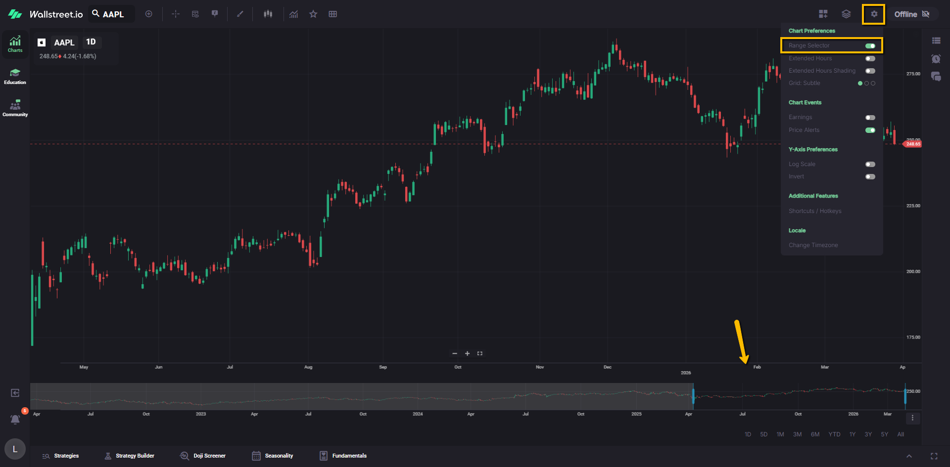
This panel shows a wider slice of price history than the main view. You can drag the handles on this mini-chart to zoom the visible time range in and out on the primary chart without changing your symbol or timeframe.
Extended Hours
The Extended Hours toggle adds pre-market and post-market trading activity to intraday charts for U.S. equities.
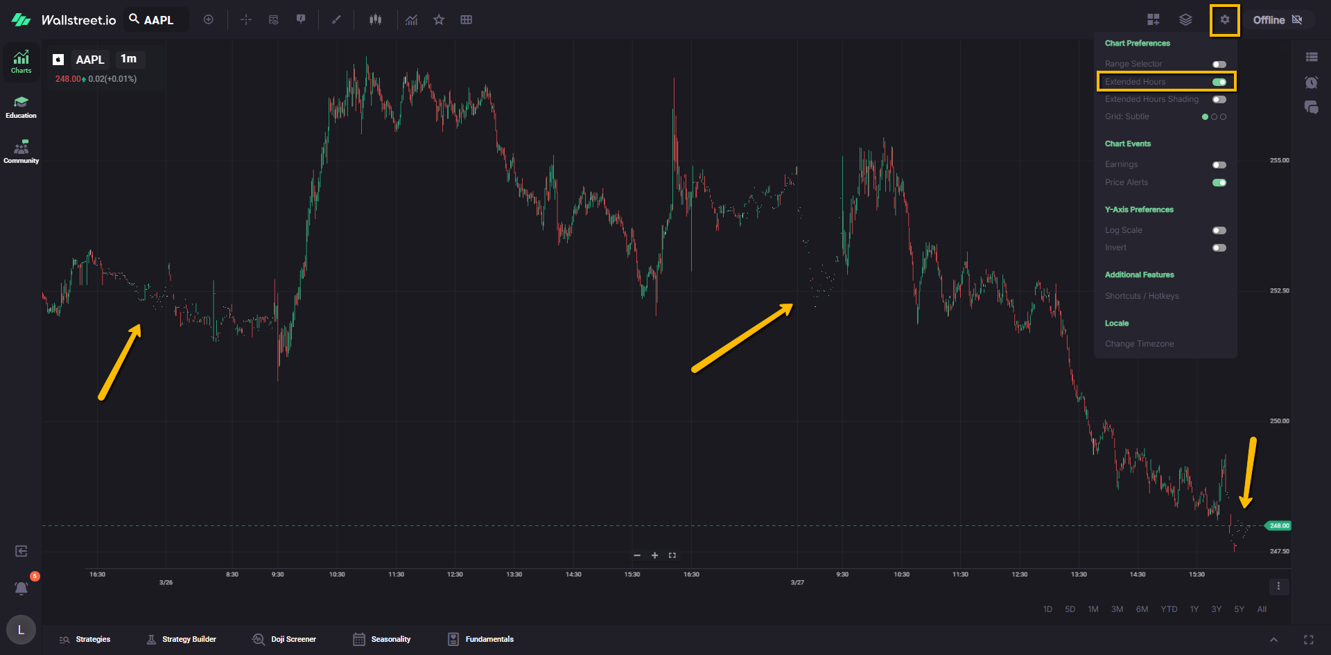
When this is on, you see both the regular session and any trading that happens before the open and after the close, which is especially useful around earnings or news events.
Extended Hours Shading
Extended Hours Shading controls the background highlight for pre- and post-market sessions.
When this toggle is on, the platform visually shades the extended hours portion of the chart so you can quickly separate regular session trading from after-hours activity.
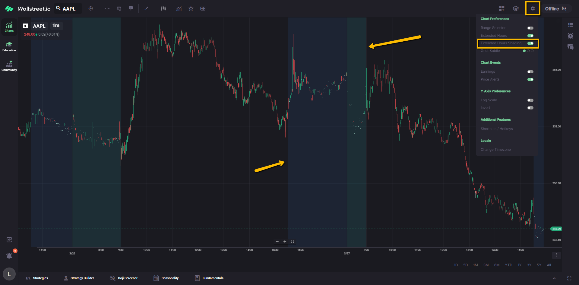
Turn it off if you want a cleaner chart while still keeping Extended Hours price data visible.
Grid Lines Brightness
Grid Lines Brightness controls how visible the chart grid lines appear in the background.
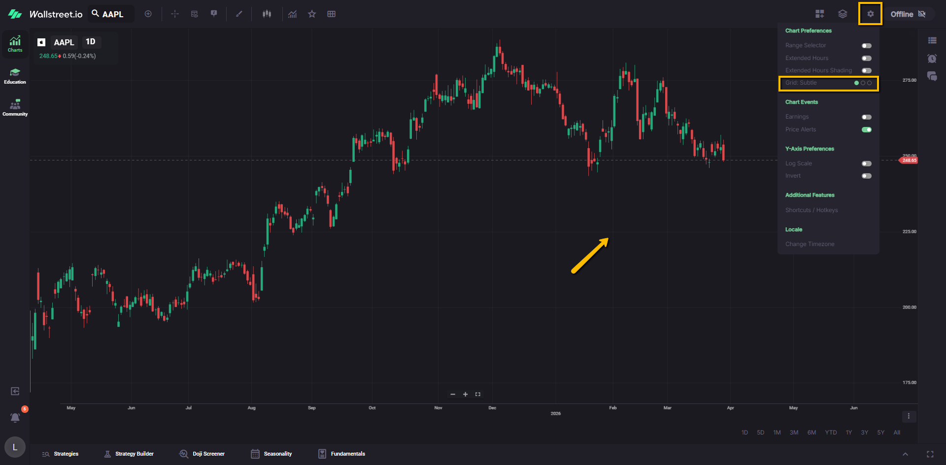
Clicking this setting cycles through four display modes: Subtle, Visible (default), Bold, and Off. Each mode adjusts the opacity of the grid lines, ranging from completely hidden to fully prominent. Small visual indicators next to the setting show the current level at a glance.
Use this to either reduce visual noise for a cleaner chart or increase contrast when you need clearer reference levels. Your selected brightness level is saved and will remain applied even after refreshing the page.
Chart Events
Earnings
The Earnings toggle shows or hides earnings markers on the chart.
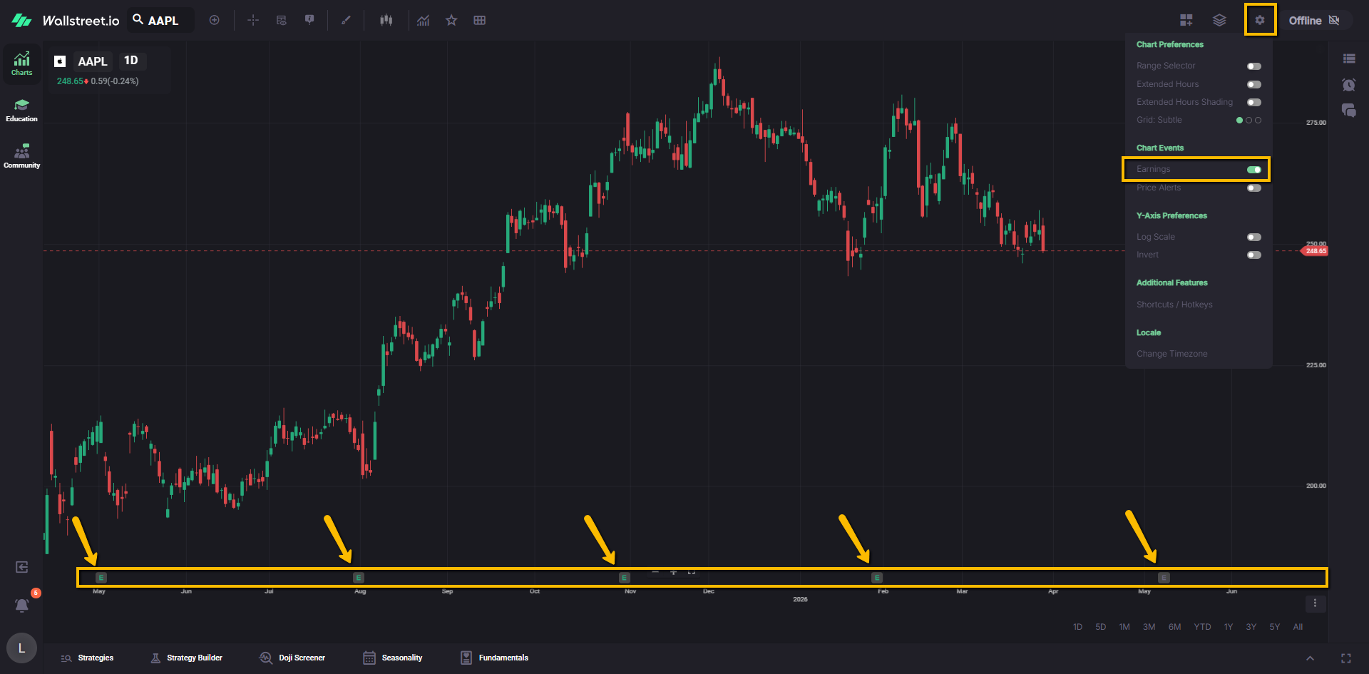
When this is on, the platform displays small “E” markers along the x-axis beneath the daily candles on the dates when earnings calls took place. This makes it easy to see how price behaved before and after each earnings event without opening another window.
Price Alerts
The Price Alerts toggle shows or hides any price alerts you have set for the selected symbol.
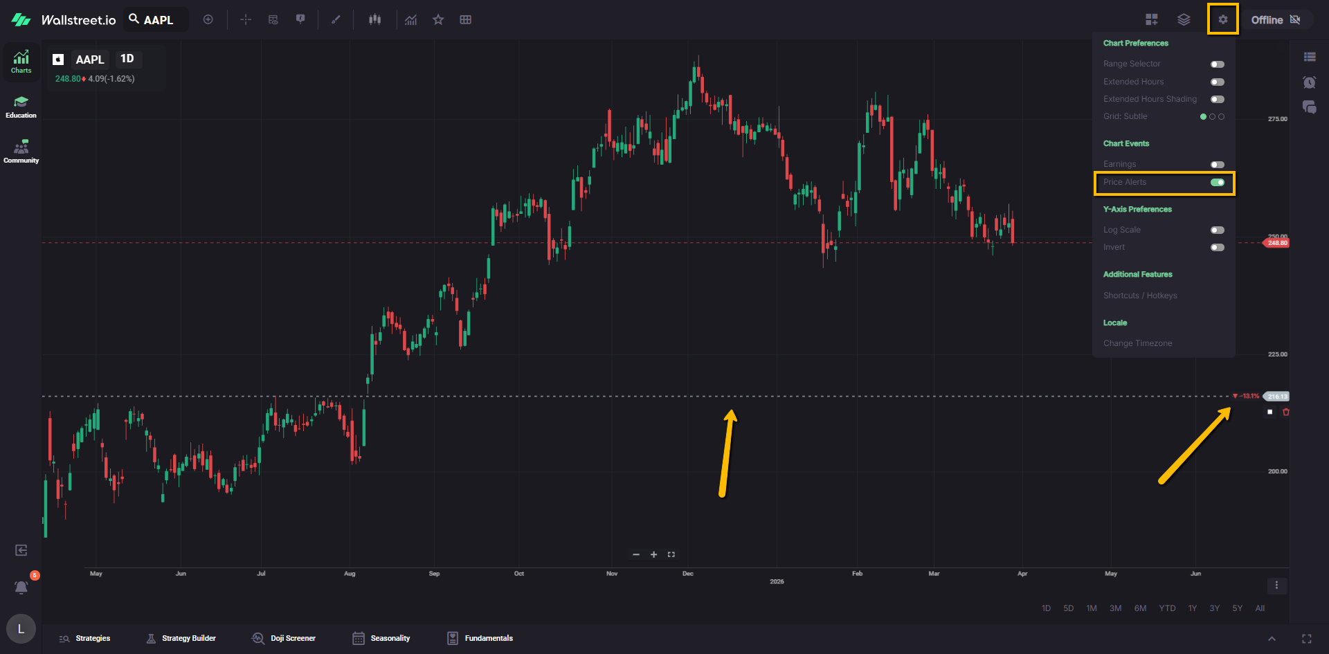
When this is enabled, your alerts appear directly on the chart, making it easy to see where key price levels are being monitored. Turning it off removes these markers from view without deleting the alerts themselves.
For a full walkthrough on how to create, manage, and use alerts effectively, please review the Price Alerts Complete Guide.
Y-Axis Preferences
Log Scale
Log Scale switches the vertical price axis from a standard (linear) scale to a logarithmic scale.
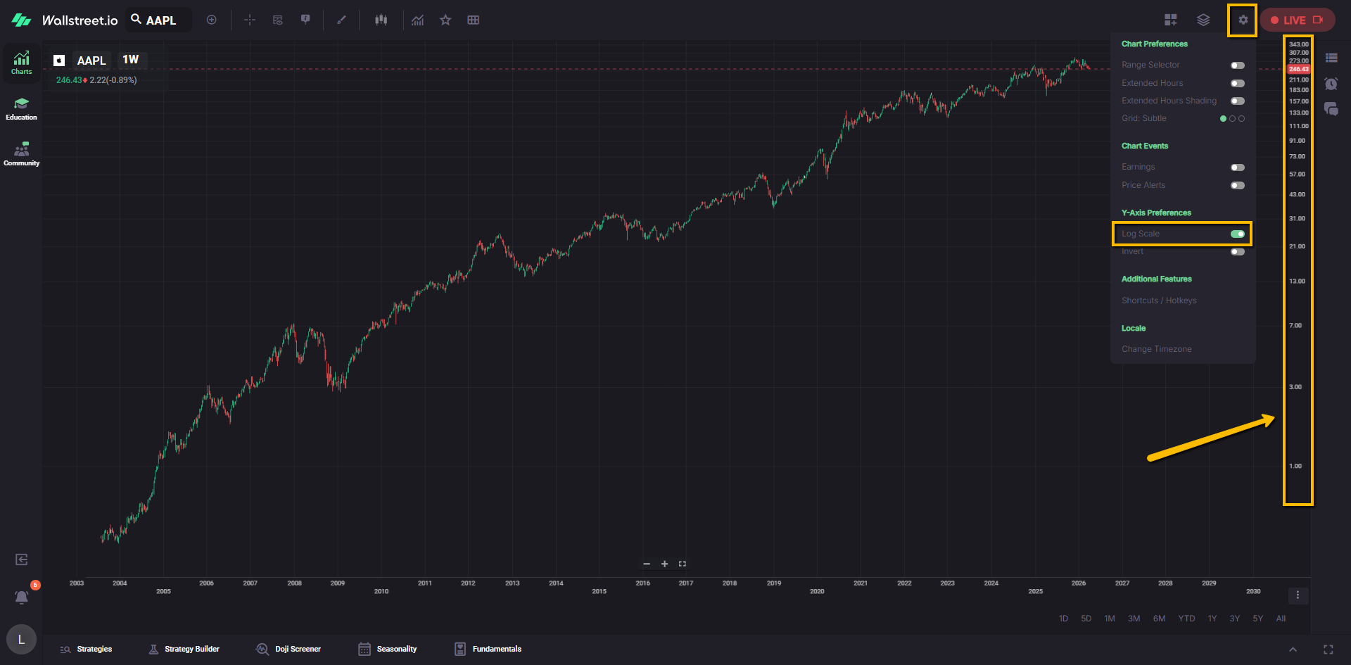
On a log scale, equal vertical distances represent equal percentage moves, not equal dollar moves. For example, the move from 10 to 20 and the move from 50 to 100 appear as the same height because both are 100 percent changes.
This view can make long trends and large percentage moves easier to compare, especially on stocks that have moved a lot over time.
If the price data includes values at or below zero, the chart automatically falls back to a standard linear scale, since log scaling cannot be applied in that case.
Invert
Invert flips the y-axis so that lower prices appear at the top of the chart and higher prices appear at the bottom.
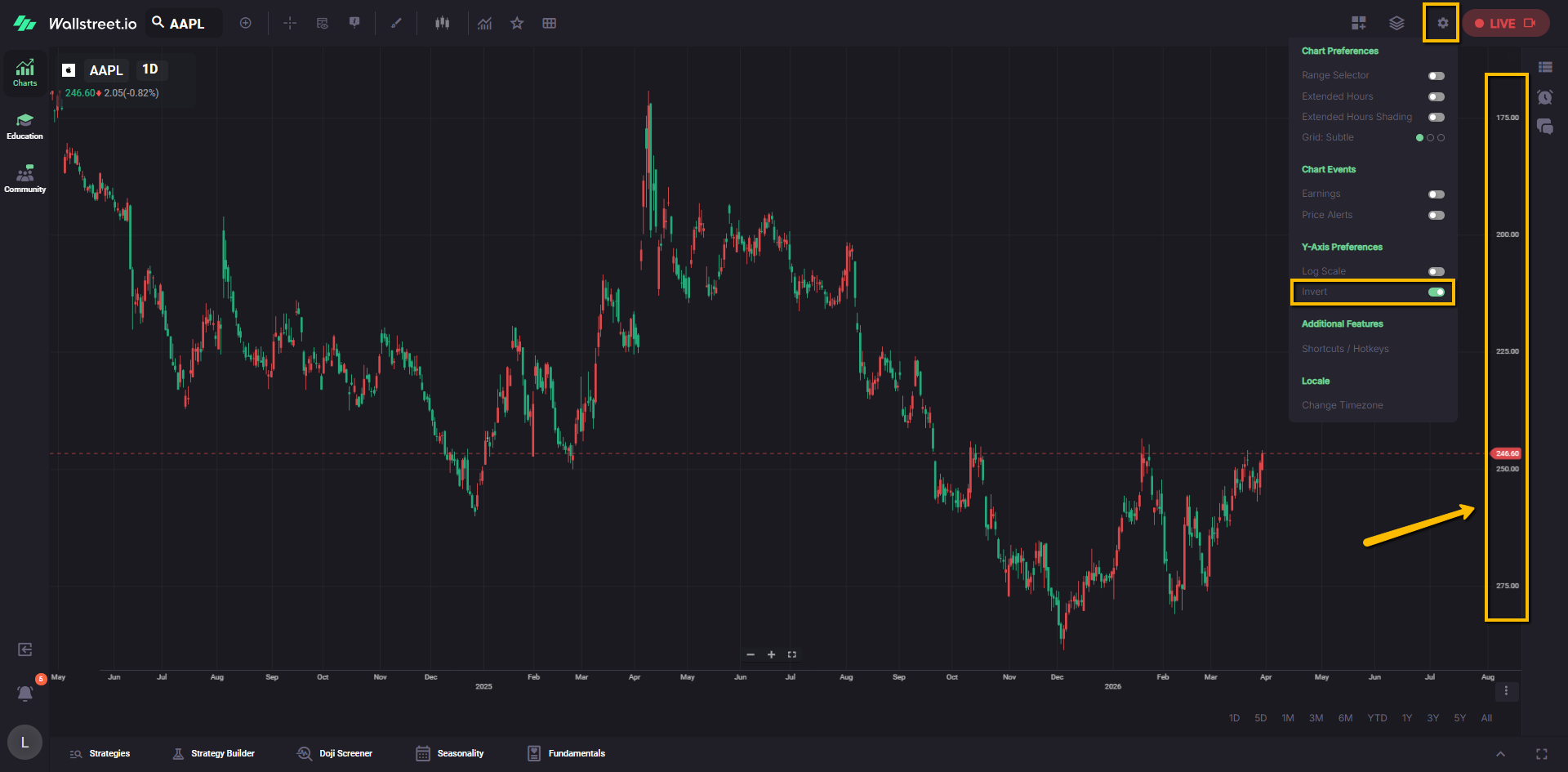
When you turn this on, the price series and any drawings or overlay studies on that chart panel are flipped as well.
This can be helpful if you are used to reading certain patterns “upside down” or if you want to analyze price in relation to another inverted series.
Note: Studies drawn in their own separate panels can usually be inverted independently using their own settings.
Additional Features
Shortcuts / Hotkeys
Shortcuts / Hotkeys opens the keyboard shortcuts legend for the chart.
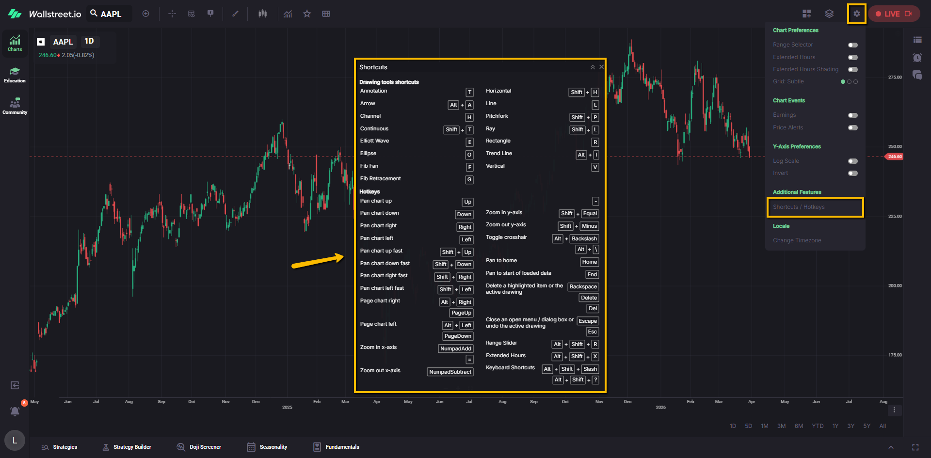
The legend lists all available hotkeys so you can see which keys control timeframes, drawing tools, orders, and other chart actions. The window can be moved and resized inside your browser so you can keep it visible while you work or minimize it when you no longer need it.
Locale
Change Timezone
Change Timezone lets you choose which timezone the chart uses when displaying session times and timestamps.
Use this if you prefer seeing chart times aligned with your local market hours or with a specific region you track.
At the time of writing, this feature is still under construction, so you may not see it applied across chart elements just yet.