Screener Tab Complete Guide
What this helps you do
This guide explains what the Screener in WallStreet.io 4.0 is, where to find it, and how its menus, filters, scope controls, and results table work.
This matters because the Screener helps you scan for technical setups across a broader universe without manually checking chart after chart. It also lets you compare signals across different timeframes from one view, so you can spot alignment faster and keep your process more structured.
Screener behavior summary
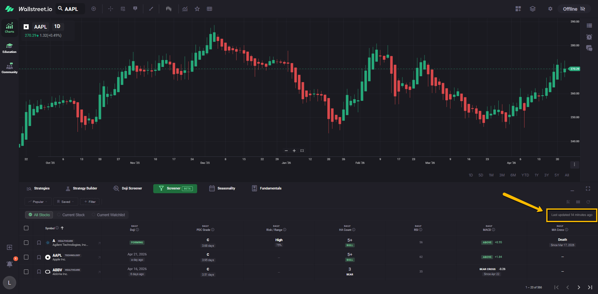
The Screener is a table-based scanning tool in the Charts workspace that surfaces symbols matching selected technical conditions.
When selected, the Screener tab opens the Screener page and displays the filter bar, scope controls, and results table.
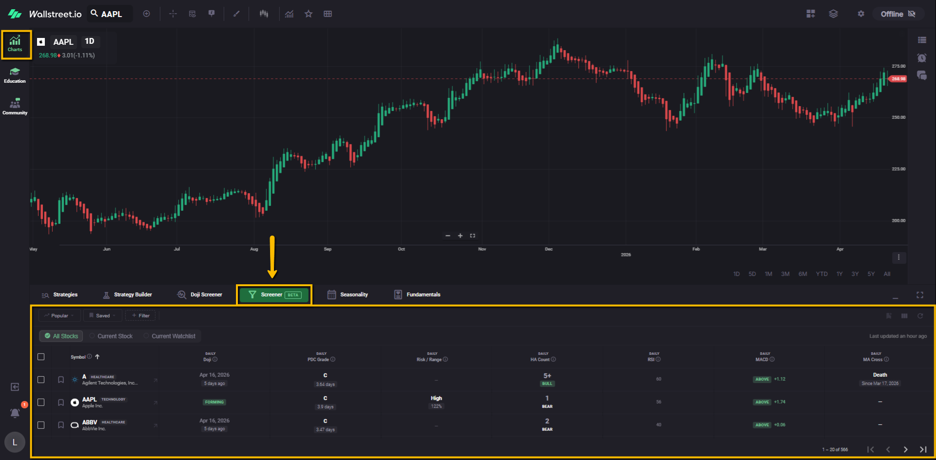
It uses active filters to narrow symbols, columns to display technical context, and scope controls to define the universe being screened.
At the time of writing, the Screener is labeled Beta. This means the feature is live and usable, but the filter set is still being expanded. The existing Doji Screener and the new Screener currently live side by side. The new Screener already includes Daily Doji as one of its filter options, and more filters are being added over time.
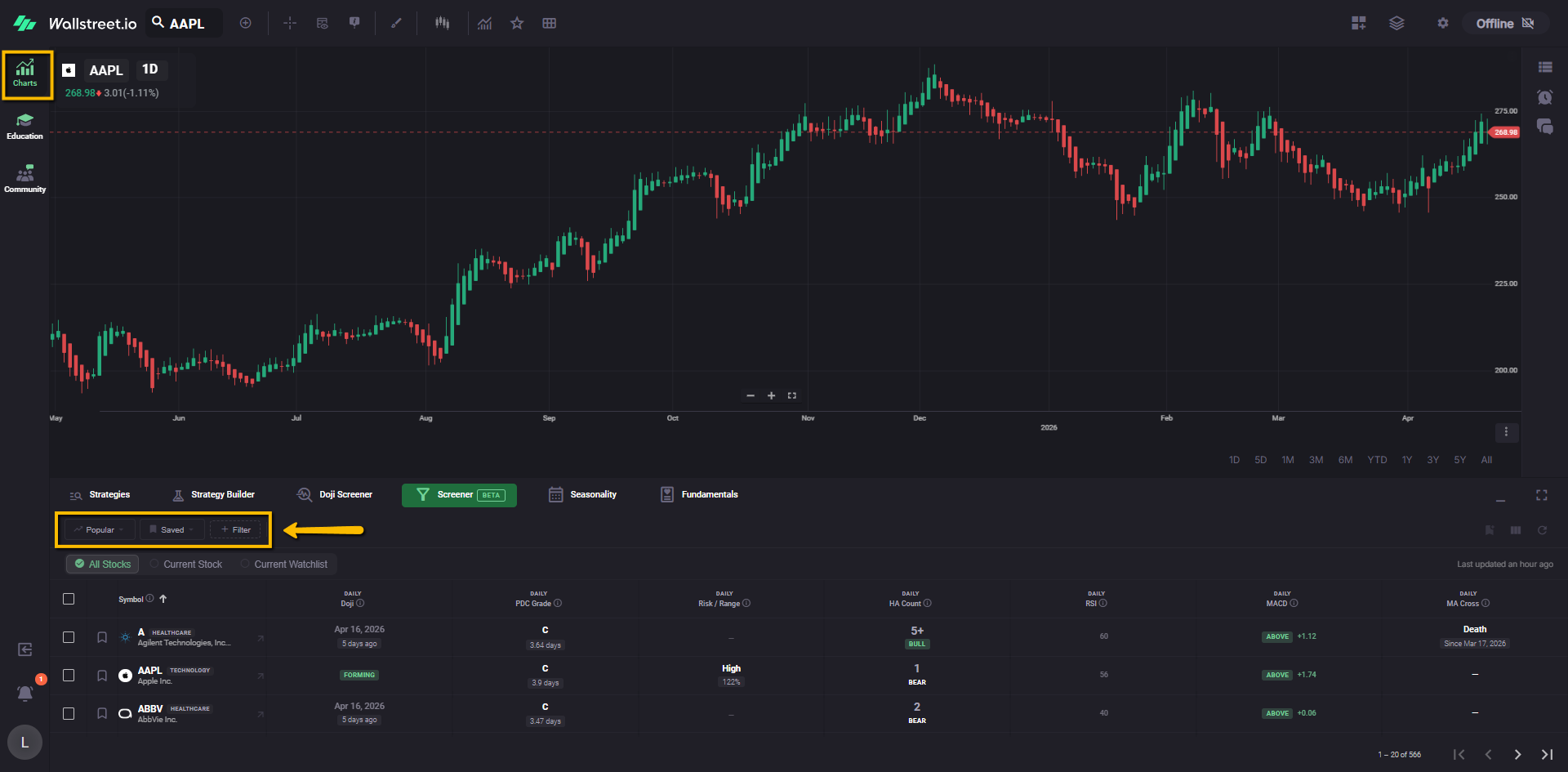
The current Beta version includes preset community filters under Popular, personal and reusable setups under Saved, and a growing list of technical filters under + Filter.
The Screener is designed to help you compare multiple technical signals from one place, including signals that use different timeframes across the same table.
Screener layout
The Screener page is organized into four main areas:
Filter bar
The filter bar appears near the top of the area and contains three main controls:
To the right of these menus, active filters appear as removable filter chips.
Active filter area
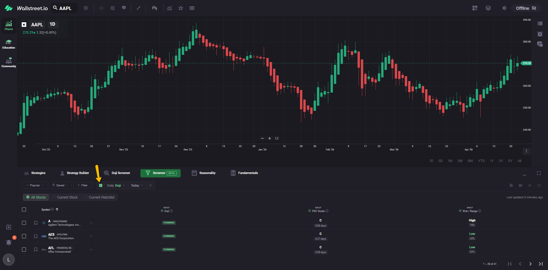
Any filter currently applied to the Screener appears as a chip in the active filter area. In the current Beta view, the Screener opens with a Doji filter already selected.
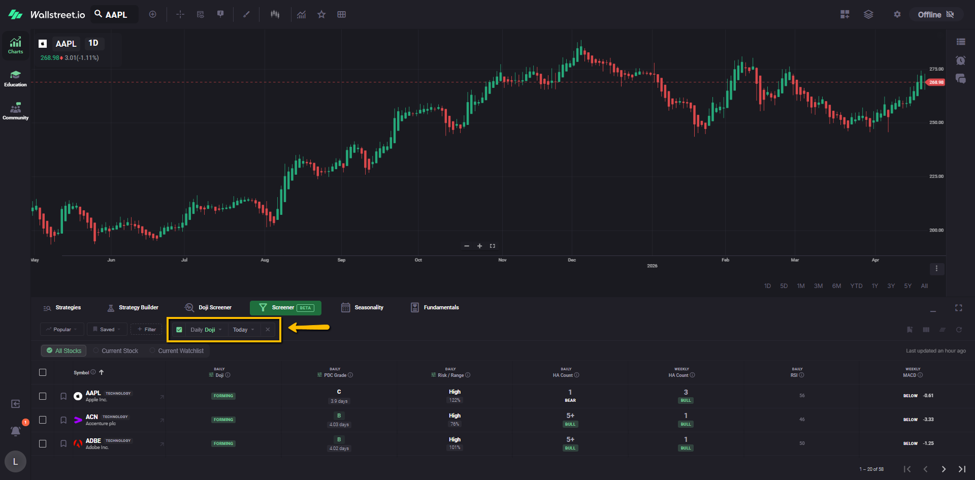
Each active filter chip can include a checkbox, one or more dropdown menus, and an X for removal.
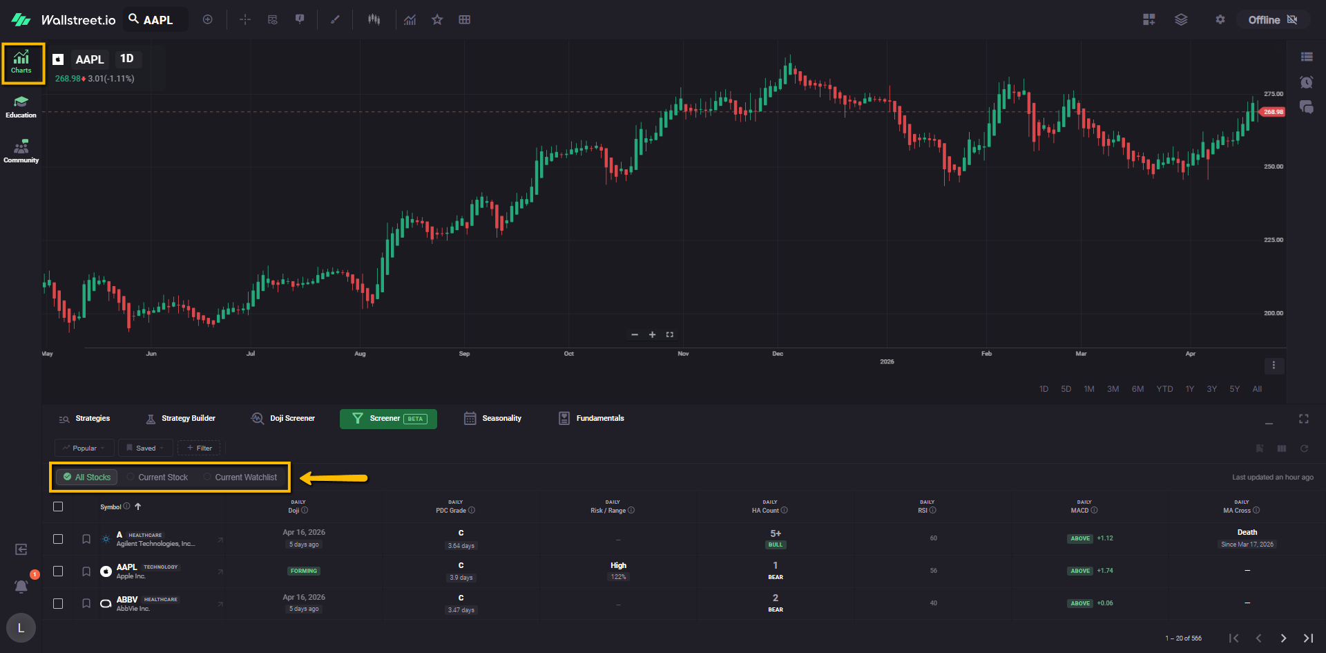
Scope controls
The Screener includes three scope options directly below the filter bar.
- Full S&P 500
- ARK ETFs: ARKK, ARKG, ARKF, ARKQ, ARKW
- Leveraged QQQ ETFs: TQQQ (3× long), SQQQ (3× short)
- 60+ additional high-quality stocks and ETFs, including momentum names and sector leaders This is the broadest scope and is useful when you want the widest possible scan.
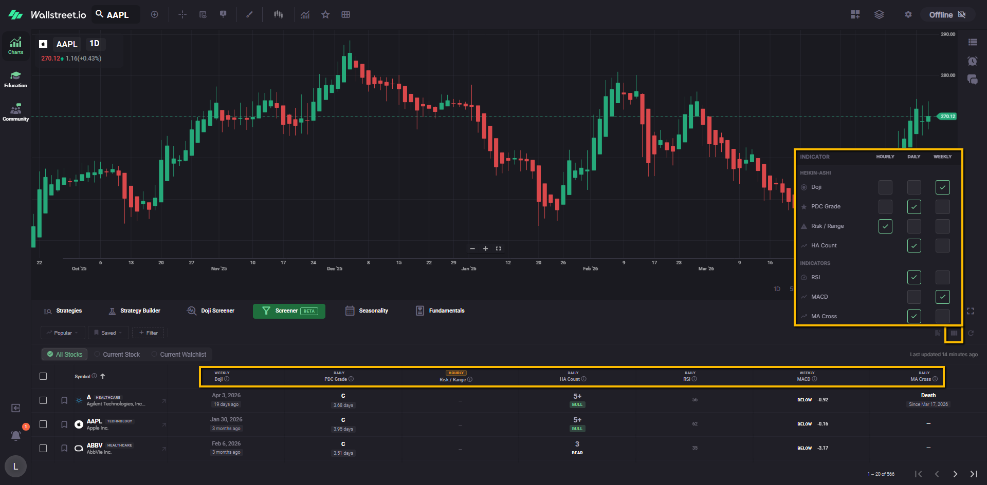
Results table
The main body of the Screener is a results table showing symbols and their corresponding technical data.
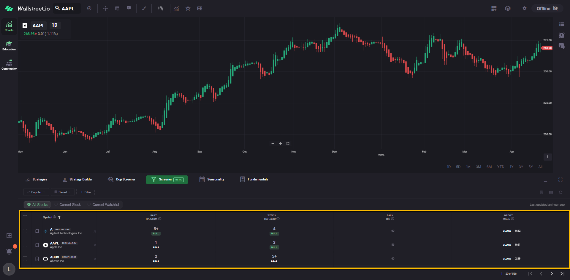
The table updates on a recurring cadence, and the upper-right area shows a Last updated timestamp so you can see how recent the displayed data is.
How filtering works
Active filter behavior
An active filter appears as a chip in the filter bar. That chip represents the condition currently shaping the Screener results.
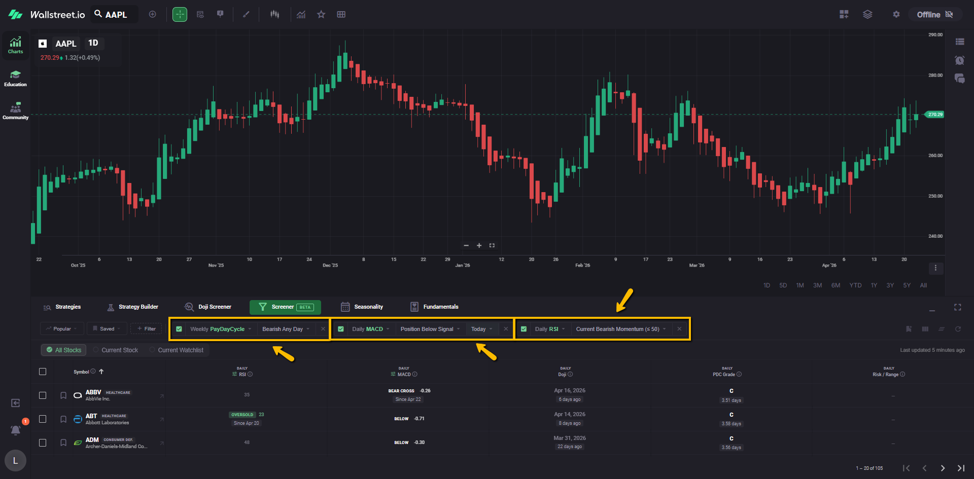
For example, a Daily Doji filter chip tells you the Screener is currently narrowed to symbols matching that Doji condition.
Filter column behavior
When a filter is applied, its related data column is added to the table automatically so the filtered condition remains visible in the results.
This keeps the filter logic and the table output aligned.
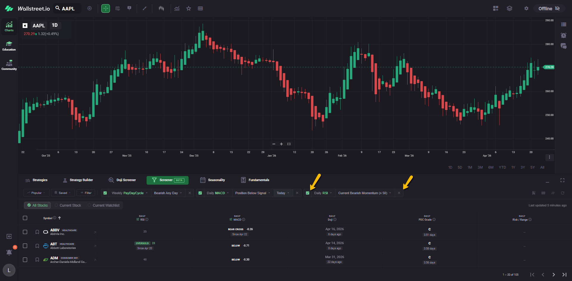
Disable versus remove
An active filter can be handled in two ways:
Disable
The checkbox on the filter chip lets you temporarily turn that filter off without deleting it from the bar.
Remove
The X on the filter chip removes the filter from the current Screener setup.
No filters applied
If all active filters are removed, the Screener returns to the broader stock universe for the selected scope. In that state, you can sort and review the available table columns without narrowing the list by a specific filter.
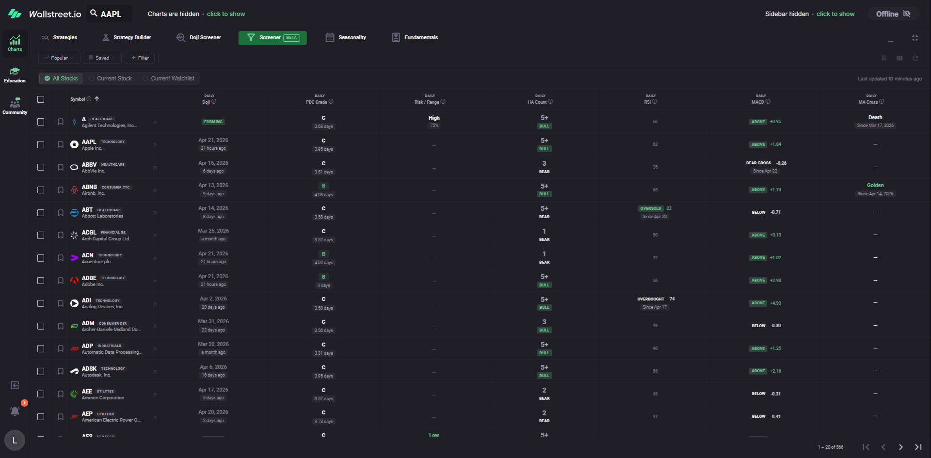
Filters and columns are not the same thing
A filter narrows which symbols appear. A column displays data for comparison.
This distinction matters because a column can be useful even when you do not want it to control which symbols are shown.
Per-column timeframes
One of the Screener’s key behaviors is that columns can be viewed across different timeframes.
You are not limited to a single timeframe across the entire table. A filtered signal can be shown alongside other columns that use different timeframes, allowing you to compare shorter-term and longer-term context from one screen.
For example, a daily signal can be compared beside a weekly momentum or trend column without switching tools.
Popular menu
The Popular menu contains community preset filters maintained as starting points.
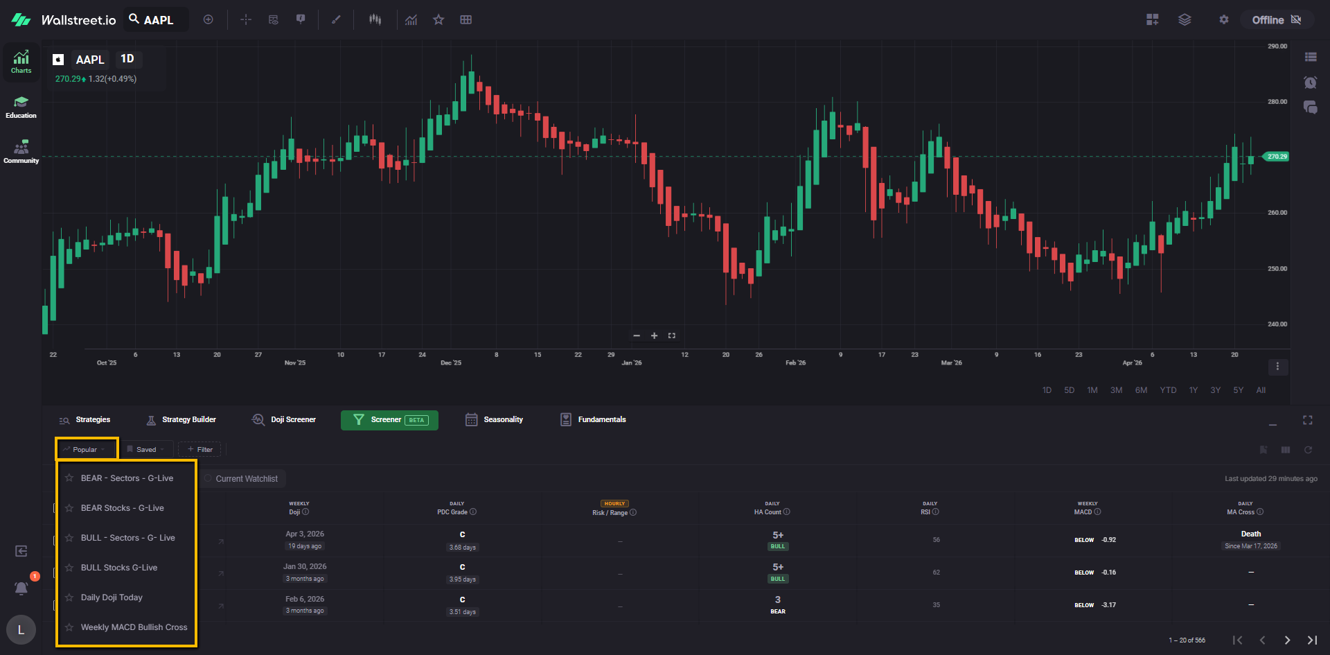
Examples shown in the current interface include:
Each preset can include a star icon so it can be favorited from within the menu.
Popular filters are useful when you want to start from a prebuilt setup rather than building a screen from scratch.
Saved menu
The Saved menu contains previously saved filter setups and also includes Save Current filter.
Saved filters are personal to your account. They are meant to help you return to the same Screener setup later without rebuilding it each time.
A saved filter setup can also preserve the column layout associated with that view, including the timeframes used by those columns. This allows the Screener to restore not just the filter itself, but the table view that went with it.
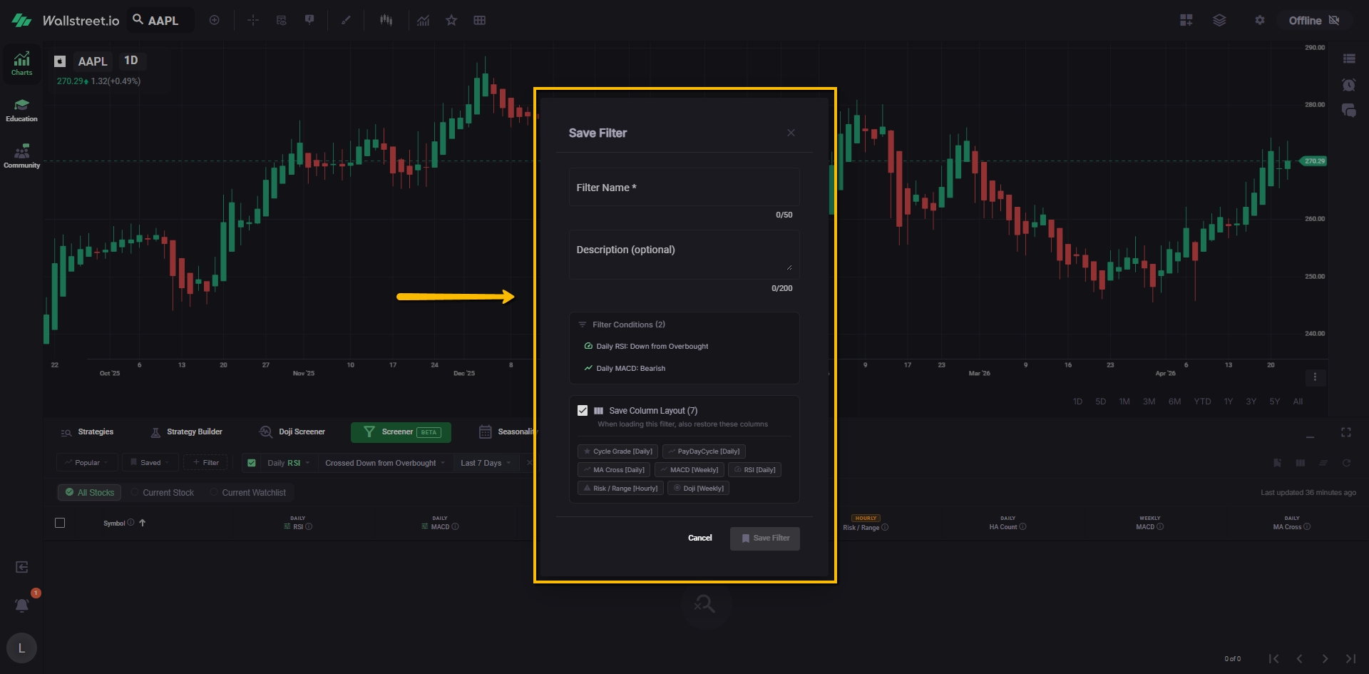
The Saved menu may also include pre-existing community or system-provided entries depending on the state of the feature.
Filter menu
The + Filter menu is where available technical filters are added to the Screener.
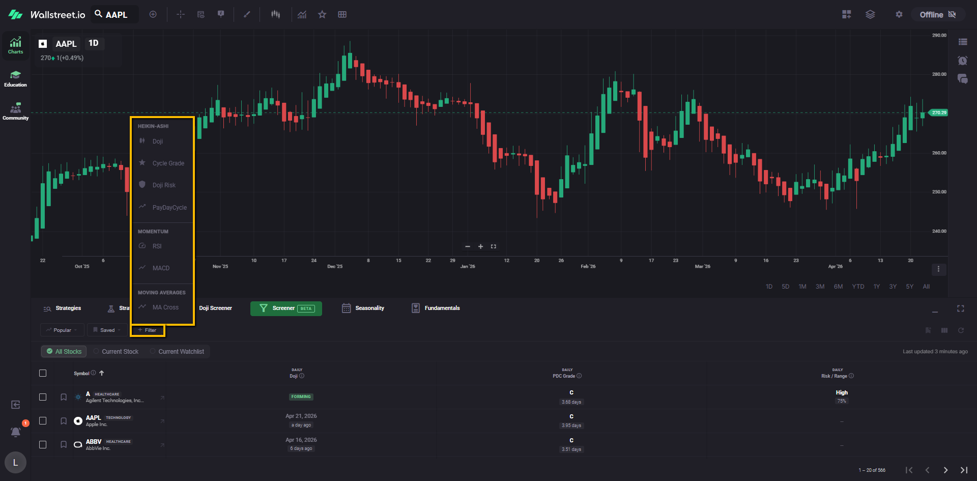
In the current Beta version, the filter menu groups filters by category. In the current interface shown, categories include:
Within those categories, currently shown filters include:
Available filters may continue to expand as Beta development continues.
Active filters overview
The current Beta Screener opens with the Doji filter already applied, so let’s take it as an example.
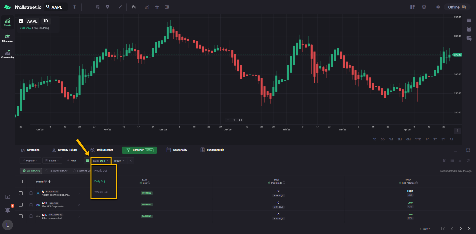
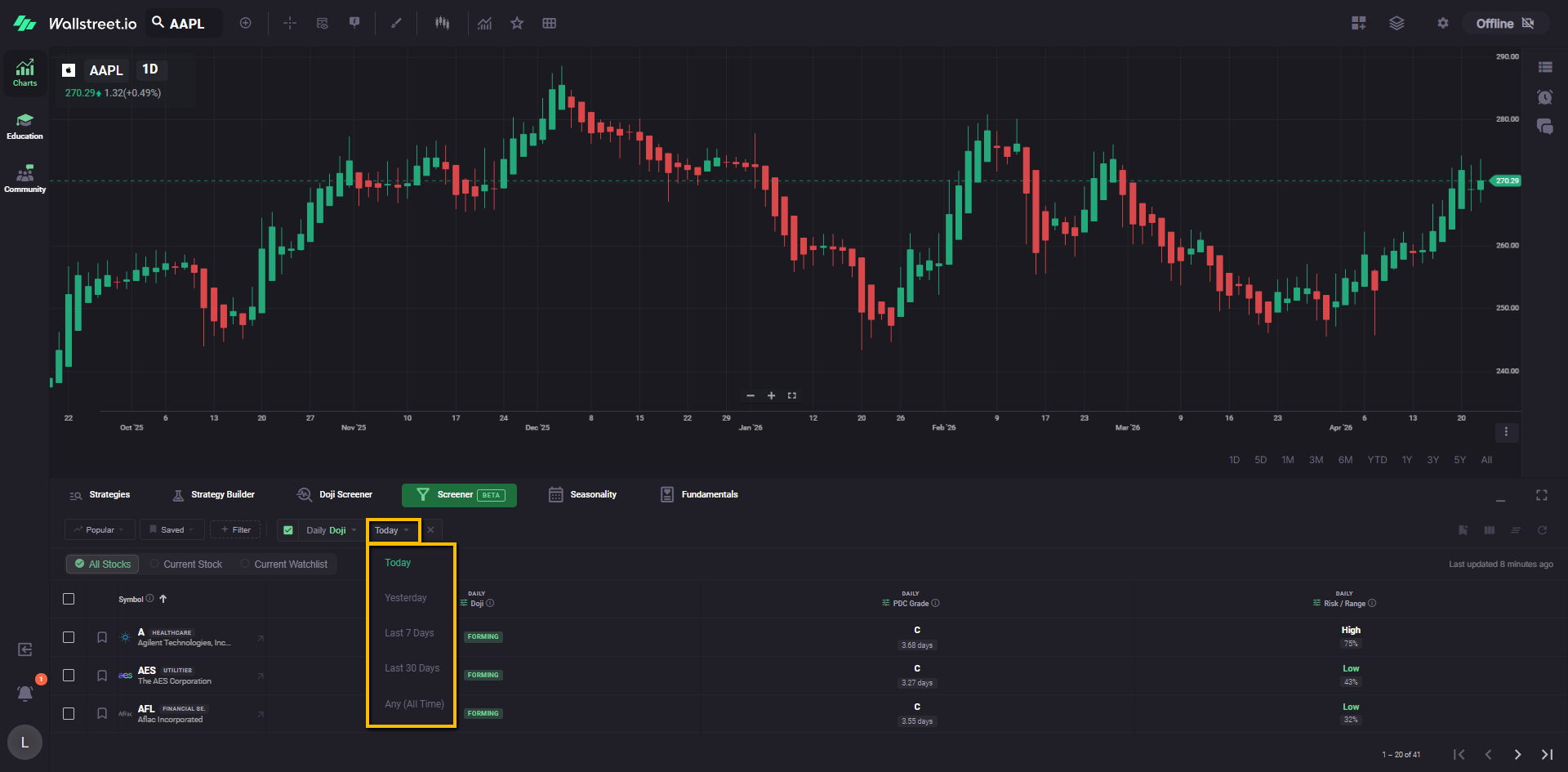
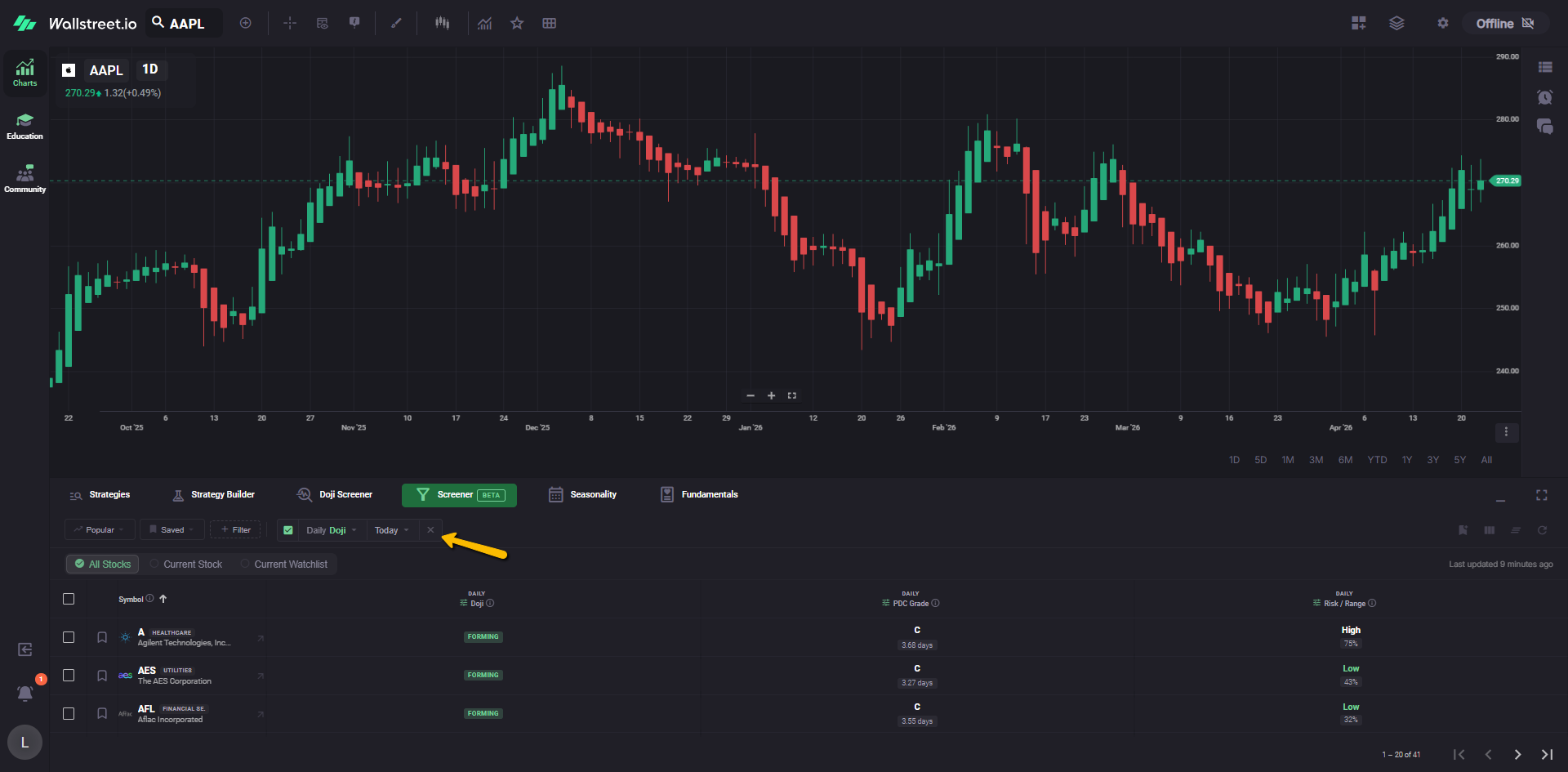
This filter appears as an active chip in the filter bar and includes several parts.
Checkbox
The checkbox right next to it enables or disables the filter without fully removing it.
Filter type dropdown
The first dropdown defines the Doji type and timeframe being screened.
Examples described for the current Doji filter include:
Time window dropdown
The second dropdown defines when that Doji occurred.
Examples described for the current Doji filter include:
Remove control
The X at the end of the filter chip removes the Doji filter from the current Screener setup.
Results table
The Screener results appear in a table below the scope controls.
Row selection
Each row includes a checkbox on the left for selection.
Symbol column
The Symbol column shows the ticker and company name. The current table view also shows category or sector labeling next to each symbol where available.
Technical columns
To the right of the Symbol column, the Screener displays technical columns tied to the current setup.
Each column can display its own timeframe label above the column name, such as Daily, Hourly or Weekly.
This makes it easier to understand the timeframe context of each metric at a glance.
Pagination
The bottom-right area of the table includes pagination controls so you can move through additional result pages when the Screener returns more symbols than fit in a single page.
Data refresh and update timing
The Screener does not refresh every value continuously in real time.
Instead, it updates on a recurring cadence, and the page shows a Last updated timestamp in the upper-right area of the results section.
The refresh control re-syncs the table with the latest available Screener data. It updates the displayed table state rather than re-running the entire Screener logic from scratch in a separate workflow.
Current filters available in Beta
At the time of writing, the Screener Beta includes these filter areas or filter names in the current interface:
Doji
Screens for Heikin-Ashi Doji conditions based on the selected timeframe and time window. “Forming” means a doji is in-progress, but it’s not confirmed until the candle close.
Cycle Grade
PayDay Cycle quality grade (A+ to F) and average cycle length in days. A higher grade and a shorter length makes it more reliable.
Doji Risk
This is the risk score (low, medium or high) based on Doji range vs. the Average True Range. Lower risk with a tighter range is ideal.
PayDayCycle
This is the Heikin-Ashi candle count. In other words, the days in the current Heikin-Ashi trend. For example, “Bull 1” means it’s the first bullish candle of the uptrend, and “Bear 3” is the third consecutive bearish candle of the downtrend.
RSI
This is the 14-period Relative Strength Index. Below 30 is generally considered oversold, and above 70 is considered to be overbought.
MACD
This is the MACD signal line relationship and histogram value. Any crosses indicate potential trend changes.
MA Cross
This is the 50-day and 200-day moving average crossover. Golden cross is bullish, the death cross is bearish.
Filters planned next
According to the current Beta rollout notes, additional filter types planned for future expansion include:
These are planned additions and may appear after further updates.