Seasonality Tab Complete Guide
What this helps you do
This guide helps you understand every part of the Seasonality tab, from the monthly score cards to the line chart, bar chart, and heatmap.
You learn what each metric means, how to adjust the lookback, and how to turn the Seasonality view into practical context for entries, exits, and position sizing on Wallstreet.io.
How the Seasonality tab is organized
The Seasonality tab is divided into two main areas. At the top you see month-level insights for the symbol you are viewing, including a live month score, a historical report card, and a written summary of how this month usually behaves.
Below that, if you scroll down, you see three visual sections, a bar chart of average monthly returns, a line chart that compares individual years, and a heatmap table that breaks those returns down by year and month.
Think of the top section as your headline for the current month, and the lower charts as the evidence behind that headline.
The timeframe and lookback controls at the top of the tab apply to all of these elements, so any change you make there is reflected across the entire Seasonality view.
Timeframe and lookback controls
At the top of the Seasonality tab you can switch between Weekly and Monthly views, and choose a lookback period of 1Y, 3Y, 5Y, 10Y, or 20Y.
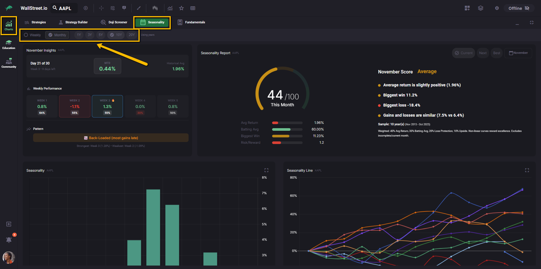
These settings control which years are included in the calculations across the entire Seasonality tab. Returns are calculated from daily close to daily close, and incomplete current months are excluded from the historical averages, so the stats you see are based only on fully completed months within the selected lookback.
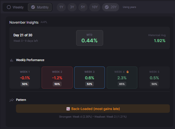
When you select the Weekly view, an additional Month dropdown appears so you can choose which month you want to analyze.
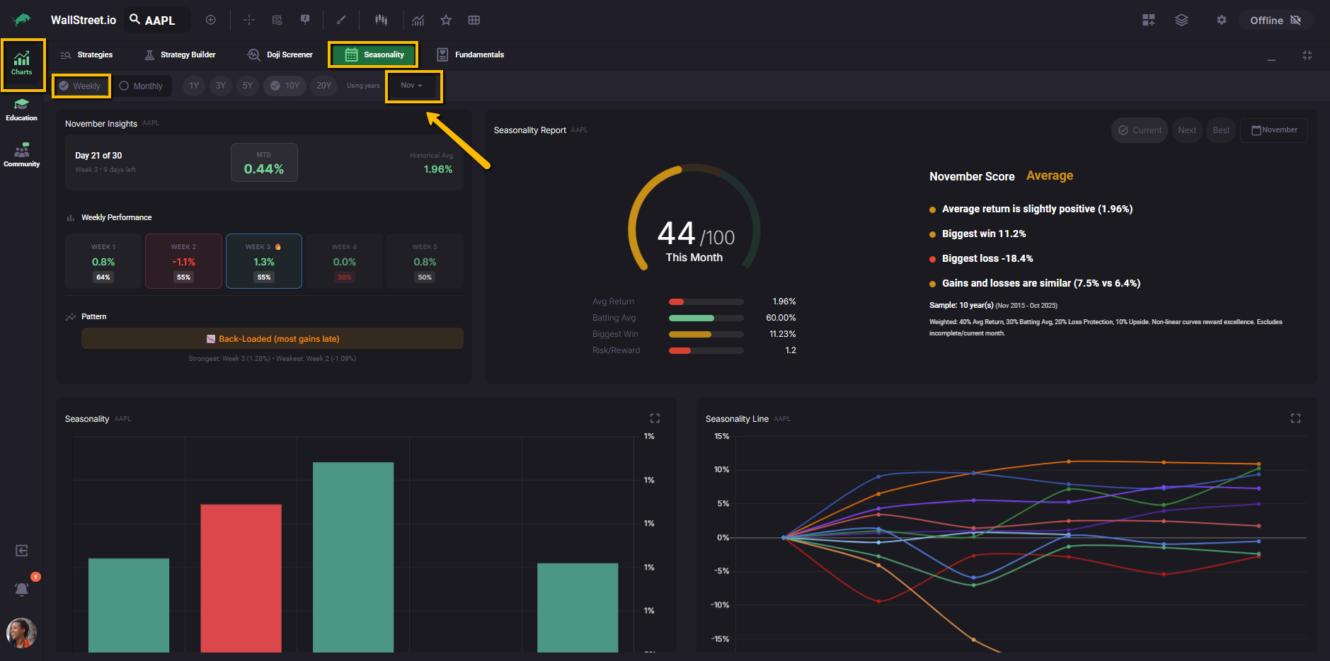
The Month Insights section then focuses on that specific month for the current symbol.
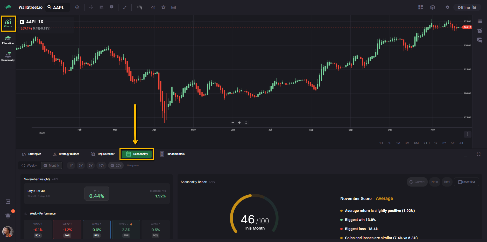
Month Insights overview
In the top left, the Month Insights panel shows where you are inside the current month, how the month is performing so far, and how that compares with its usual pattern.
It combines three views: a live month-to-date (MTD) tile, a historical average tile for the same month, and a row of weekly tiles that highlight which parts of the month have tended to be stronger or weaker.
At the bottom, a Pattern label summarizes whether gains usually show up early, late, or are spread more evenly.
Once you understand this panel, the rest of the Seasonality tab becomes much easier to read, so we will start here.
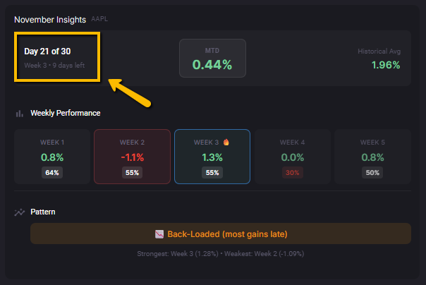
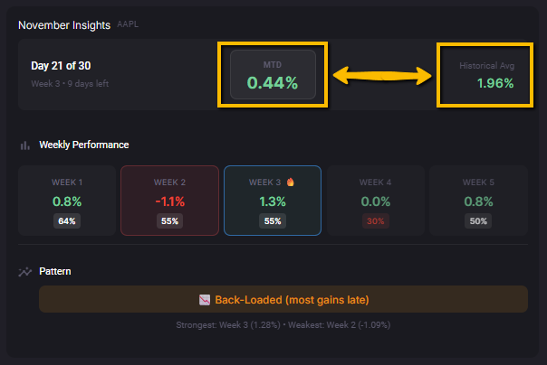
Month Insights details
The Month Insights panel in the top left gives you a quick snapshot of how this month is playing out compared with its historical behavior.
The label such as “Day X of Y” shows where you are inside the current month, together with the current week number. The tooltip explains that this helps you line up the live action with the historical weekly patterns that appear below.
In the middle and right tiles you see the Month-to-Date performance (MTD) for the current month and the Historical Avg for this same month across all completed years in the sample. Comparing MTD to Historical Avg helps you see whether the current month is running ahead of or behind its usual pace.
Below that, the Weekly Performance row breaks the month into individual weeks, for example Week 1 through Week 5, with a return and a win rate for each week.
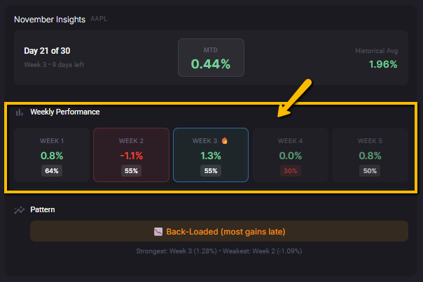
When you hover over a week tile, the tooltip shows the historical average return for that week, the win rate with the count of positive years, the best and worst single year, and a short confidence hint, for example “Moderate confidence (50–70% win rate).”
At the bottom, the Pattern strip summarizes how gains usually distribute across the month.
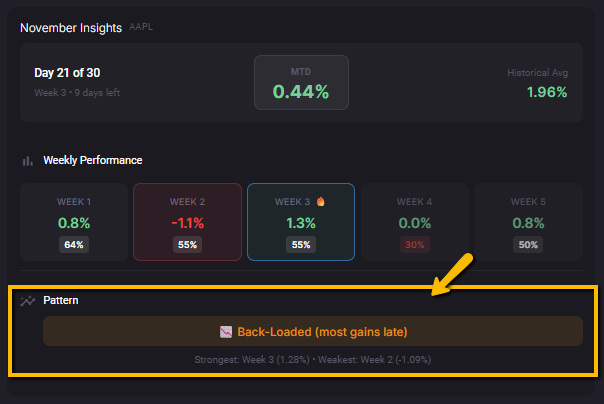
A label such as “Back-Loaded (most gains late)” tells you that most of the month’s gains have historically occurred in the last two or three weeks, and the text below highlights the strongest and weakest weeks based on historical average returns.
The Month Insights section updates when you change the lookback period, so you can compare how stable these patterns are over shorter or longer histories.
Seasonality Report
The Seasonality Report gives you a single score out of 100 for the current month, based on how this month has behaved across your selected lookback period. It combines return, consistency, downside behavior, and upside potential so you can quickly see whether this month has been historically attractive for the symbol you are viewing.
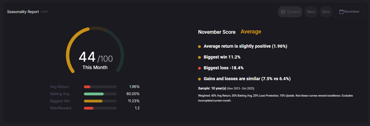
On the left, the gauge shows the numeric score (for example 44 / 100) and the label “This Month.” This score uses the same lookback and timeframe settings you chose at the top of the Seasonality tab, and only includes completed historical months. The small bars and values under the gauge break the score into four ingredients:
On the right, the November Score panel translates the score into plain language.
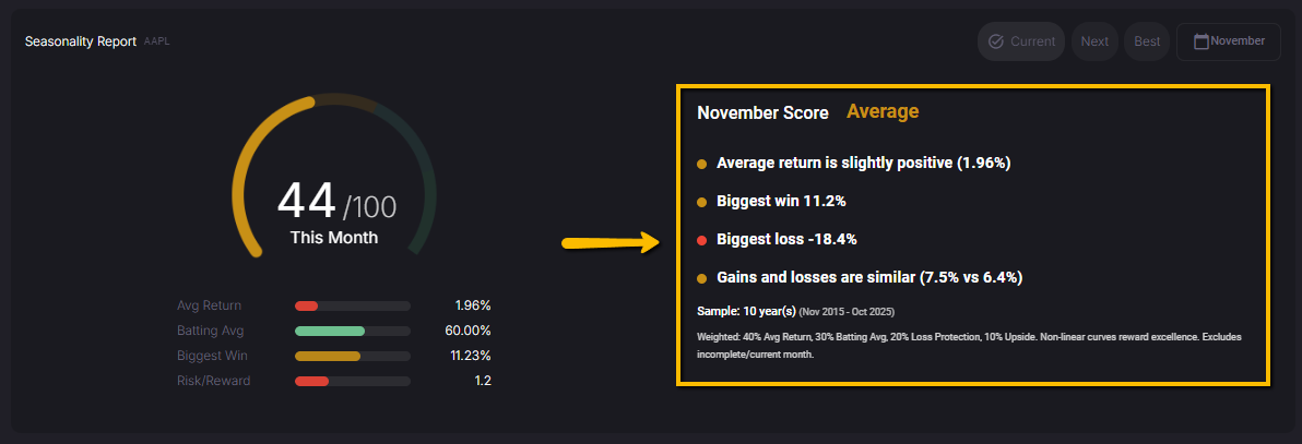
You see a text label such as “Average” along with short bullet points that highlight the average return, biggest win, biggest loss, and how gains and losses compare. This helps you judge whether the score is being driven more by strong upside, by low downside, or by a mix of both.
Below the summary, the Sample line shows how many years are included and the date range (for example, “Sample: 10 years (Nov 2015–Oct 2025)”). The small text under that explains how the score is built, for example a weighting such as 40% Avg Return, 30% Batting Avg, 20% Loss Protection, 10% Upside, and notes that incomplete or current months are excluded from the calculation.
In the top right of this panel, the Current, Next, Best, and Month selector buttons let you move between months without changing tabs.
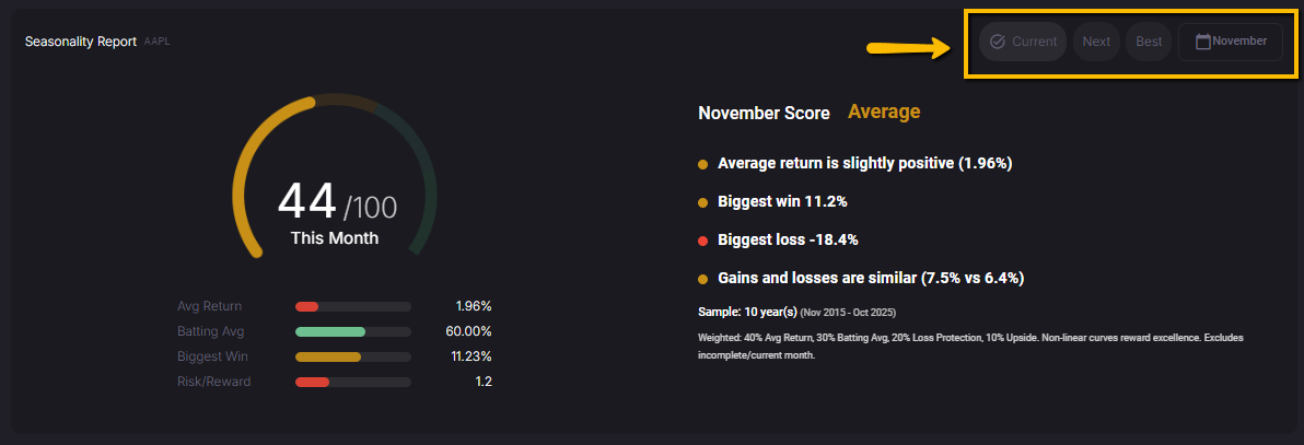
Current jumps to the month you are in right now, Next moves to the upcoming month, Best highlights the historically strongest month for the selected symbol and lookback, and the Month button lets you jump directly to a specific month such as November. This makes it easy to scan through the calendar and spot which months deserve more of your attention.
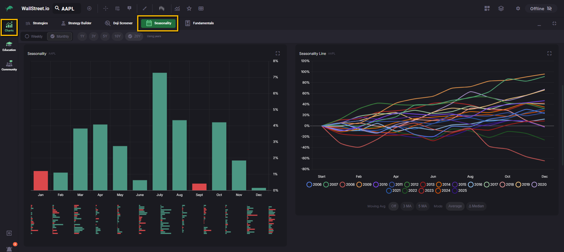
Monthly and Weekly Seasonality bars
The Seasonality bar chart shows how a symbol has historically performed across the calendar, so you can compare month by month or week by week at a glance.
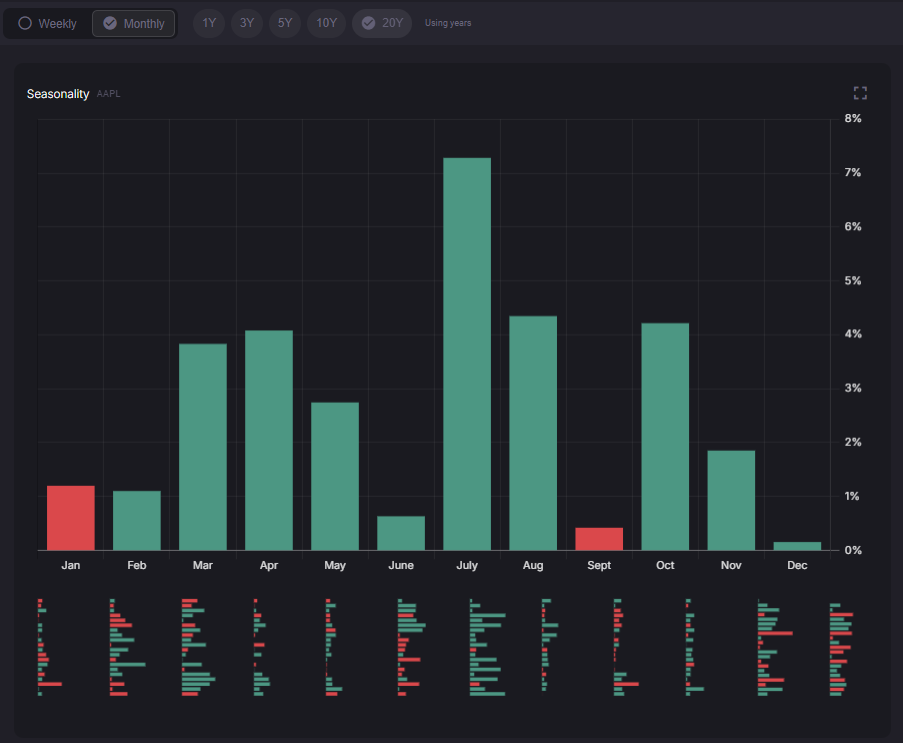
In Monthly view, each tall vertical bar represents the average return for that month across the selected lookback. Green bars mark months that have been positive on average, and red bars mark months that have been negative on average. This is a simple way to see which months have historically been stronger or weaker for the symbol you are studying.
When you hover over a vertical bar, a tooltip appears on the right that shows:
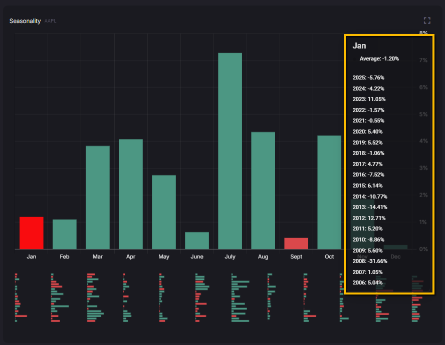
These values use the same logic as the rest of the tab: buy-and-hold returns based on daily closes, and only completed months are included.
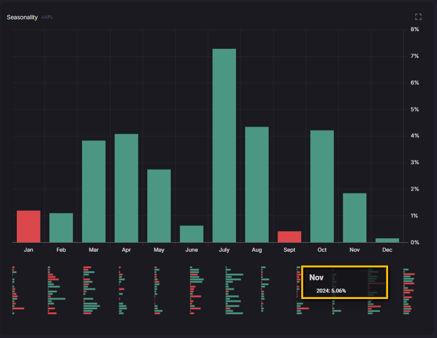
Under each month you will see a cluster of horizontal mini bars. Each mini bar represents the return for that month in a specific year within your lookback. If you hover over a mini bar, the tooltip shows the return for that month in that specific year, which makes it easy to spot unusually strong or weak seasons.
If you switch the top control to Weekly, the chart focuses on a single month that you pick from the Month dropdown. The vertical bars then represent the average return for each week of that month, and the hover panel lists the historical returns for that week in each year. This lets you move from a broad seasonal view down into the specific weeks that have mattered most.
Use this chart whenever you want to scan quickly for recurring patterns. The tall bars show you which months or weeks tend to pull their weight over time, and the mini bars and hover details give you the year-by-year context behind those averages.
Seasonality Line chart
The Seasonality Line chart lets you compare how each individual year has moved through the calendar for the symbol you are viewing. Each colored line represents one year in your selected lookback, starting at zero on the left and updating as you move from the start of the year toward December. The vertical axis shows the running percentage return, so you can see which years trended higher, which ones rolled over, and where they diverged from the pack.
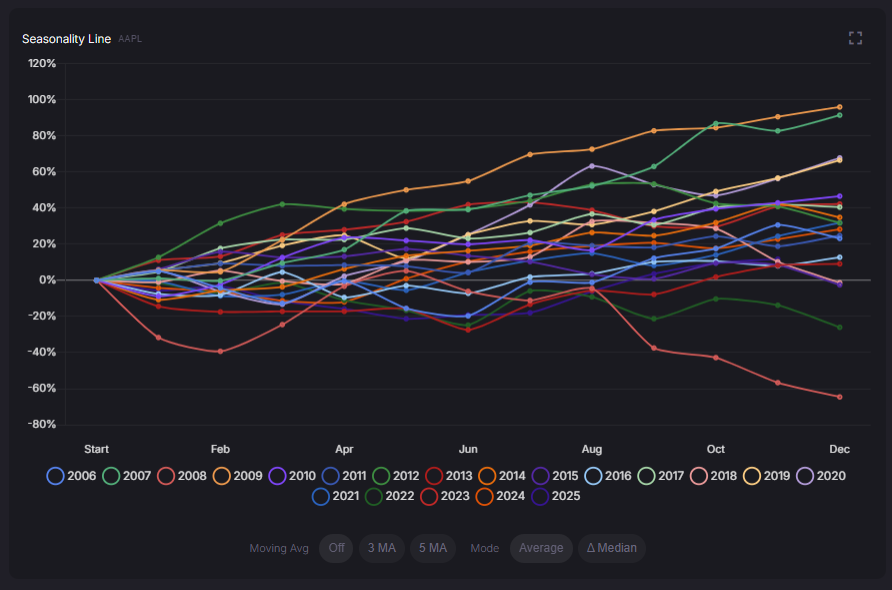
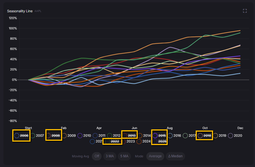
Along the bottom, the year legend acts as a toggle. If you click a year, it gets crossed out and that line disappears from the chart. This makes it easier to isolate a handful of years you care about, for example recent years or past extremes, without losing the overall context of the others.
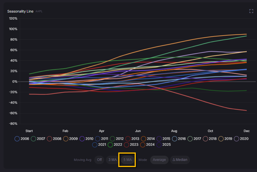
Below the chart you can turn on moving averages to smooth out the noise. The Moving Avg control lets you choose a 3-period or 5-period moving average across the calendar, which adds a smoother line so you can focus on the underlying seasonal tendency instead of every small wiggle.
You can also switch how the summary line is calculated. Average shows the typical seasonal path based on the average performance across all years in your sample. Median mode changes the view to highlight how each year behaves relative to the median. When you select Δ Median, a note appears that says:
“Median mode shows each year's deviation from the median year's performance at each month, helping identify which years consistently outperform or underperform the typical seasonal pattern.”
In practice, that means the chart is no longer only about raw returns. It becomes a way to spot outlier years that repeatedly run hotter or colder than the usual seasonal path, which can be useful when you are thinking about how current conditions compare with the past.
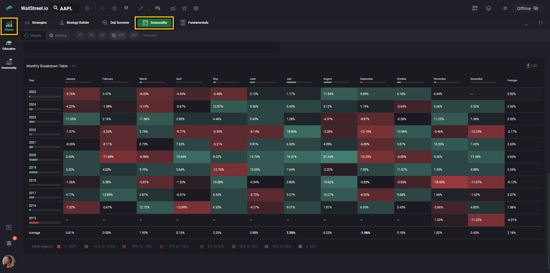
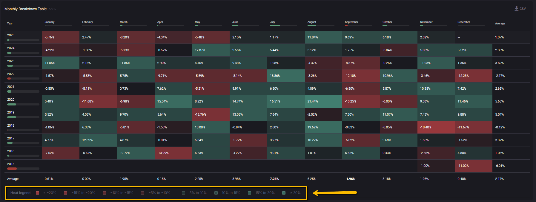
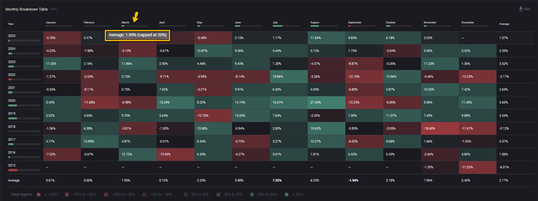
Monthly Breakdown Table
The Monthly Breakdown Table shows every year and every month in your selected lookback as a heatmap of returns. It is the most detailed view in the Seasonality tab and lets you see exactly how each month has behaved year by year.
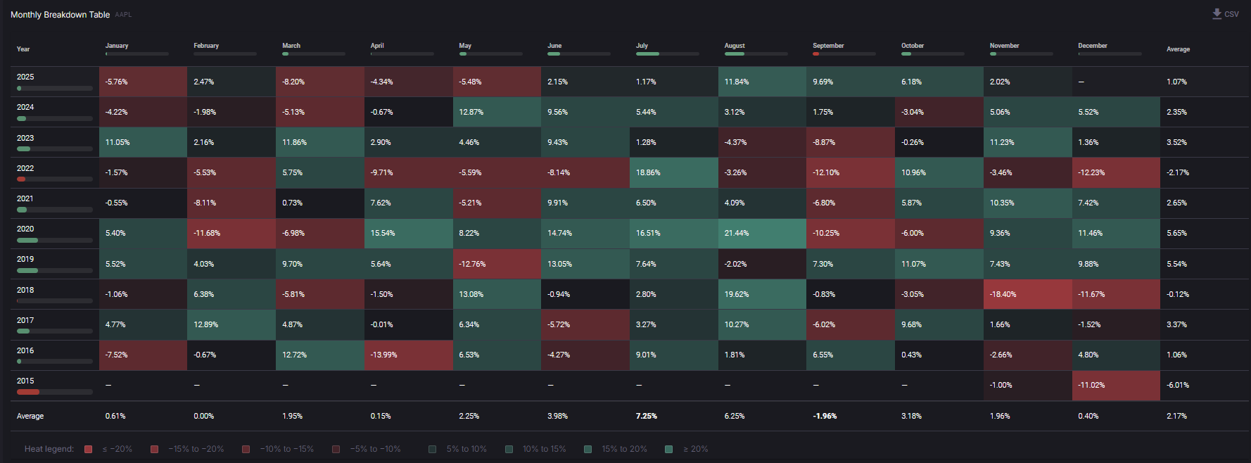
Each row is a year, and each column (January through December) is that month’s buy-and-hold return for the chosen symbol, based on daily closes. The Average column on the right shows the average annual return for each year, and the Average row at the bottom shows the average return for each month across all years in the sample.
Coloring follows the heat legend at the bottom of the table. Deep red cells mark strongly negative months, deep green cells mark strongly positive months, and mid-tones represent smaller moves. The legend lists the exact ranges, from “≤ -20%” up to “≥ 20%”, so you can see at a glance which periods were outliers and which were closer to flat.
When you hover over a month header at the top or a year label on the left, a tooltip shows the average return for that period, expressed as a percentage and labeled as “capped at 20%”. This cap keeps extreme returns from distorting the view while still letting you recognize unusually strong or weak seasons.
You can export the full table by clicking the CSV button in the top-right corner of the section.
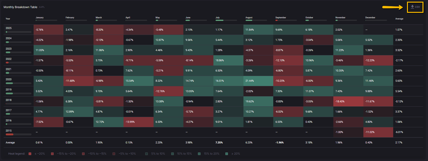
The download contains the same monthly returns that appear in the grid, which makes it easy to run your own analysis or keep a record of the seasonality profile for your watchlist symbols.
Putting the Seasonality tab to work
Once you are familiar with each part of the Seasonality tab, you can use it as a quick historical backdrop for your trade ideas. The Month Insights and Seasonality Report panels tell you how the current month usually behaves and how this year is tracking compared with that history. The bar chart and line chart help you spot recurring strengths and weaknesses across months and years, and the Monthly Breakdown Table lets you drill all the way down to individual year-month combinations.
Seasonality does not predict what will happen next, and it does not replace your own risk management or strategy rules. Instead, it gives you a clear, data-based view of how this symbol has behaved in similar calendar windows, so that when you plan entries, exits, and position sizes on Wallstreet.io, you do it with the historical context right in front of you.