Charts Workspace Complete Guide
What this helps you do
This guide helps you understand the main parts of the Charts Workspace, what each area controls, and how they fit together. When you know where everything lives and what it does, you can move faster on the platform, keep your charts consistent, and spend more of your attention on trade decisions instead of hunting for buttons.
Charts Workspace at a glance
The Charts Workspace is the main place where you read price action and run your analysis on Wallstreet.io. It is made up of four key areas that work together:
Chart Toolbar
The row of controls across the top of the chart. This is where you change symbols and timeframes, add comparisons, open drawing tools, apply indicators, change chart types, manage layouts, and open chart settings.
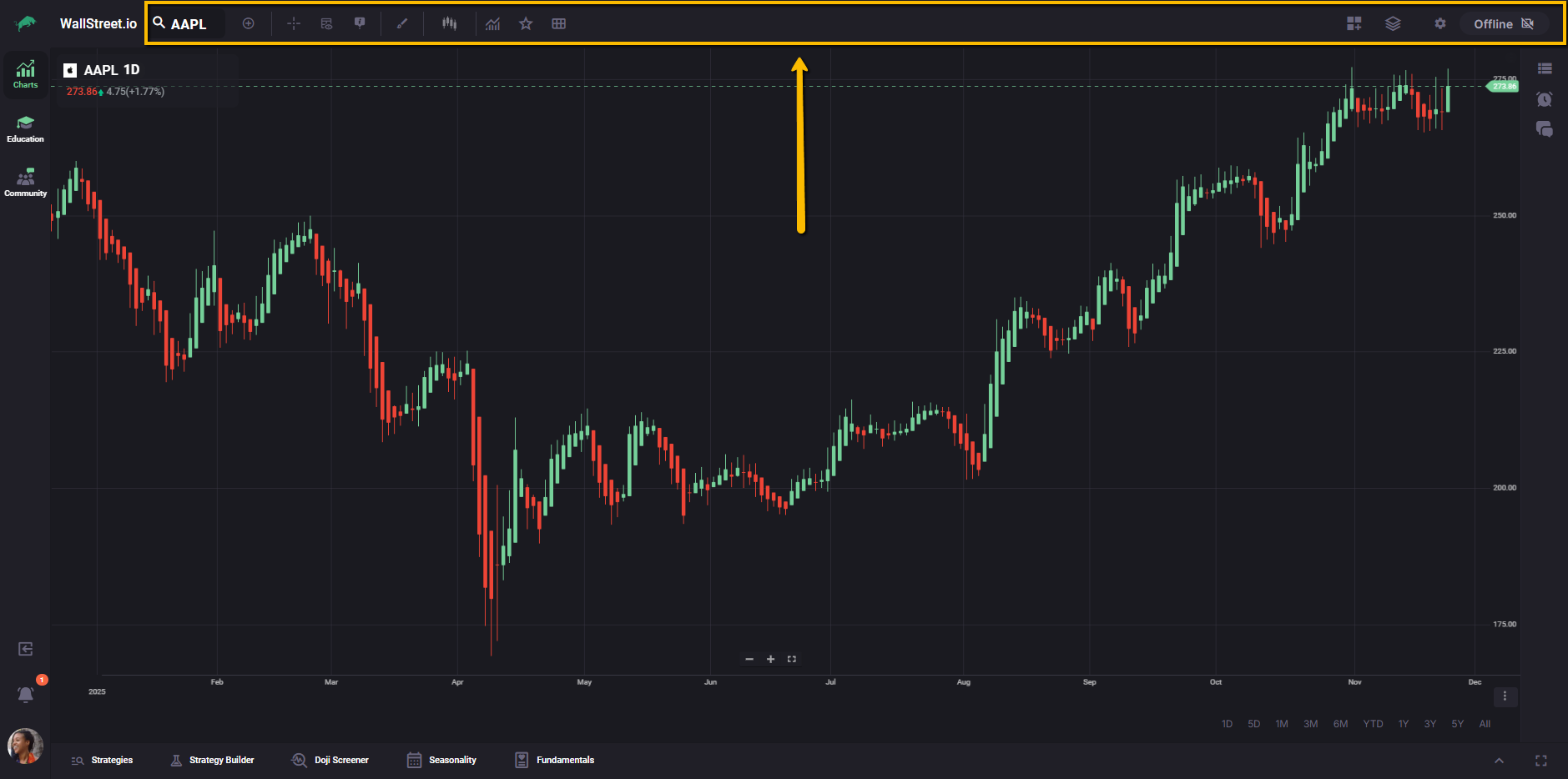
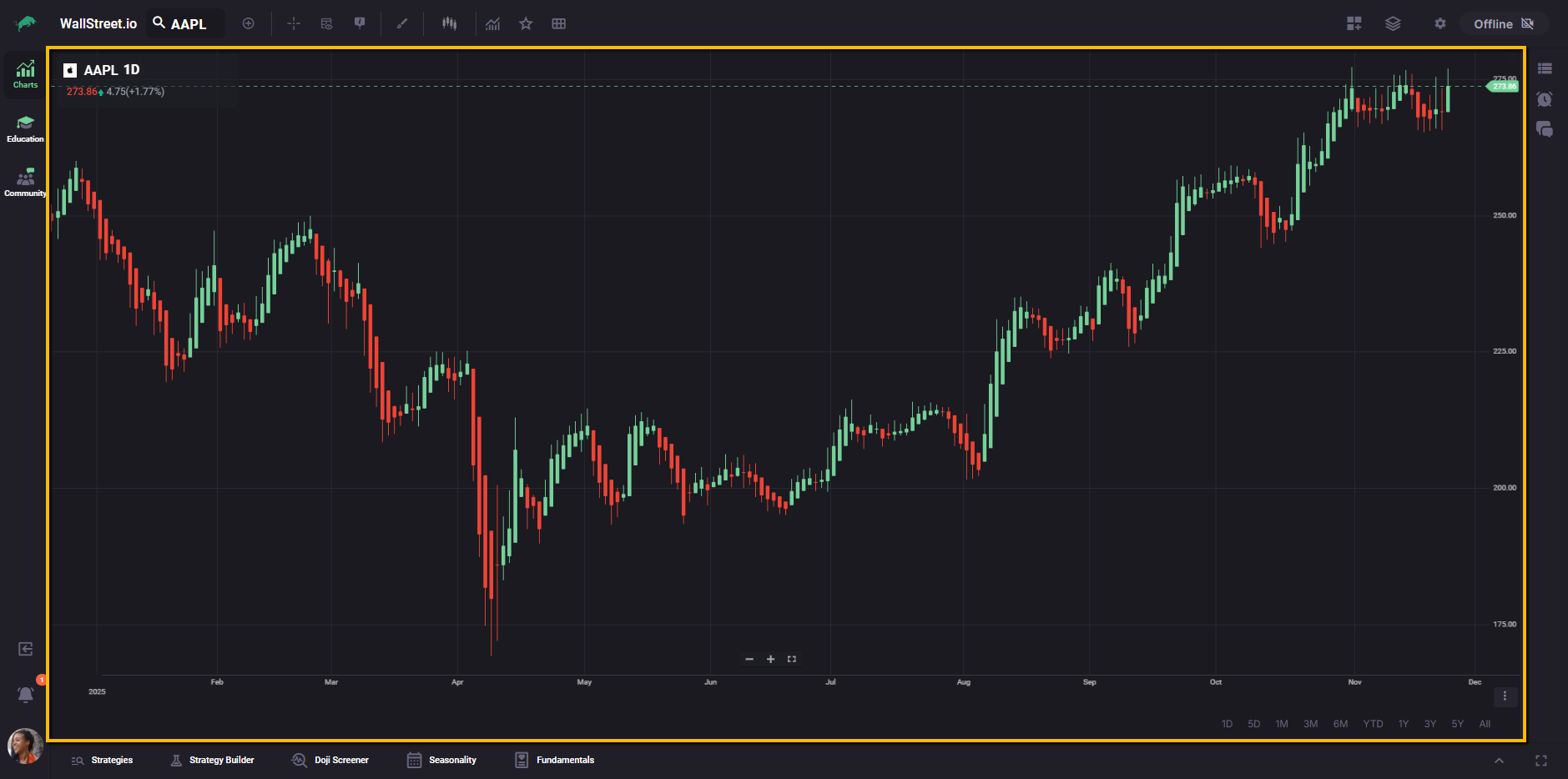
Chart Area
The central price chart where you see candlesticks or other chart types, indicators, drawings, and strategy visuals. This is where you read market structure, zoom in and out, and visually confirm what your tools are showing.
Y-Axis menu (Price axis)
Your chart’s Y-axis is the price axis on the right side of the chart. By default, it shows price levels.
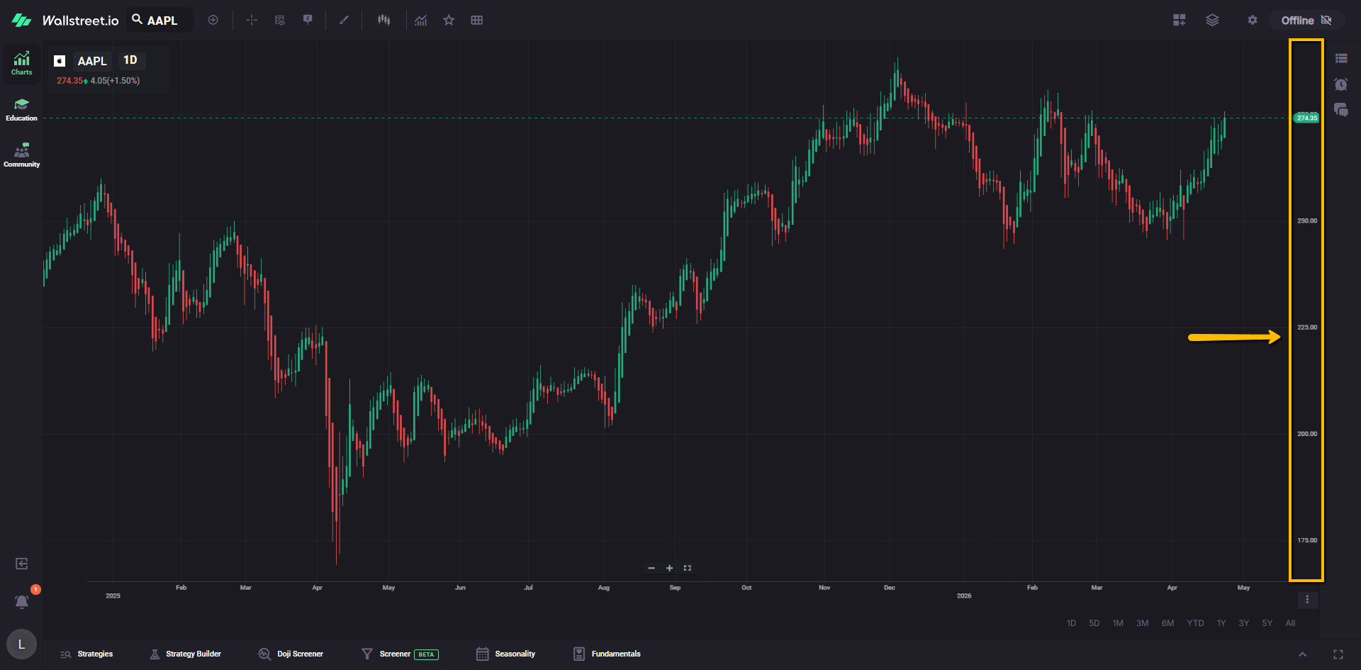
You can also switch the axis display to show Net Change or Percent Change, which can make it easier to judge movement at a glance.
The menu for this is hidden until you hover your mouse over the Y-axis. When you hover, a small three-dot icon appears near the top of the axis.
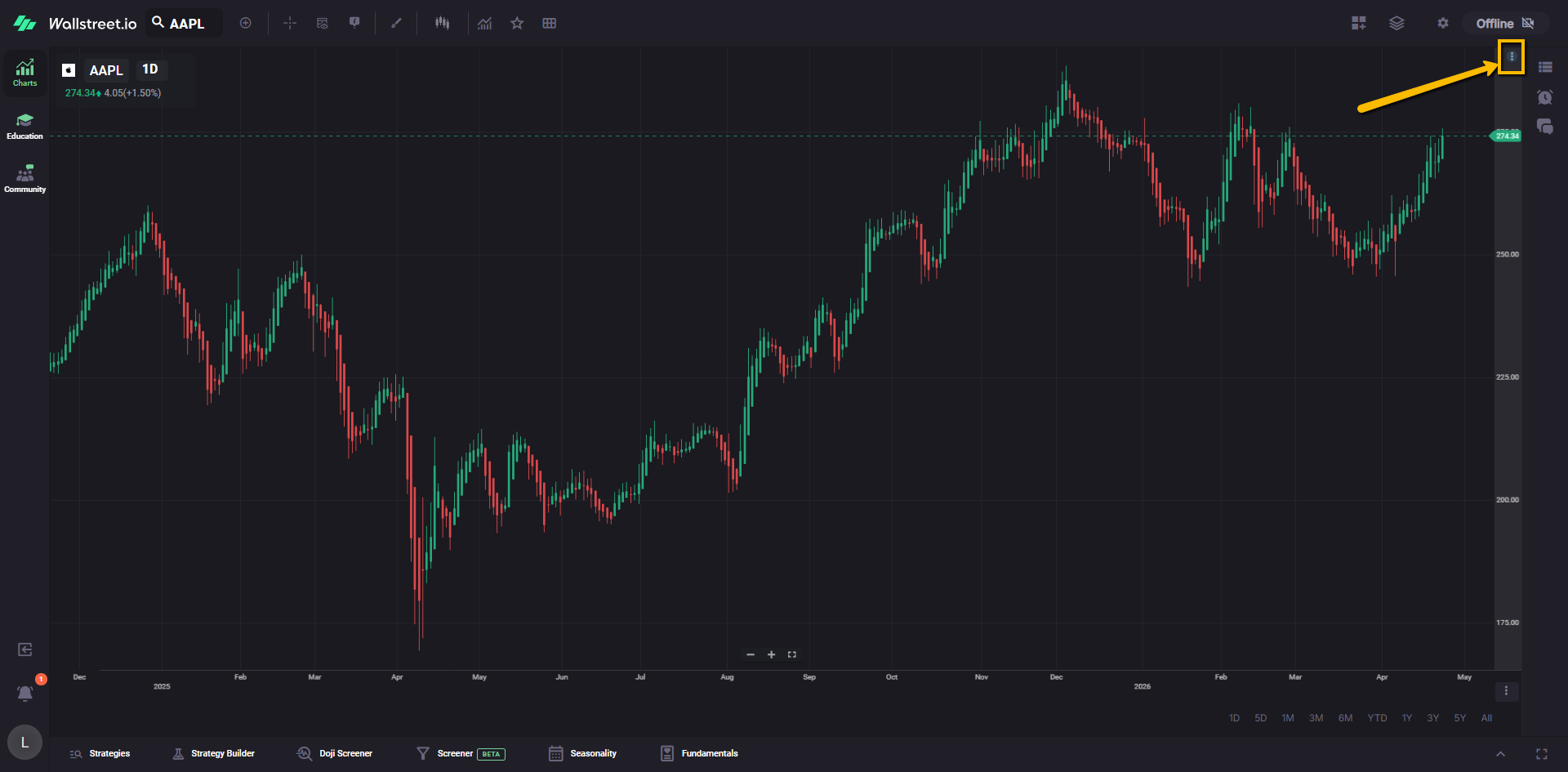
Clicking it opens a quick menu where you can toggle:
Net Change
Shows the change in dollars instead of only the raw price.
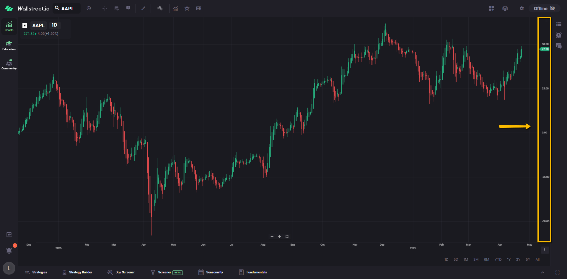
Percent Change
Shows the change in percent instead of only the raw price.

You can toggle either option on or off at any time, depending on what you want to see on the chart.
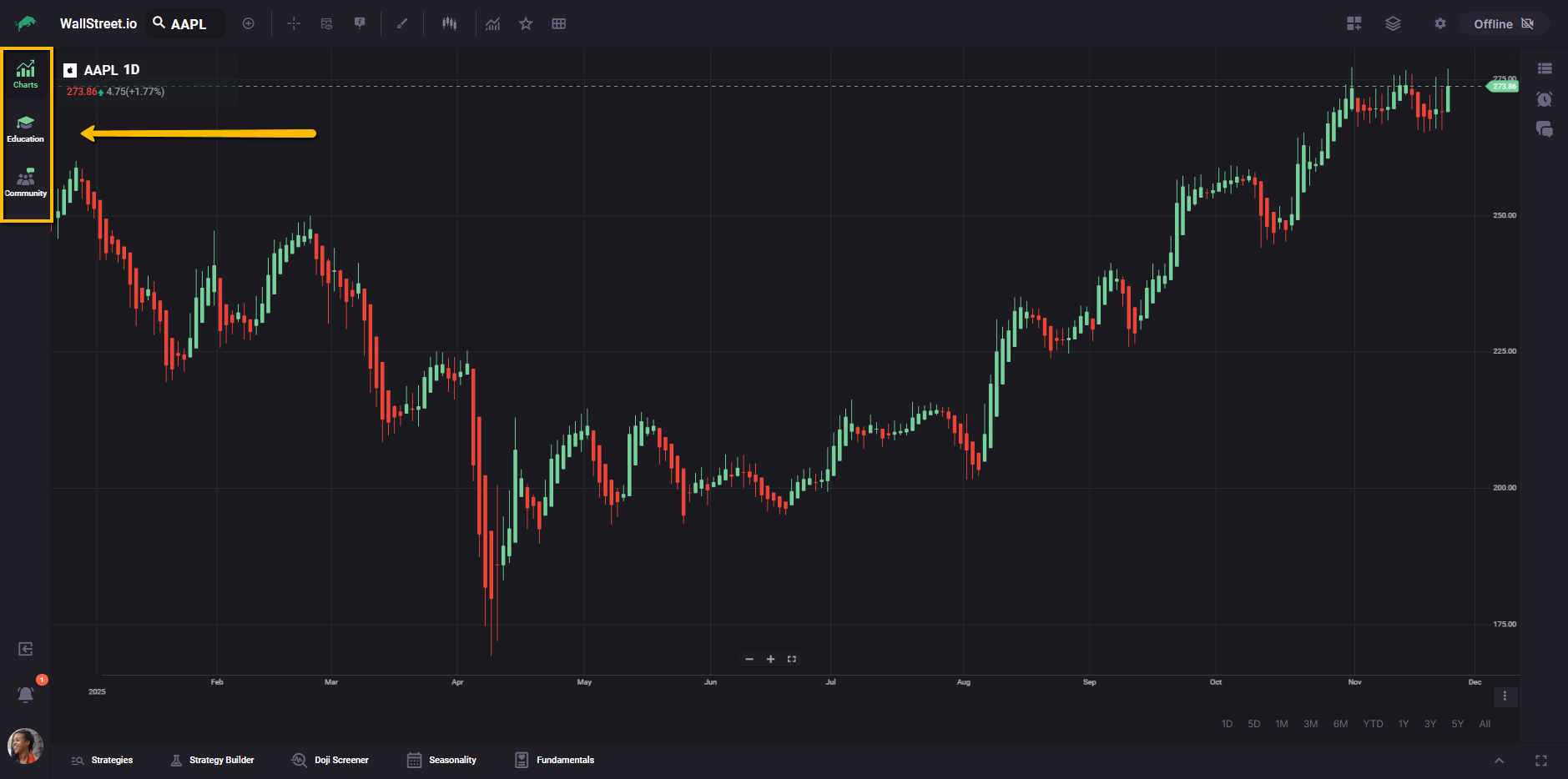
Workspace Switcher
The vertical bar on the left lets you move between the main workspaces on Wallstreet.io: Charts, Education, and Community. This makes it easy to switch from analysis, to learning, to community discussions without leaving your current session.
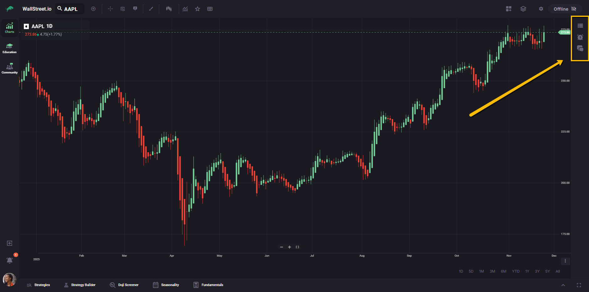
Workspace Utilities panel
The panel on the right that can show Watchlists, Chatrooms, and Alerts, depending on which tab is active.
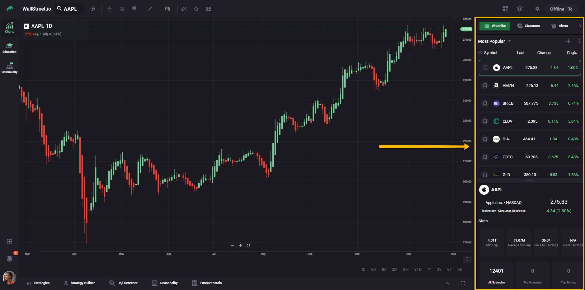
You can collapse this panel when you want a larger chart. When it is hidden, it becomes a slim strip of icons that works like a focused navigation bar for these utilities, so you can still open Watchlists, Chatrooms, or Alerts without leaving the Charts Workspace.
Strategy Bar
The bar along the bottom of the workspace that lets you move between the Opportunity Radars (Strategies, Strategy Builder, Doji Screener, Seasonality, and Fundamentals). These tools work with the chart to help you test ideas, review performance, and surface trade setups.
For more information about any of the tools in the Strategy Bar, you can review the complete guides for Strategies, Strategy Builder, Doji Screener, Seasonality, and Fundamentals in the Opportunity Radars section.
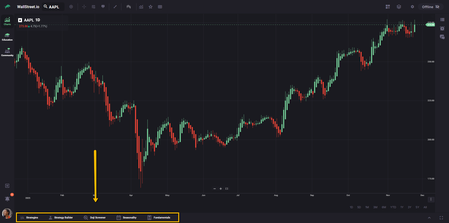
Chart Toolbar
The Chart Toolbar runs along the top edge of the chart and contains grouped controls for symbol selection, analysis tools, and layout management. Each icon either performs an action on the chart or opens a menu with more options.
For clarity, it helps to think of the toolbar in three clusters:
First cluster: Symbol and Periodicity
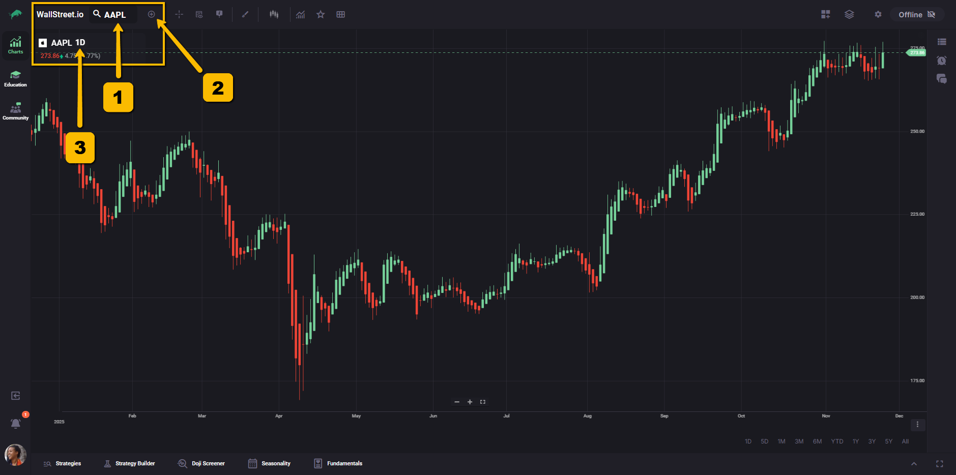
1. Symbol Lookup
Lets you search for and select the stock or symbol you want to chart.
2. Periodicity Selector
Controls the timeframe or bar period you are viewing, such as daily, weekly, or intraday intervals.
3. Add Comparison
Adds another symbol to the same chart so you can compare performance between two or more symbols.
Second cluster: Analysis Controls
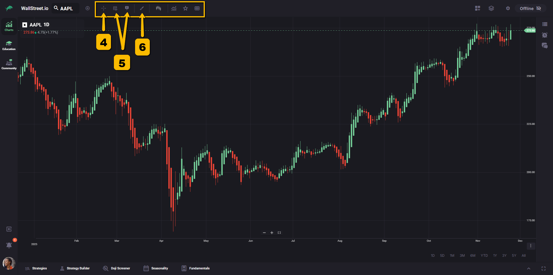
4. Crosshairs
Toggles a crosshair cursor that helps you inspect exact price and time values on the chart.
5. Heads-up Displays
Shows additional on-chart readouts, such as price, change, or other contextual information near your cursor.
6. Drawing Tools
Opens the library of drawing tools you can place on the chart, such as trendlines, channels, and Fibonacci tools.
For a complete list and definitions, see the Drawing Tools Library.
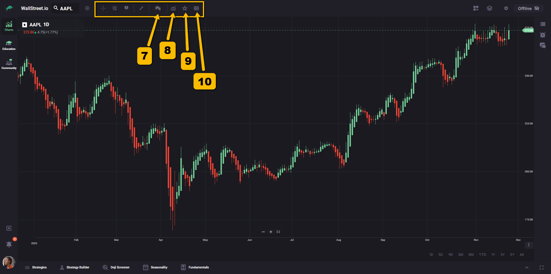
7. Studies / Indicators
Opens the menu where you can add or remove indicators from your chart.
For details on each available study, see the Indicator Library.
8. Chart Types
Lets you switch between chart types, for example candlesticks, Heikin-Ashi, or line charts.
For more about how each chart type behaves, see the Chart Types Library.
9. Favorite Studies
Gives you quick access to indicators or combinations you have marked as favorites.
10. Indicator Sets (formerly Views)
Lets you save and recall sets of indicators so you can switch between different analysis setups without rebuilding them from scratch.
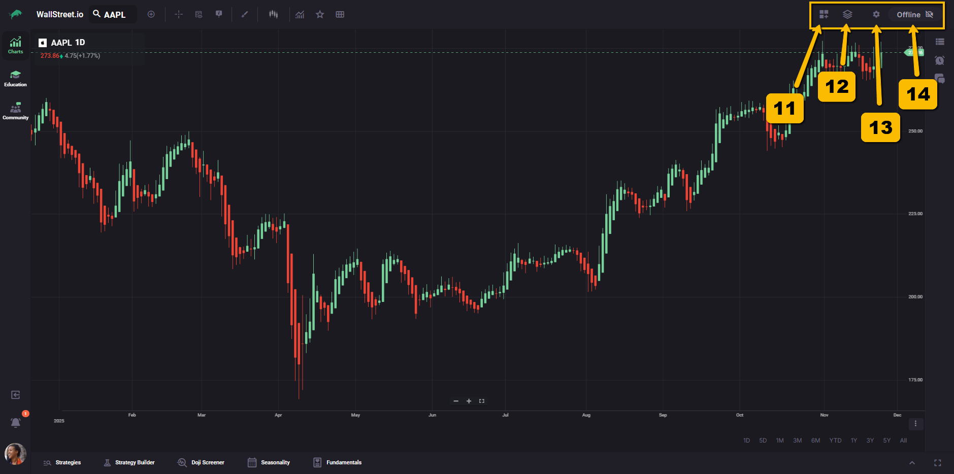
Third cluster: Layouts and Settings
11. Grids Menu
Opens layout options for multi-chart grids when available, so you can view more than one chart at a time inside the workspace.
12. Layouts
Lets you save, load, and manage full chart layouts, including symbol, indicators, and visual settings.
13. Chart Settings
Opens the Chart Settings panel, where you can adjust how the chart displays price, time, sessions, and other visual options. A separate guide explains each setting in more detail.
14. Live Meetup sign
Appears when a live event is available and links your charting workspace to active streams or meetups that are running at that time.
This guide focuses on what each area and control represents. For deeper explanations of specific tools such as indicators, drawing tools, or chart types, you can use the dedicated reference guides in the Reference Library.