Get Set Up like Gino
What this helps you do
This guide shows you how to set up your Wallstreet.io Charts Workspace so you can follow along with Gino Live more easily.
You’ll load Gino’s shared PayDay Cycle layout, save a copy for yourself, create quick links for your favorite chart views, and add Gino’s Community Watchlists so they’re easy to access during each session.
Why it matters
Gino moves quickly during live sessions. When your workspace is already set up with the same layout, chart types, and watchlists he uses, you can spend less time clicking around and more time watching the opportunities he’s walking through.
Before you start: make sure you are using 4.0
This setup is designed for the Wallstreet.io 4.0 platform.
Look at the bottom-right corner of the platform. If you see a green rocket icon, click it to switch from Classic into the 4.0 platform.
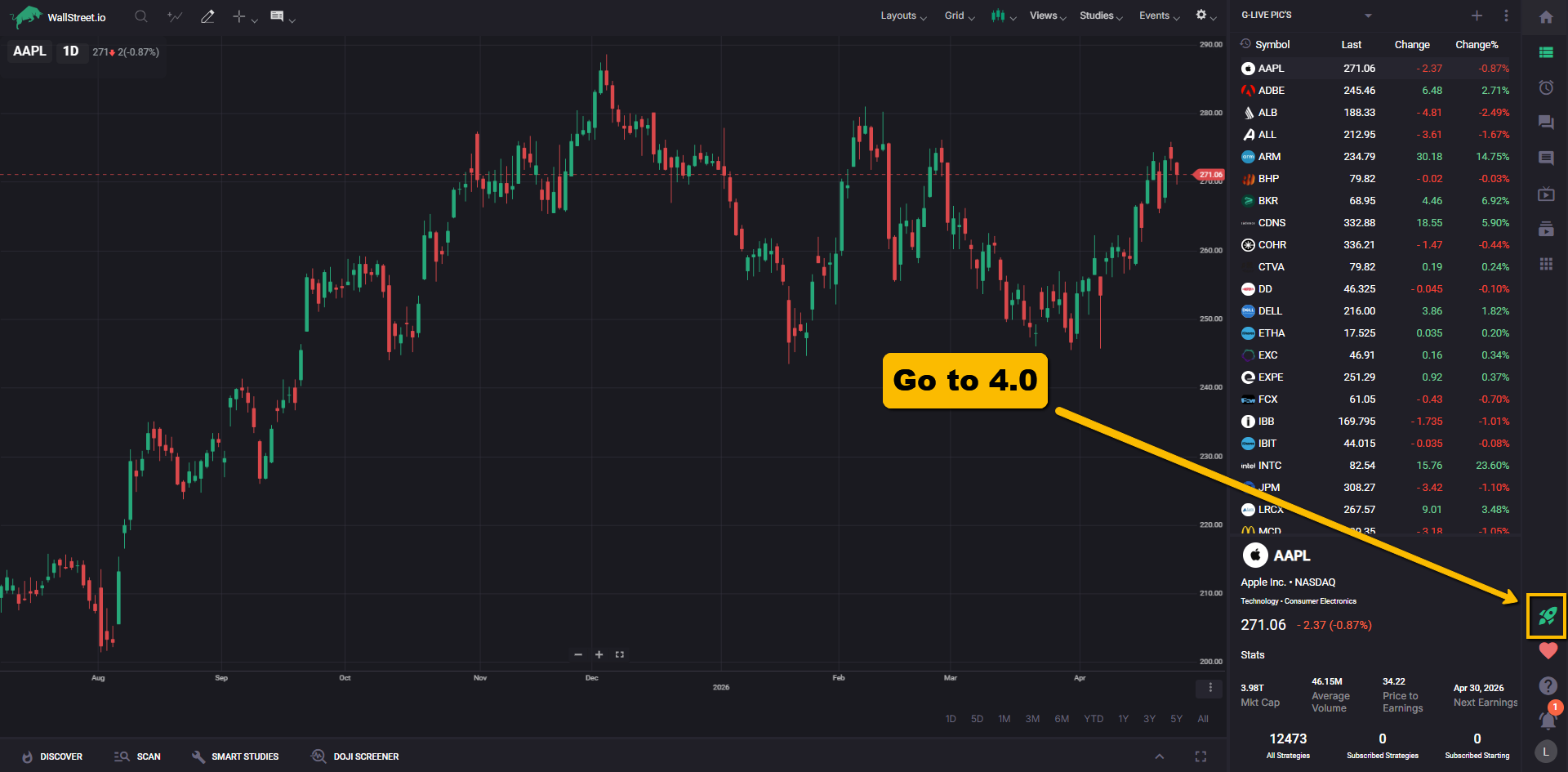
If you do not see the green rocket icon, you are already in the right place and can move on to the next step.
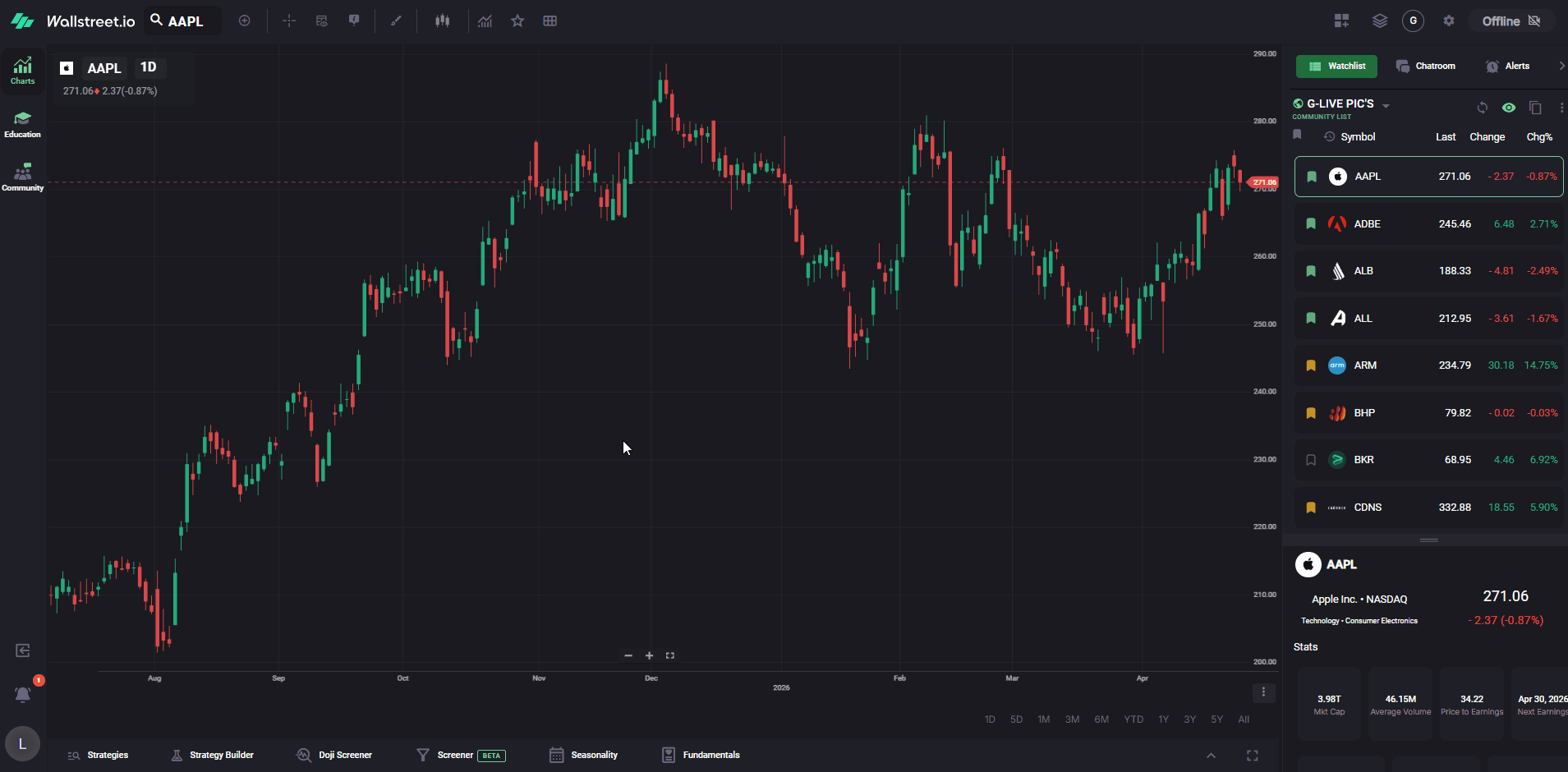
What your workspace looks like at first
When you first open the 4.0 platform, your Charts Workspace may look more basic than what you see during Gino Live.
That is normal.
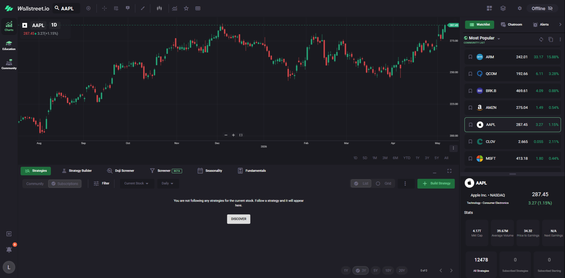
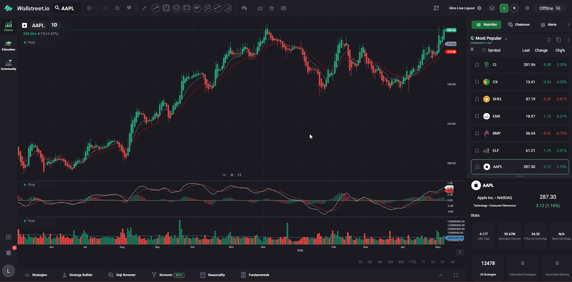
New accounts usually start with a clean chart, the default watchlist panel, and the standard analysis tabs across the bottom. Gino’s workspace looks different because he has already saved his favorite layouts, shortcuts, watchlists, Screener filters, and column views.
In this guide, you’ll set up those same core pieces one step at a time.
By the end, your workspace will be much closer to what Gino uses during his live sessions, so you can follow along more easily instead of trying to rebuild everything while he is moving through charts.
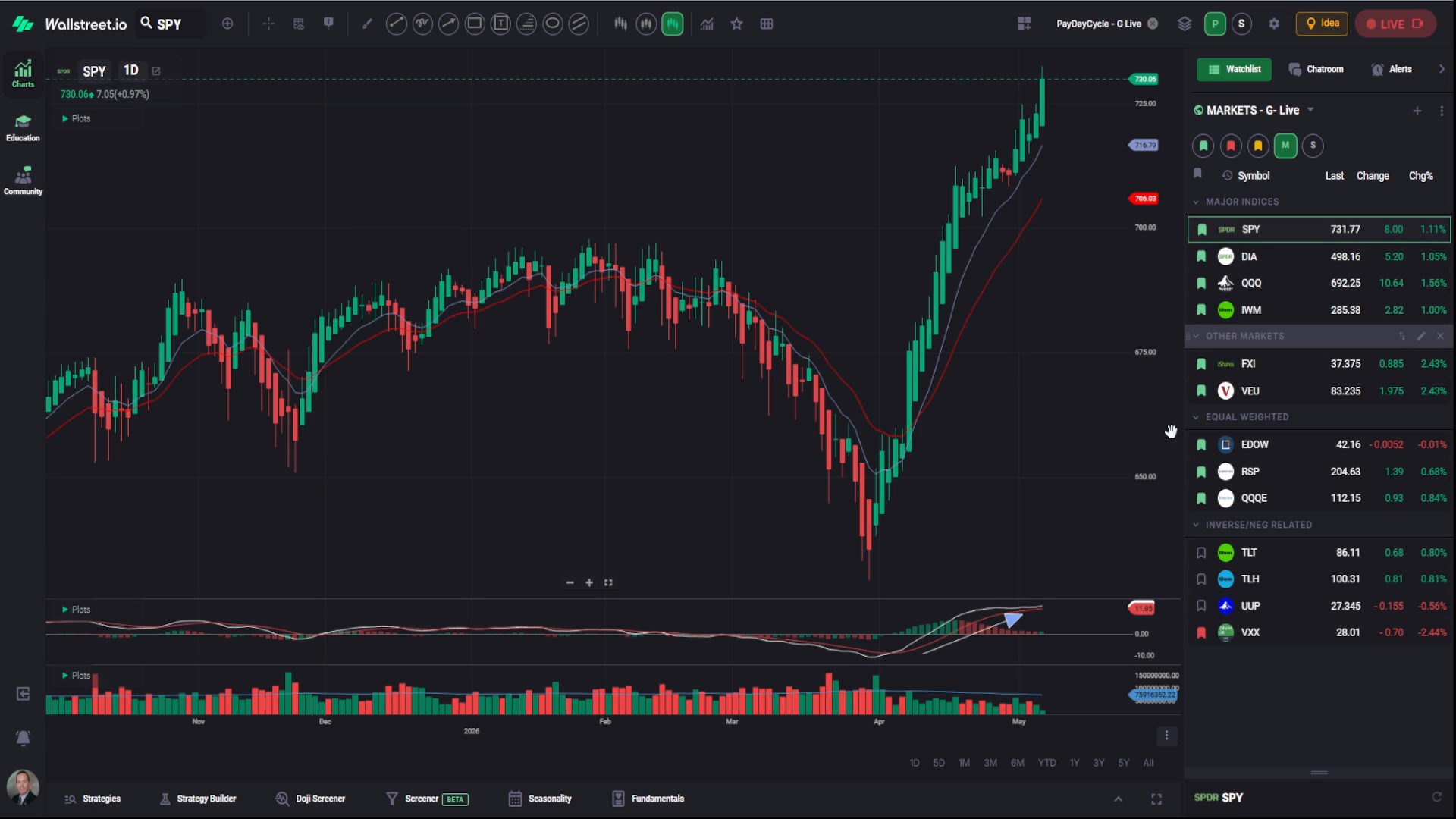
1. Load Gino’s PayDay Cycle layout
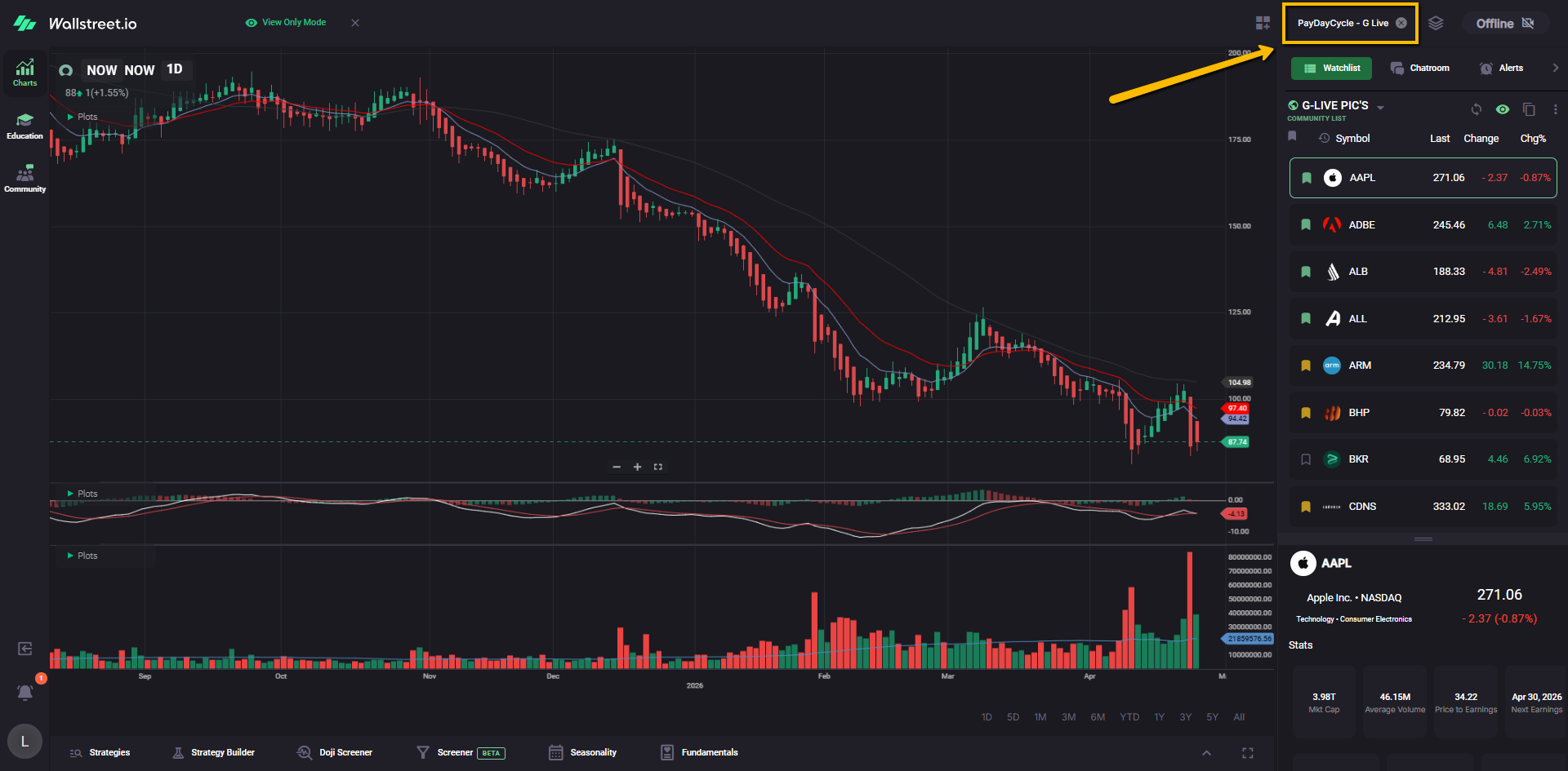
In the Charts Workspace, go to the top-right corner of the platform and click the Layouts icon. It looks like a small stack of papers.
From the Layouts menu, find and select the Community Layout named: PayDay Cycle - G-Live
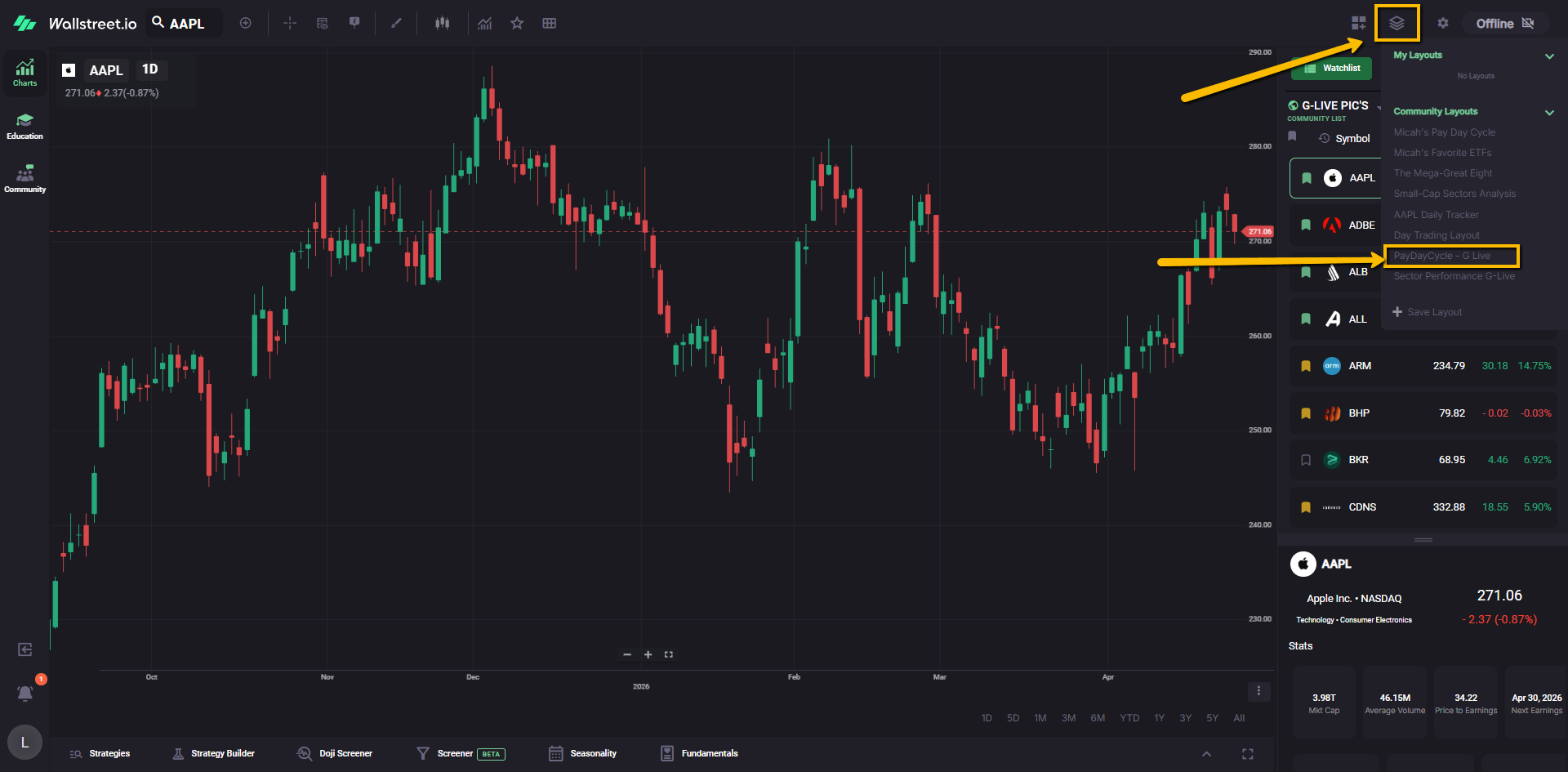
When prompted, confirm that you want to apply the layout.
Once the layout is applied, you’ll see the layout name appear next to the stack-of-papers icon at the top-right of the chart.
This layout gives you a ready-made PayDay Cycle chart setup with:
Heikin-Ashi candles, Moving Averages, MACD, and a Volume Chart with a Moving Average plotted at the bottom.
2. Save the layout as your own
Community Layouts are view-only, so to be able to change the symbol and keep modifying it as you want, you’ll want to copy this layout if you’d like to keep it in your own Layouts list.
Click the Layouts icon again, then select Copy Layout.
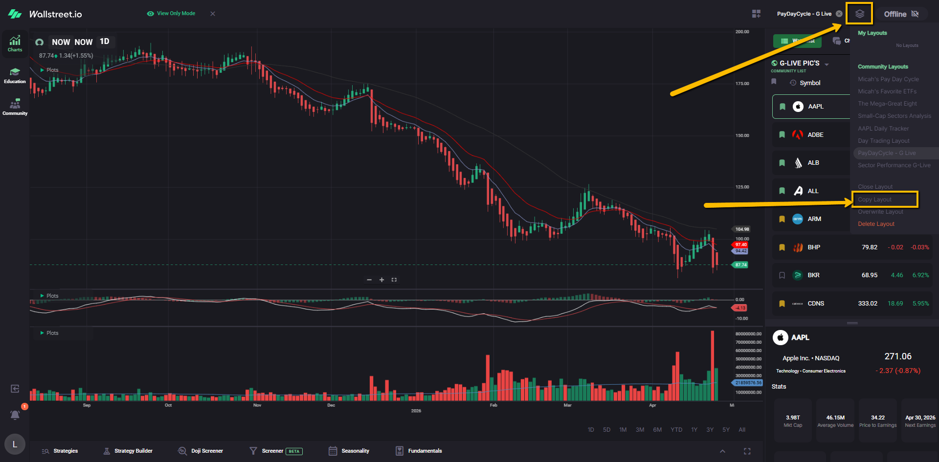
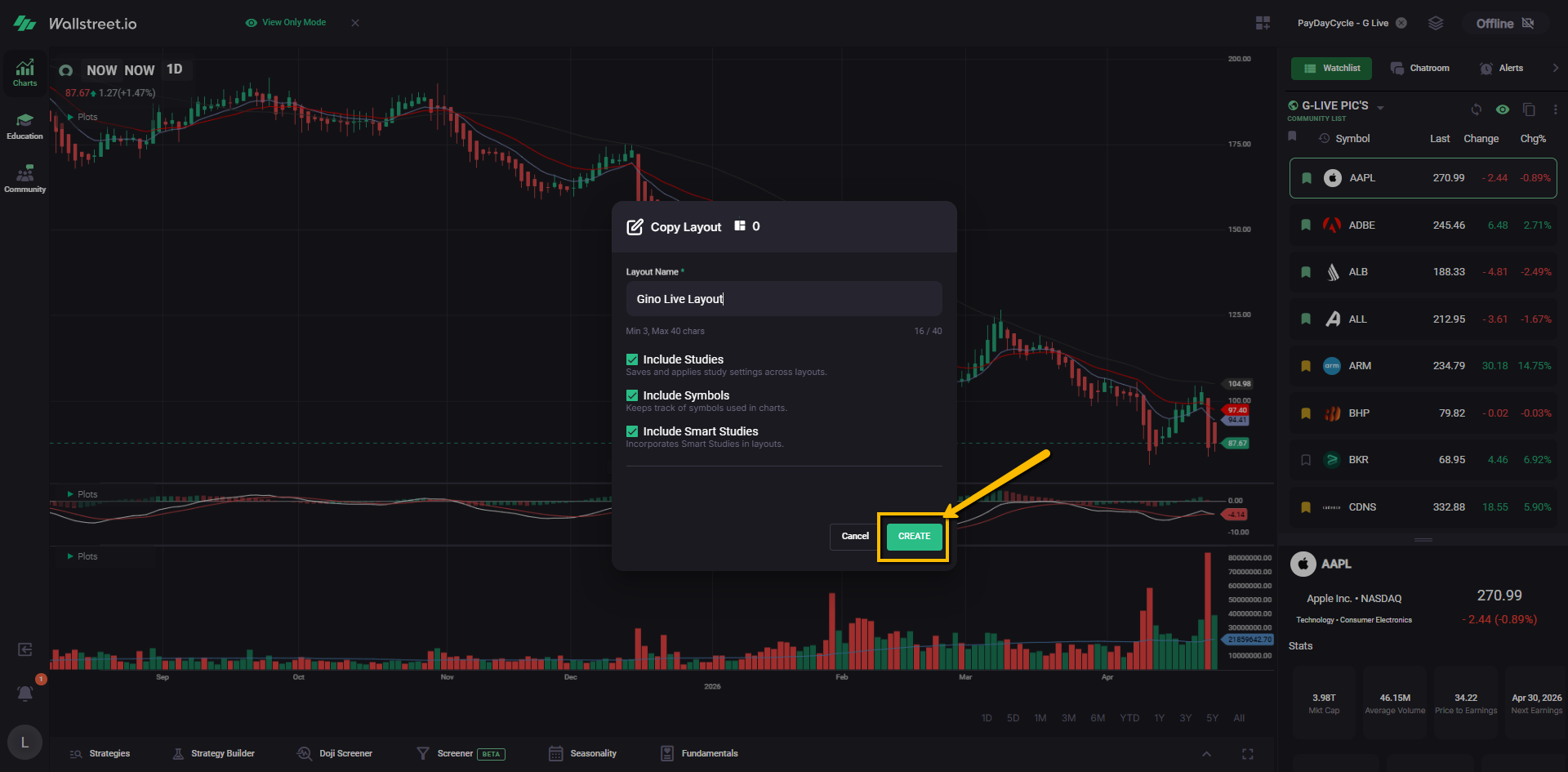
Name the layout whatever you’d like. For example, you could call it: “Gino Live Layout.”
Leave the checkboxes selected, then click Create.
Your copied version will now appear in your own Layouts list.
3. Create a quick link for your copied layout
To save time each day, add your copied layout as a favorite.
Open the Layouts menu again, find the layout you just created, and click the star next to it.
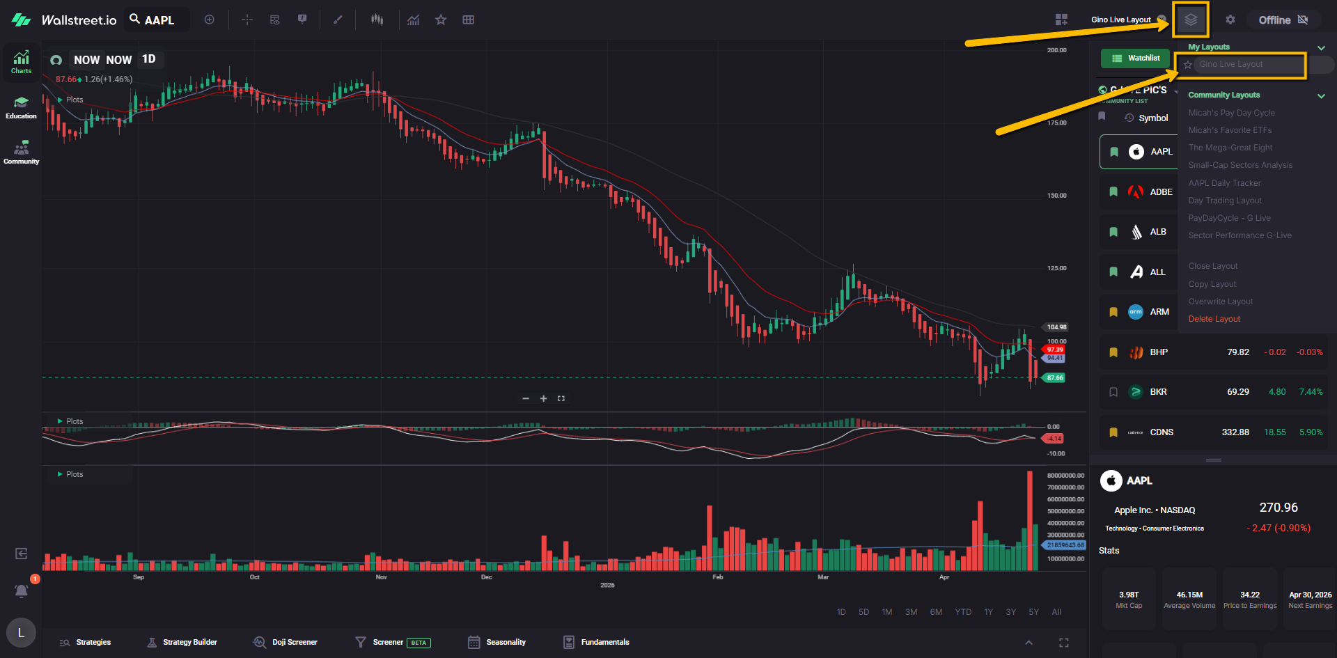
This creates a quick-link button on your Chart Toolbar using the first letter of your layout name.
Now, when you log in, you can click that quick link to load your Gino Live chart setup faster.
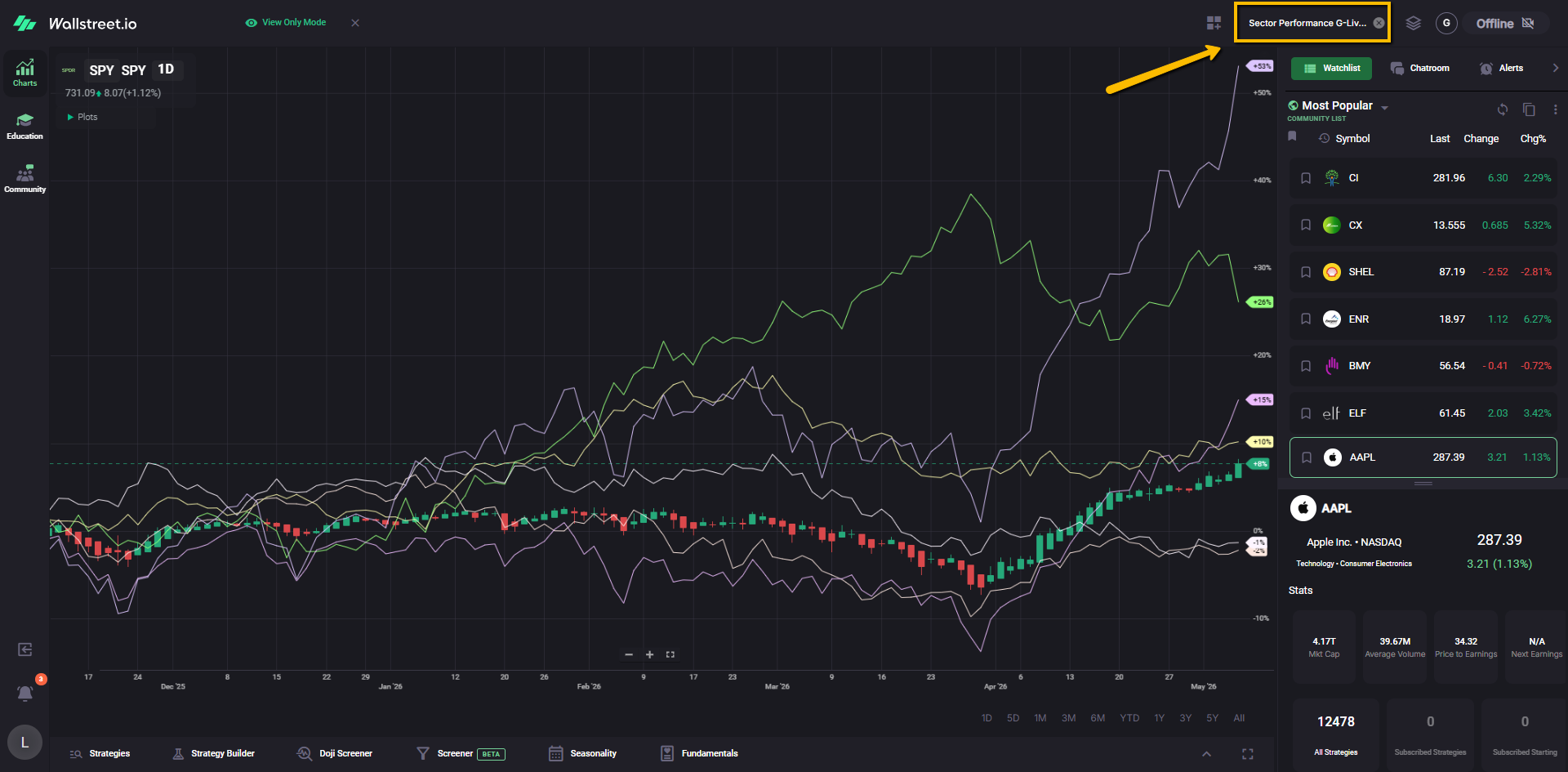
Gino also uses a second layout called Sector Performance.
On his toolbar, you may see two layout shortcuts:
P for “PayDay Cycle - G-Live”
S for “Sector Performance”
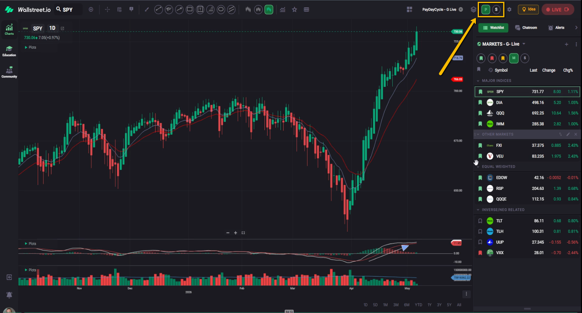
The Sector Performance layout helps you compare sector performance against SPY, which can make it easier to see where strength or weakness is showing up across the market.
To create a shortcut for this other Layout, repeat the same process you used for the PayDay Cycle layout:
Open the Layouts menu, select the Sector Performance Community Layout, apply it, copy it as your own layout, then click the star next to your copied version to create a quick-link shortcut.
Once both shortcuts are saved, you can quickly switch between Gino’s PayDay Cycle Layout and his Sector Performance Layout from the Chart Toolbar.
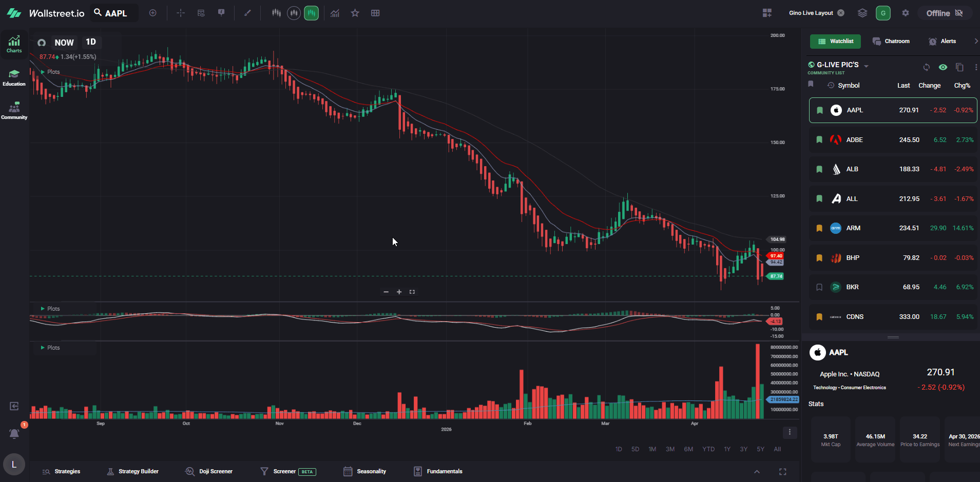
4. Create quick links for Candle and Heikin-Ashi chart types
Gino often uses Heikin-Ashi candles for PayDay Cycle analysis, but it can still be helpful to switch back to regular candles when you want to compare price action.
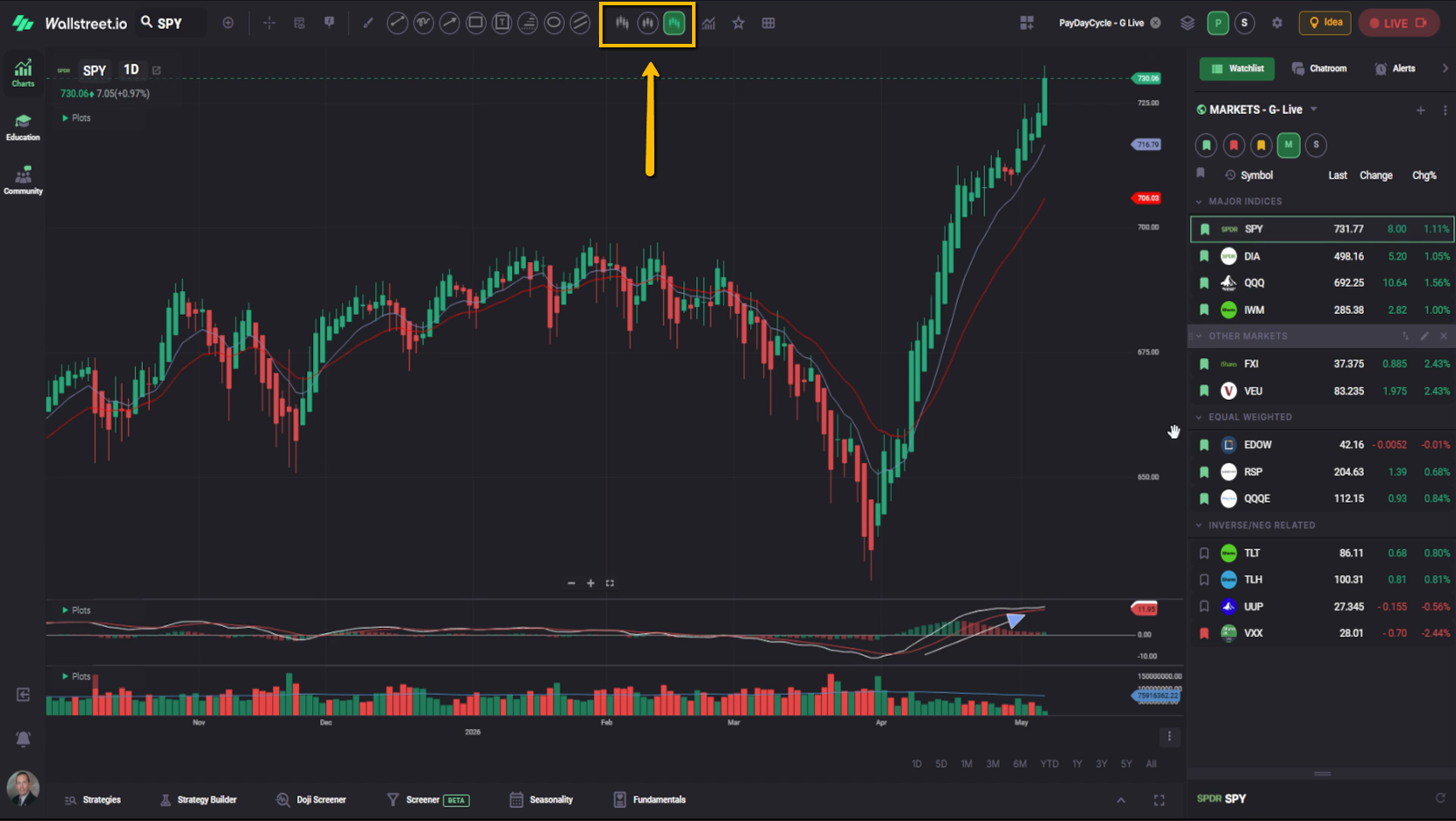
To make switching faster, create quick links for both chart types.
Click the Chart Types menu near the upper-left side of the Chart Toolbar. This is the icon that looks like candles.
Find Candle, then click the star next to it.
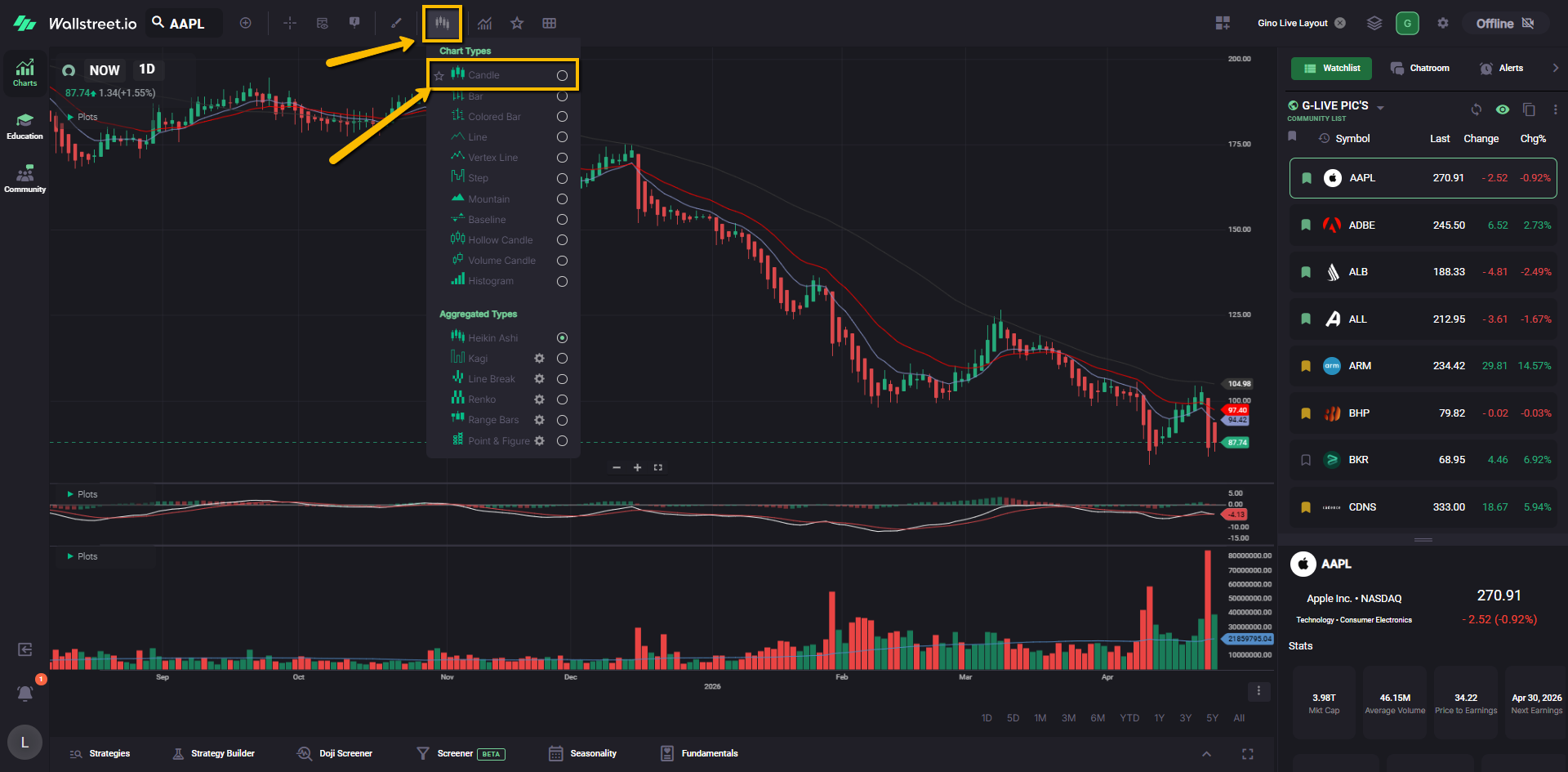
Next, open the Chart Types menu again and scroll down to Aggregated Types.
Find Heikin-Ashi, then click the star next to it.
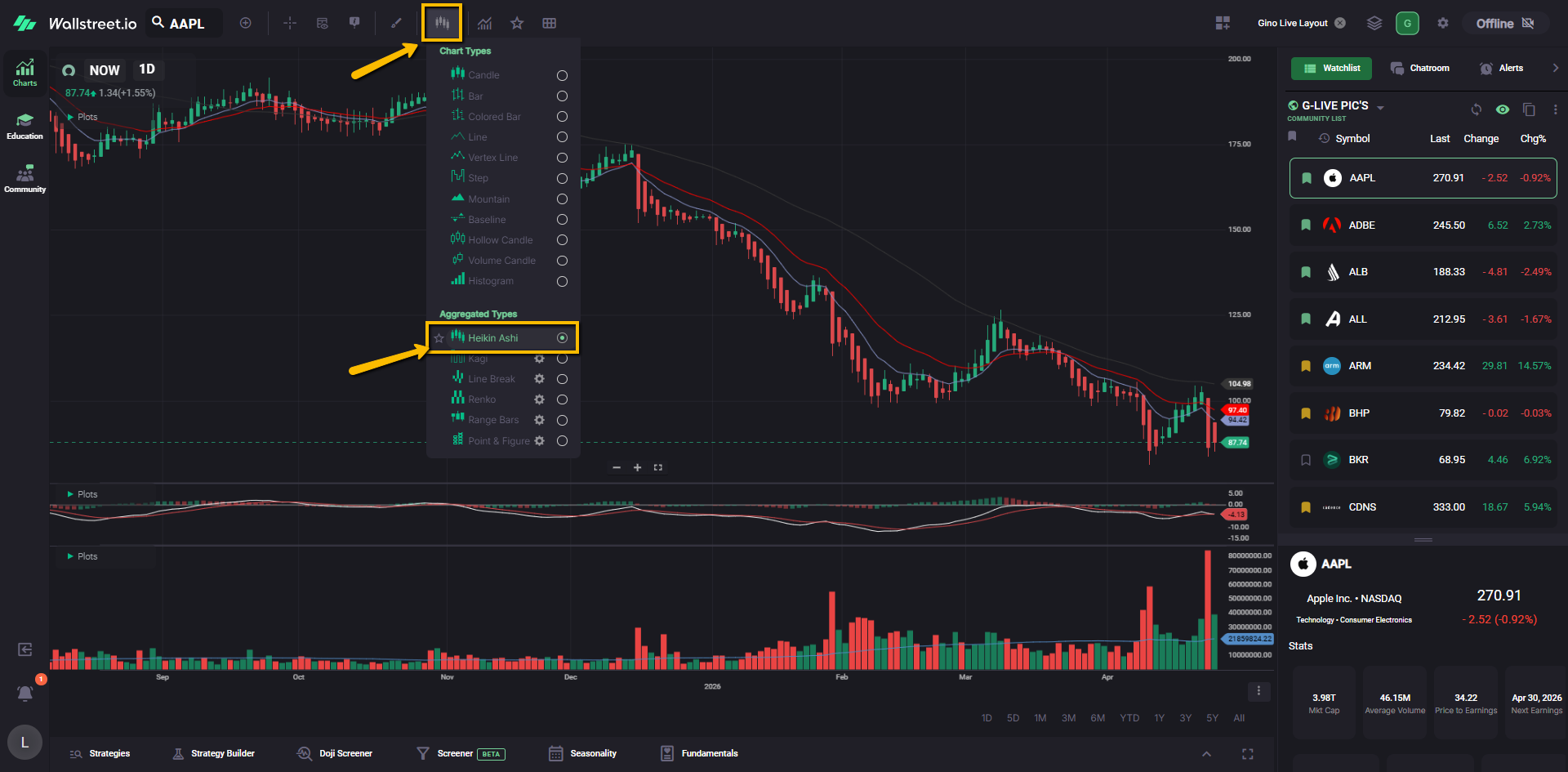
You’ll now have quick-link buttons that let you switch back and forth between regular candles and Heikin-Ashi candles without opening the full menu each time.
5. Create drawing tool shortcuts like Gino
Gino also keeps several drawing tools saved as shortcuts on his Chart Toolbar.
These drawing shortcuts help him move faster during live sessions when he wants to mark up a chart, point something out, draw a trendline, highlight a setup, or explain what he is seeing.
You do not need to save every drawing tool Gino uses. These are simply the ones he keeps handy because he uses them often during his lessons.
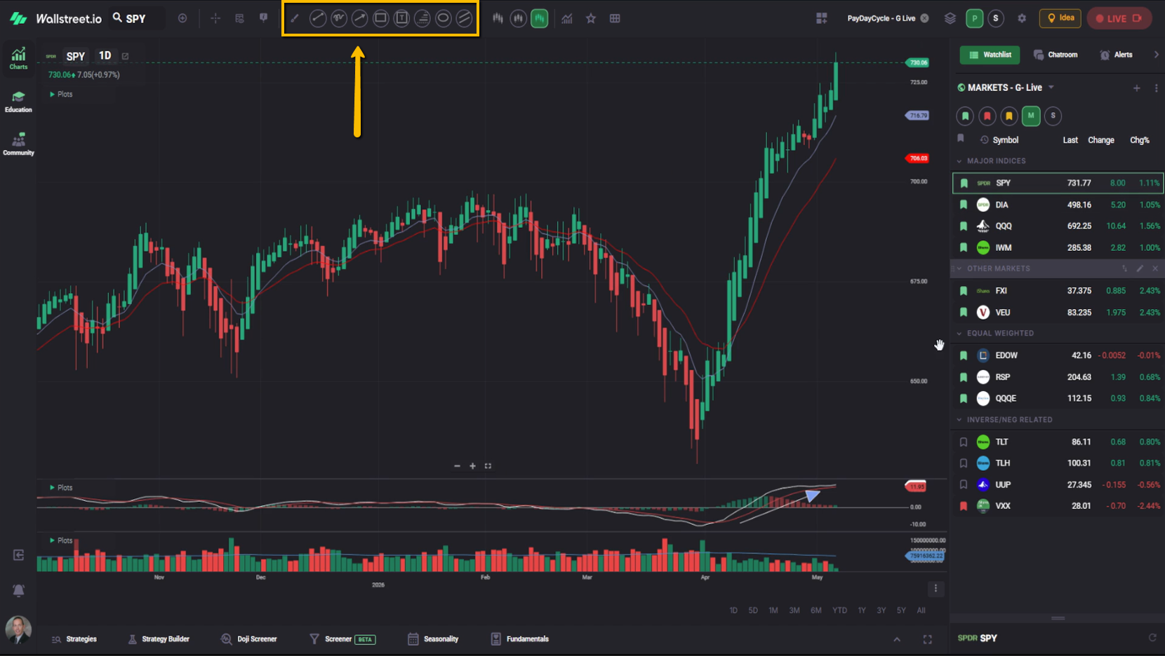
To create drawing shortcuts, click the Drawing Tools icon on the Chart Toolbar. This icon looks like a small brush.
A collapsible Drawing Tools menu will open on the left side of the chart.
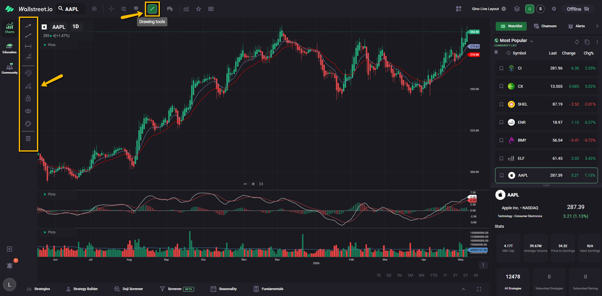
Look through the menu and click the star next to each drawing tool you want to save as a shortcut.
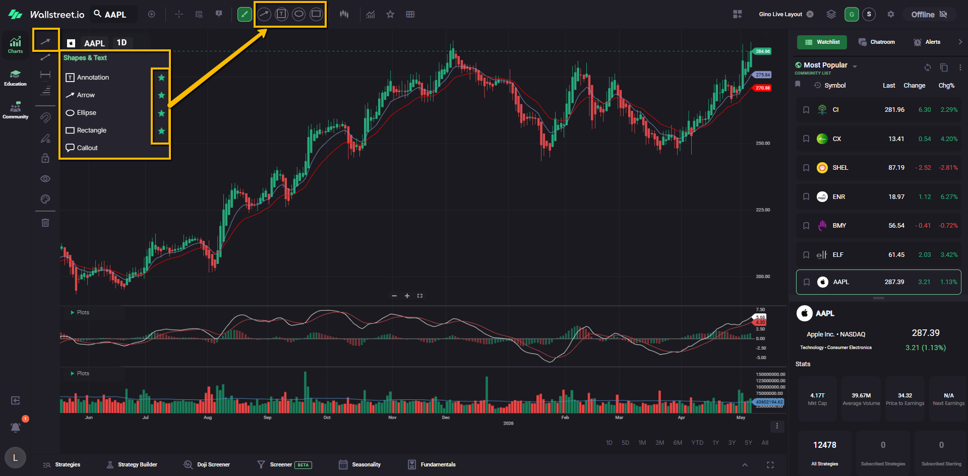
Gino commonly uses shortcuts for:
Once starred, those drawing tools will appear as quick-link buttons on your Chart Toolbar.
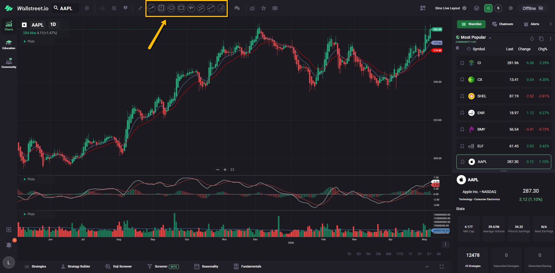
This makes it easier to follow along when Gino is drawing on his chart during a live session, and it also gives you faster access to the same tools when you want to mark up your own charts.
6. Add Gino’s Community Watchlists
Gino uses several Community Watchlists during his live sessions. These help him move through markets, sectors, and symbols he is watching.
On the right-side Watchlist panel, click the name of the current watchlist. This opens the Watchlist menu.
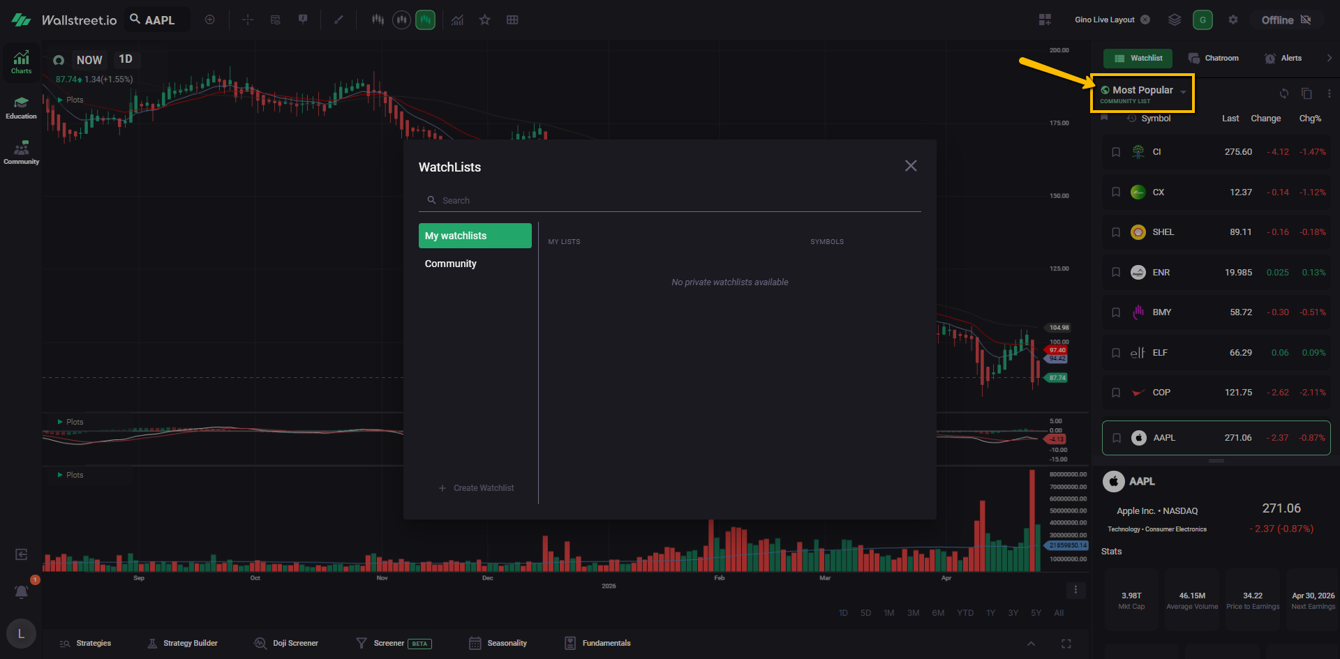
In the pop-up window, go to Community Watchlists.
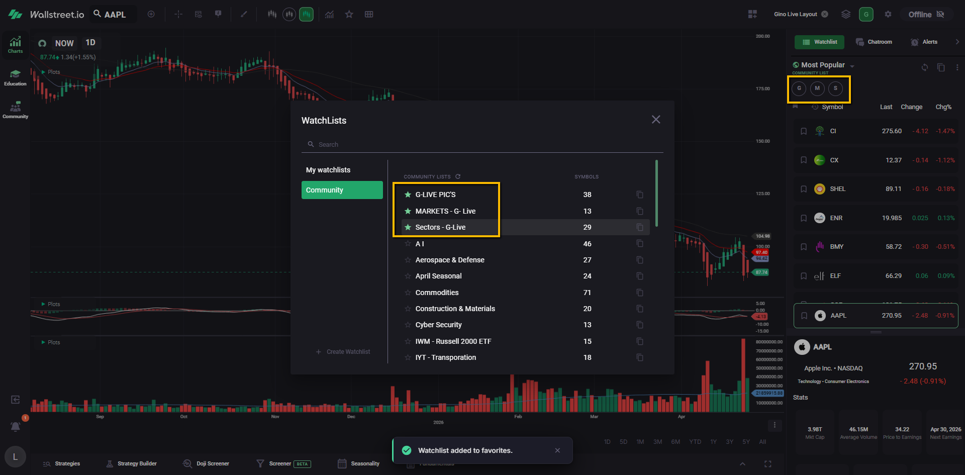
Community Watchlists are sorted alphabetically. Scroll until you find Gino’s lists, including:
Click the star next to each watchlist you want quick access to.
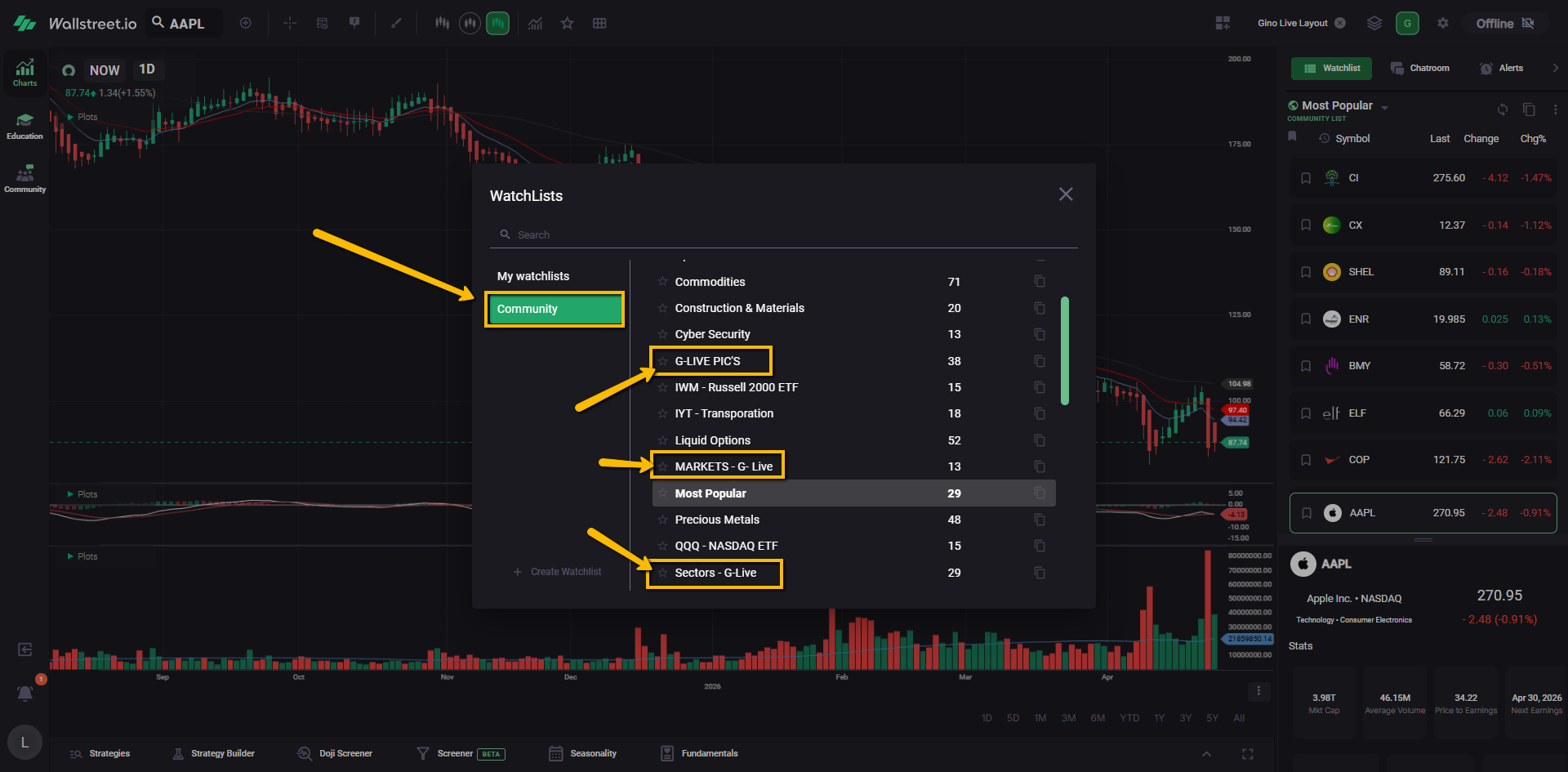
Once starred, these watchlists will appear near the top of your Watchlist menu and as quick links at the top of the Watchlist area.
Gino also uses Compact Mode for his watchlists.
This is a small display setting that makes each symbol row tighter, so you can see more symbols at a glance while following along during a live session.
To turn it on, click the three-dot icon at the top-right of the Watchlist panel, then select Compact Mode.
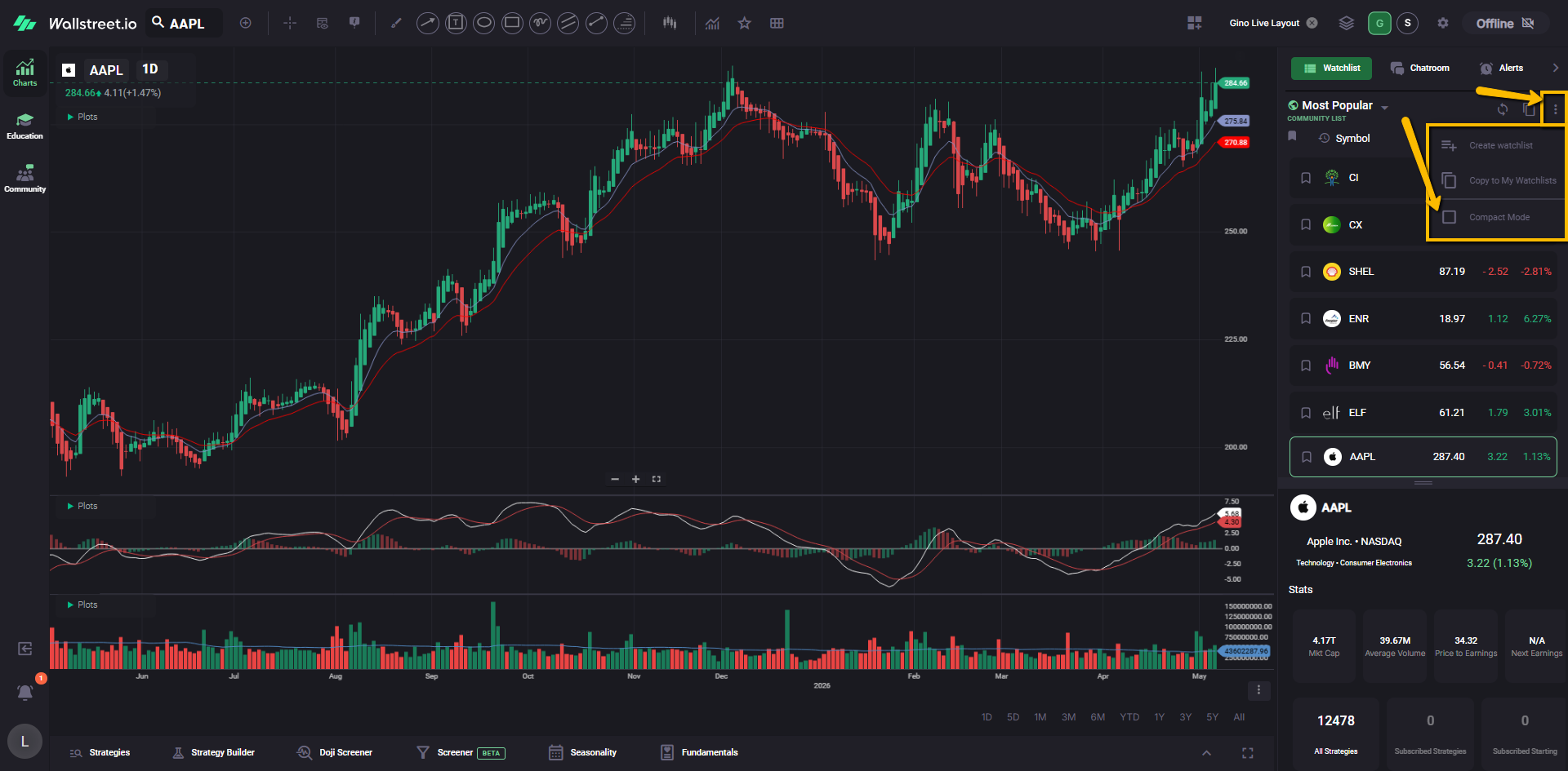
You can use Compact Mode with Community Watchlists or with your own custom watchlists. It does not change the symbols in the list. It only changes how the watchlist appears on your screen.
7. Copy Gino’s watchlists if you want your own editable version
Community Watchlists are view-only. This means you can use them and follow along with Gino’s updates, but you cannot directly edit the original Community version.
If you want your own editable copy, go back to the Community Watchlists list.
Find the watchlist you want to copy, then click the Copy To My Watchlists icon next to its name.
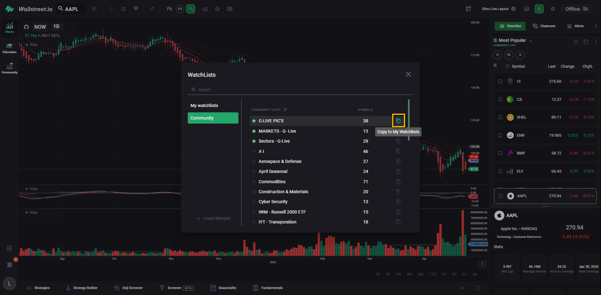
This saves a copy under your own custom watchlists, where you can make changes if you want to organize it your own way.
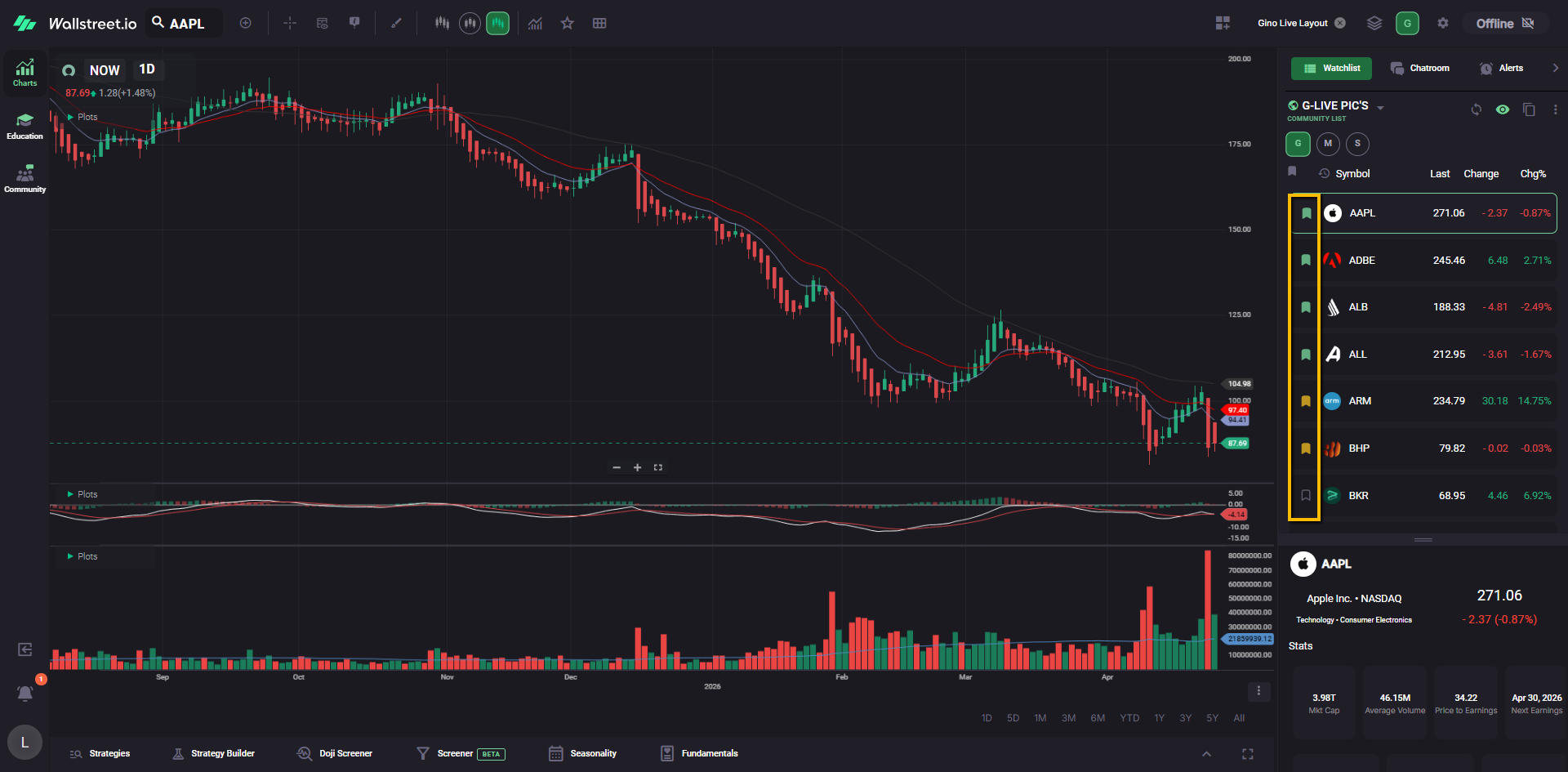
8. Follow along with Gino’s color tags
During Gino Live, Gino may color-code symbols in his watchlists to show what he is seeing in the market.
For example, he may use:
These tags are based on Gino’s daily analysis. Some symbols may not have a tag if he does not have a current opinion on them.
To switch between Gino’s color tags and your own color tags, click the eye icon near the top of the Watchlist panel. From there, choose the view you want to see.
You can select Creator’s Tags to view Gino’s color coding on a Community Watchlist, or select your own tag view to see the colors you have added yourself.
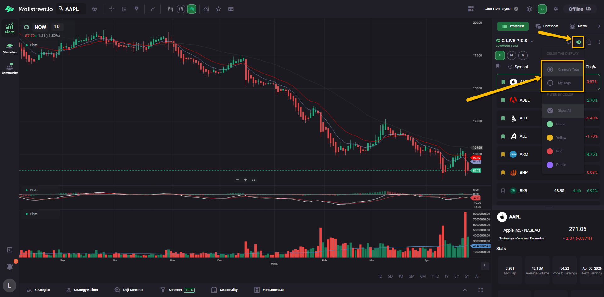
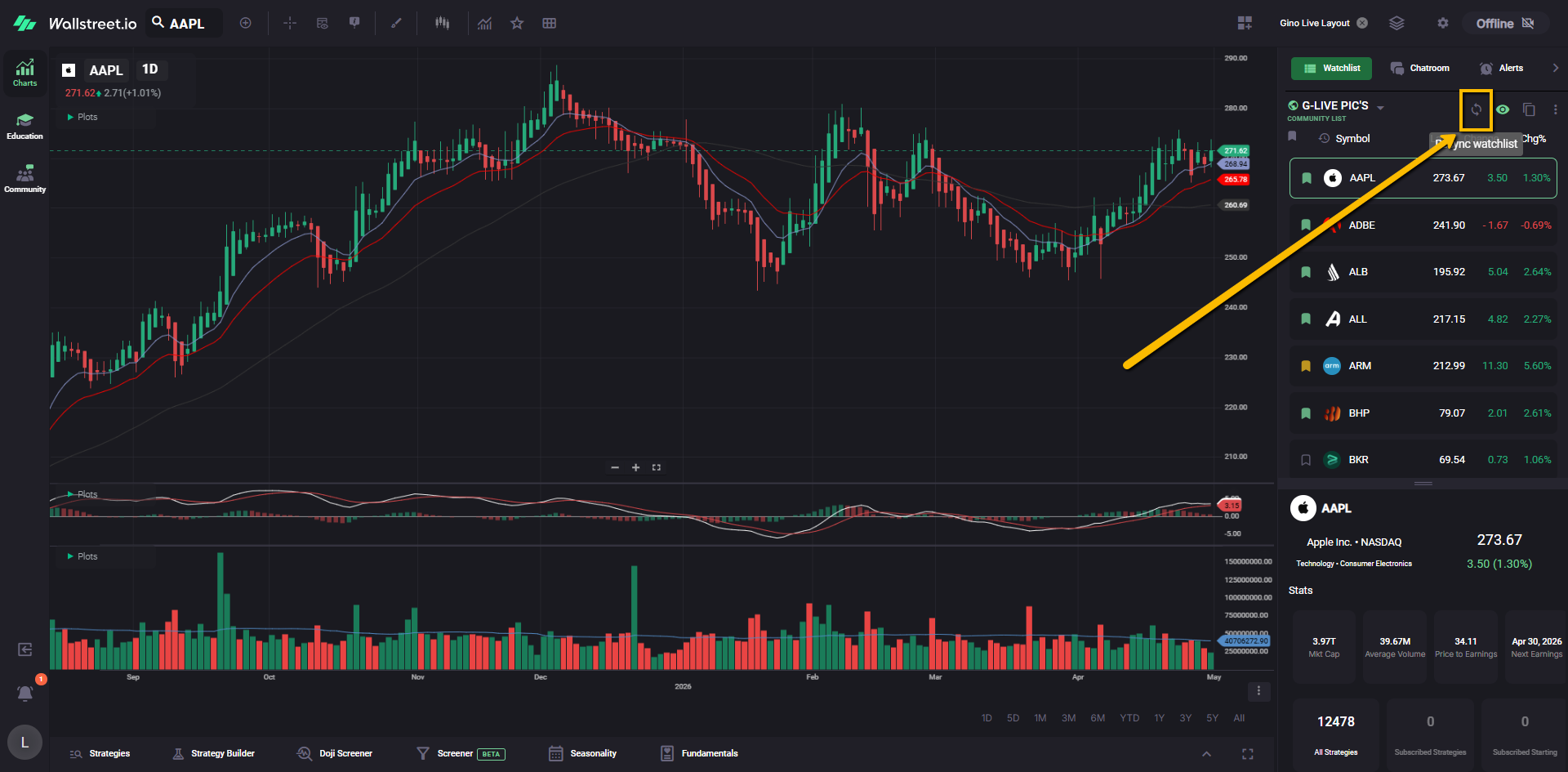
To see the updated Gino’s color-coded flags, sometimes you may need to click on Resync watchlist at the top, right next to the eye icon, and also refresh the site as a whole:
If you copy one of Gino’s Community Watchlists into My Watchlists, the symbols will be copied into your own editable version. However, the color-coded tags from the Community Watchlist will not be copied over.
To create color-coded labels near the top of your own watchlist, you’ll need to add your own color tags to the symbols in your copied watchlist.
Once your watchlist has color-coded symbols, those tags appear as color-coded labels near the top of the Watchlist panel. Think of them like quick visual notes that help you sort and focus.
For example, you can use these tags to quickly view bullish names, bearish names, critical names, or hot setups.
9. Set up the Screener like Gino
Gino also uses the Screener during live sessions to narrow down stocks based on specific technical setups.
To make this easier to follow, you can create one-click shortcuts for the Community Filters Gino uses most often.
In the Screener area, click the Popular menu.
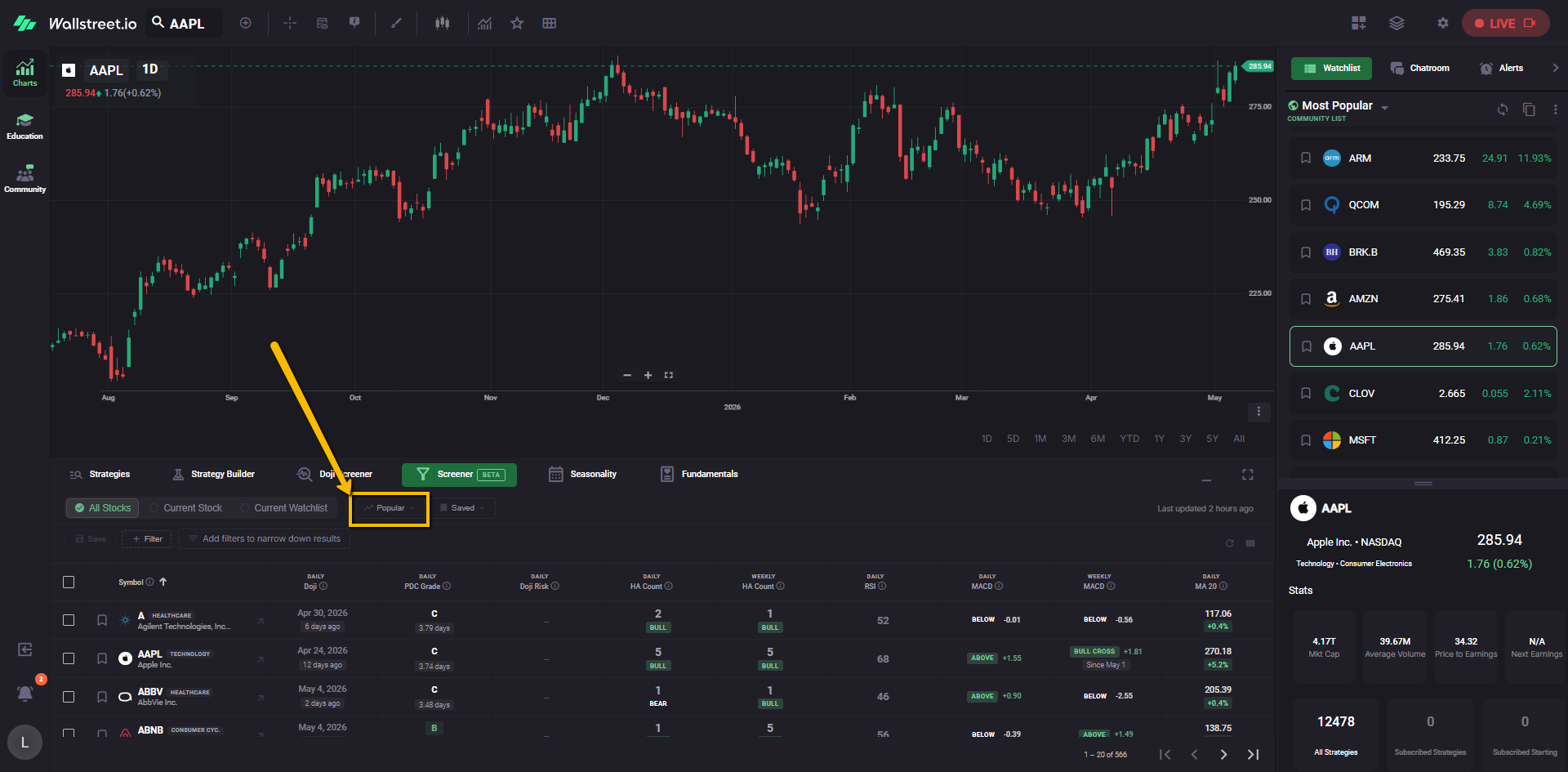
A dropdown menu will open with available Community Filters. Look for Gino’s filters, including:
To create a shortcut, click the star icon next to each filter you want to save.
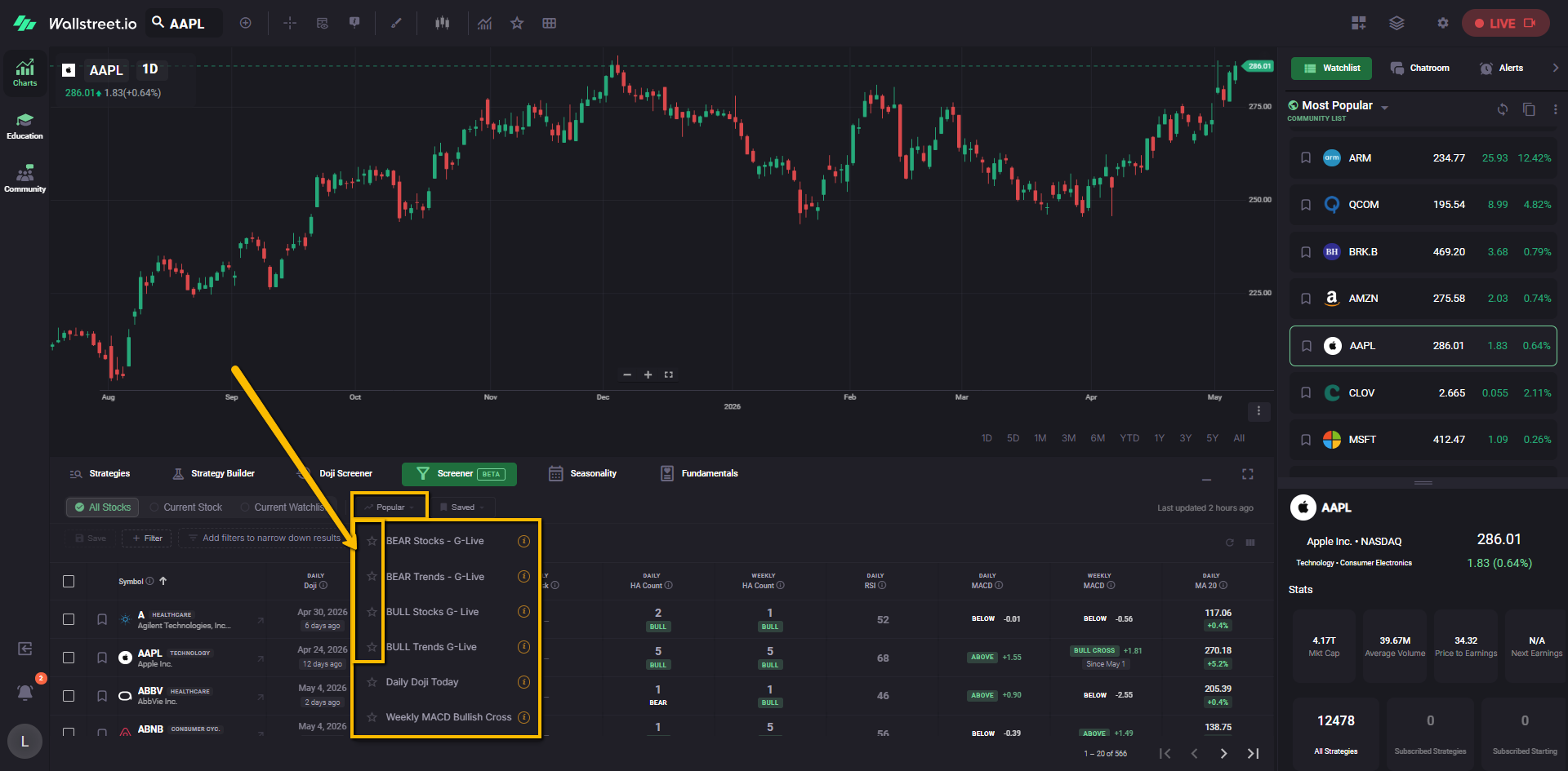
Once starred, those filters appear as one-click shortcuts across the top of the Screener area. This lets you quickly load the same filters Gino uses without opening the Popular menu each time.
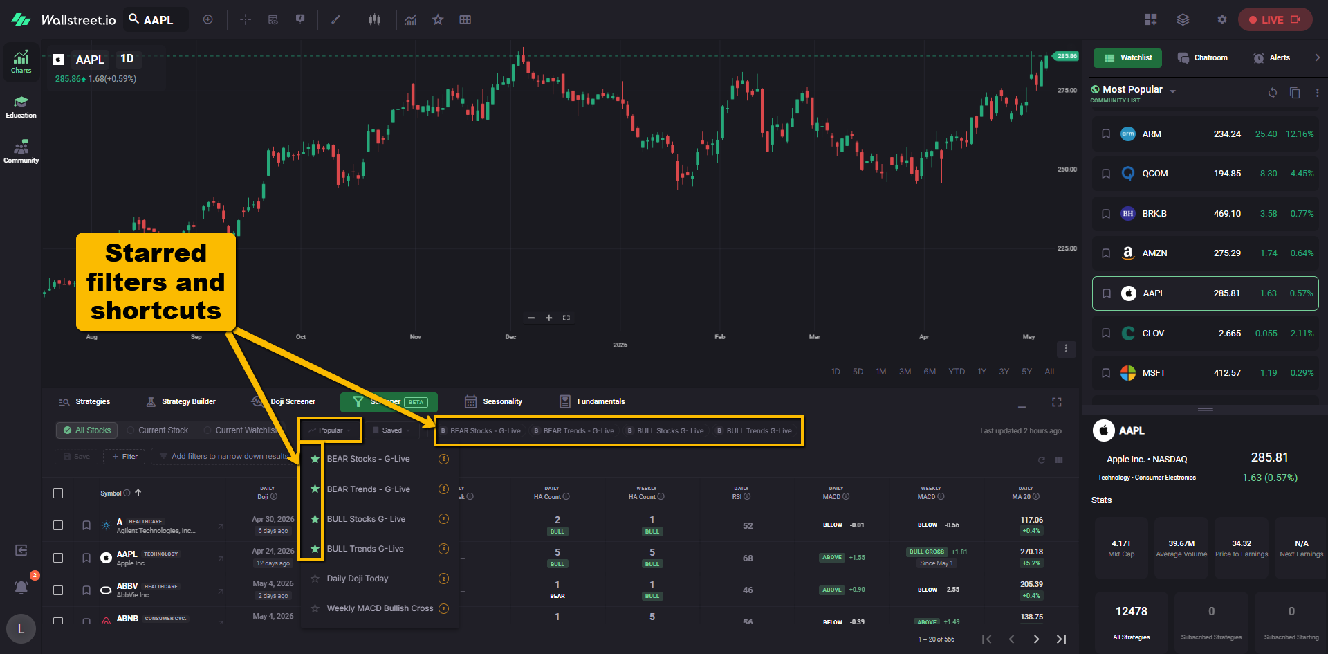
When you select one of these shortcuts, the Screener applies that filter and shows its filter chips in the row below, next to the Save and Filter buttons.
For example, if you select BEAR Stocks - G-Live, you may see filter chips such as:
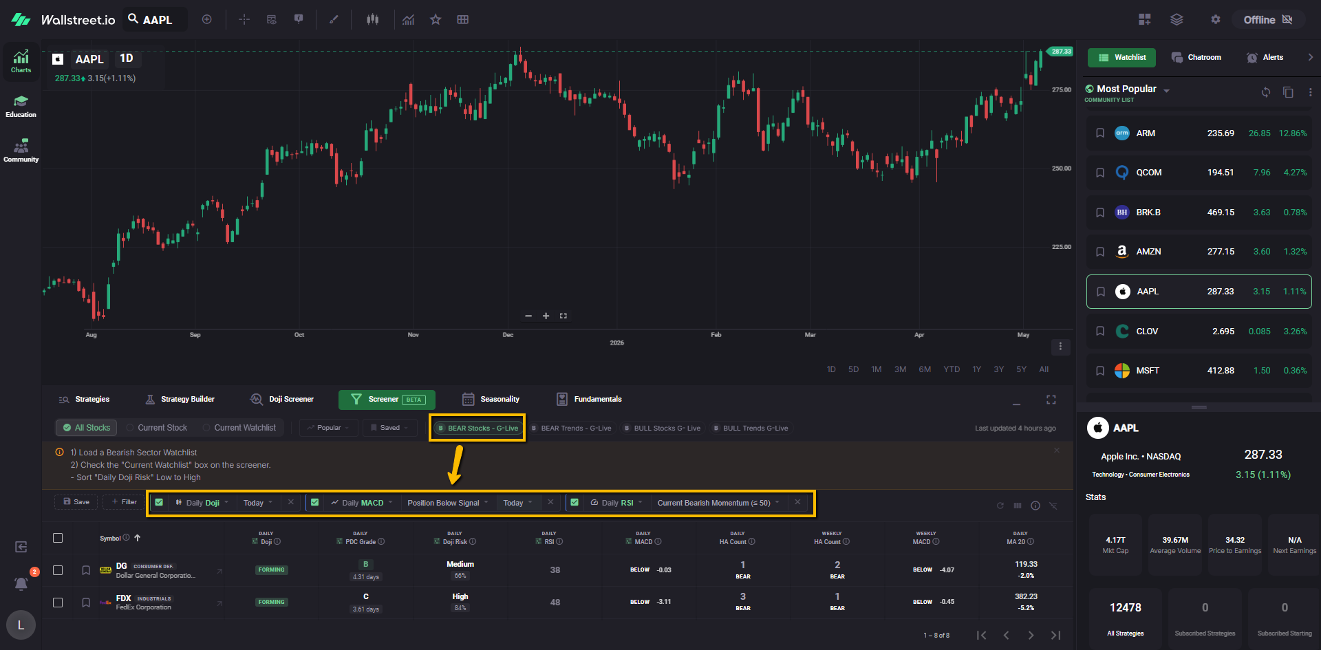
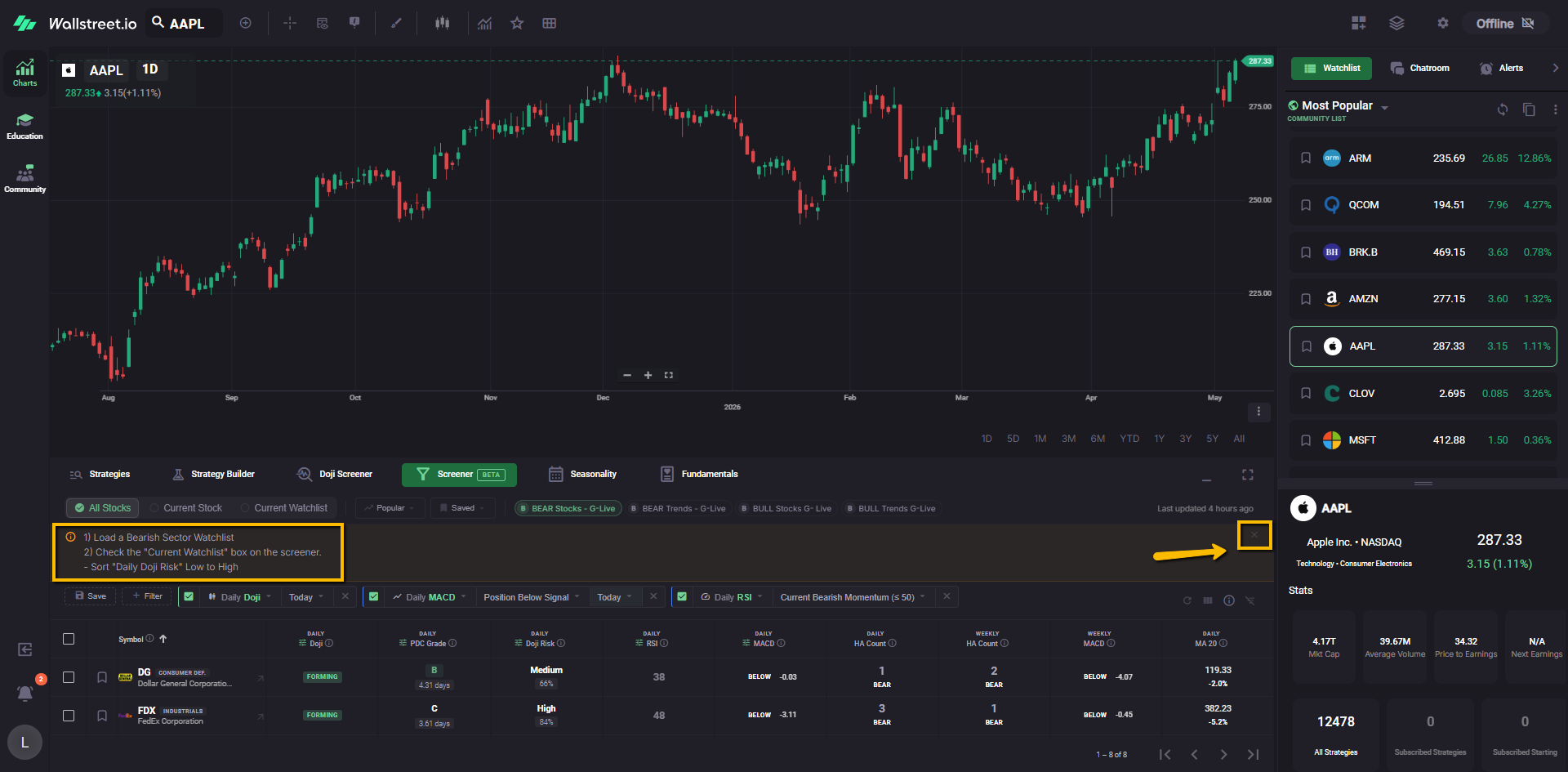
Some filters may also display short instructions inside the Screener area. You can remove those instructions by clicking the X in that message area.
If you want to remove the active Screener filters and start fresh, click Clear All Filters at the top-right of the Screener area.
10. Show or hide Screener columns
The Screener can display different data columns depending on what you want to review.
Gino tends to use certain columns based on what he is screening for during his sessions. To match that view more closely, use the small Show/Hide columns icon near the top-right of the Screener area.
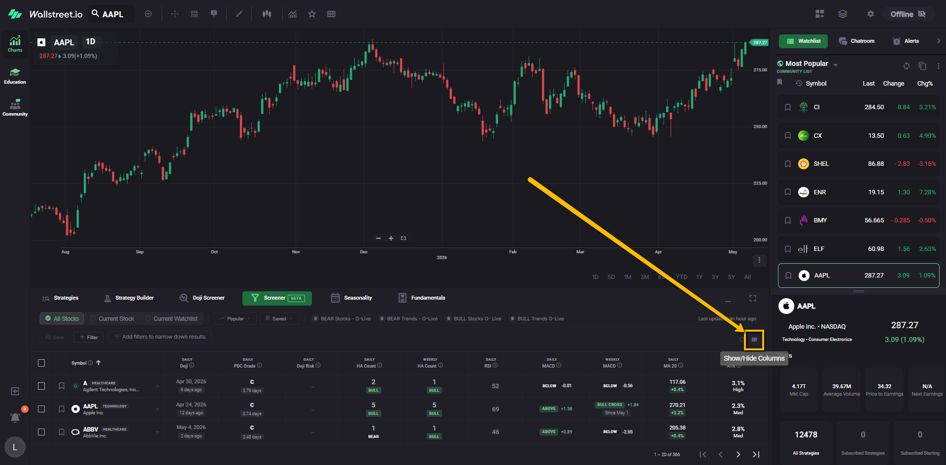
Click the columns icon to open the column selector.
From there, you can check or uncheck the columns you want to show or hide.
For example, Gino may use columns related to Heikin-Ashi, RSI, MACD, Moving Averages, and ATR when reviewing Screener results.
Once selected, those columns will appear in the Screener table below.
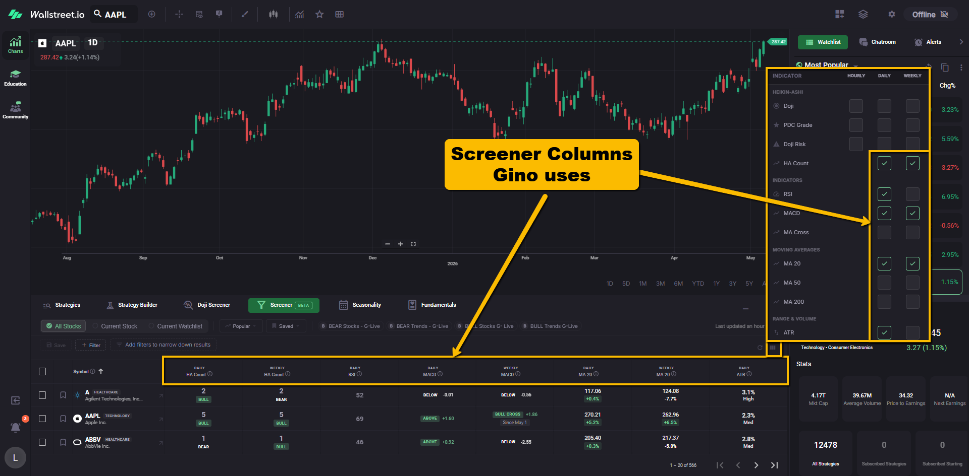
This gives you a cleaner Screener view, so you can focus on the same types of data Gino is using during the session.
Now you’re ready to follow along with Gino Live!
Once your layouts, shortcuts, watchlists and filters are set up, you’ll have a much smoother daily workflow.
Gino may also use other areas of the platform during his sessions, including the Seasonality, Fundamentals, and other features. This setup gives you a strong starting point so you can follow his chart work without getting lost in the clicks.
Next, you may want to open Community > Live Streams > Gino Live before the livestream starts so your charts and the live session are ready at the same time.
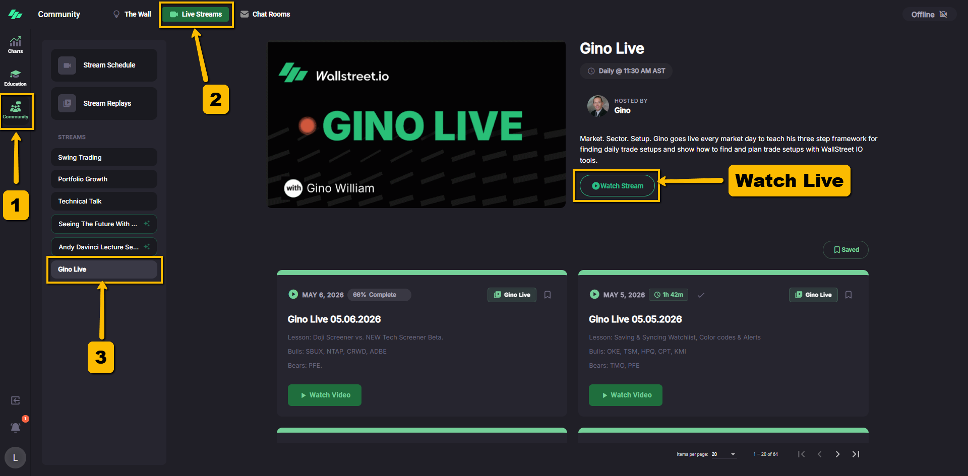
Watch Gino Live while using your charts
When you open any livestream or replay video on our platform, you can use the Pop-out button at the bottom-right of the video player to separate the video from the main page.
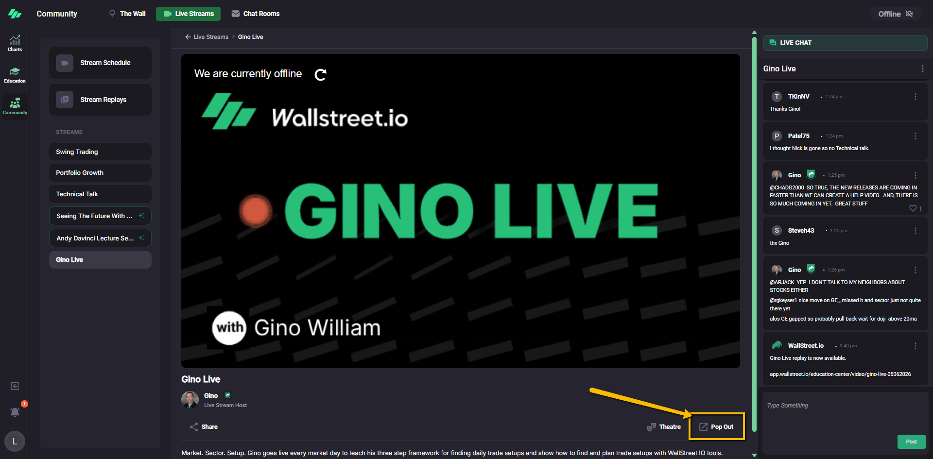
Once the video is popped out, you can move the smaller video window around your screen and resize it. Then, you can return to your Charts Workspace while the video continues playing.
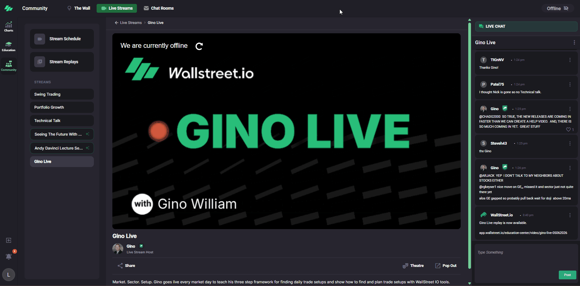
This is especially helpful if you use more than one monitor. You can keep Gino Live or a replay on one screen and keep your charts open on the other.
It also works well on a single screen if you want to keep watching or listening while you review charts, watchlists, use the Screener, or follow along in real time.