Fundamentals Tab Complete Guide
What this helps you do
The Fundamentals tab helps you answer one question for any stock:
“Is this a business I actually want to own, at this price, right now?”
You use it to see how a company scores across growth, value, stability, income, and momentum, then drill into earnings quality, cash flow, valuation, and analyst expectations without leaving Wallstreet.io.
This matters because it keeps your trade ideas grounded in business reality, not just price action, so you can stack strategy signals on top of solid fundamentals instead of guessing. When you know what each chart and metric is telling you, it becomes easier to decide whether a symbol deserves more of your attention in the Strategy Builder or on your Watchlists.
Overview tab
The Overview tab is the default view. It gives you a fast, visual read on what kind of stock you are looking at before you start digging.
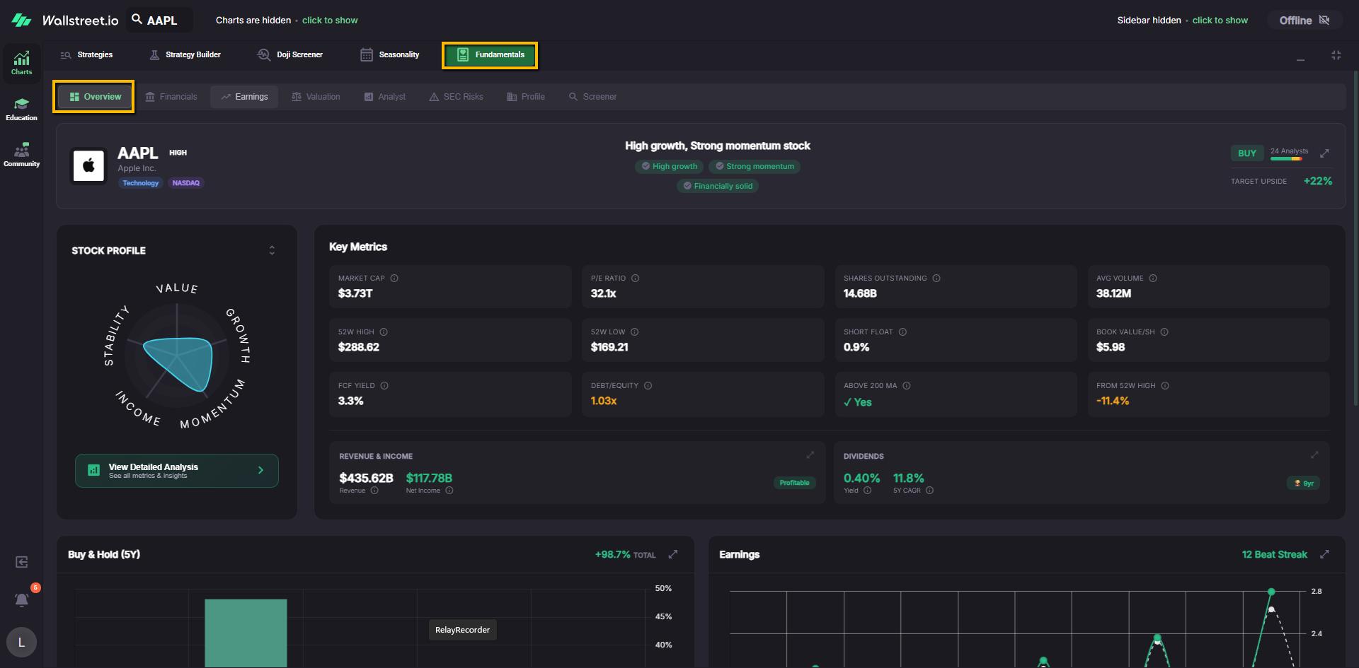
Header strip: identity, story, and analyst snapshot
At the very top you will see:
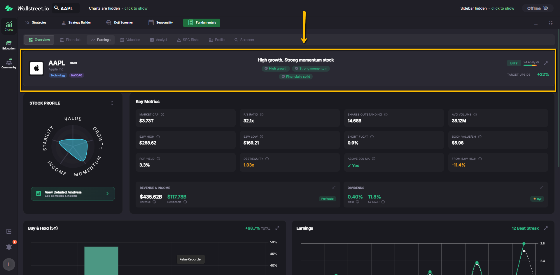
You can use this strip to anchor three things quickly: what the company is, how the platform scores its overall profile, and how the analyst community is currently leaning.
Stock Profile radar chart
On the left you will see the Stock Profile spider chart. It scores the stock across five dimensions:
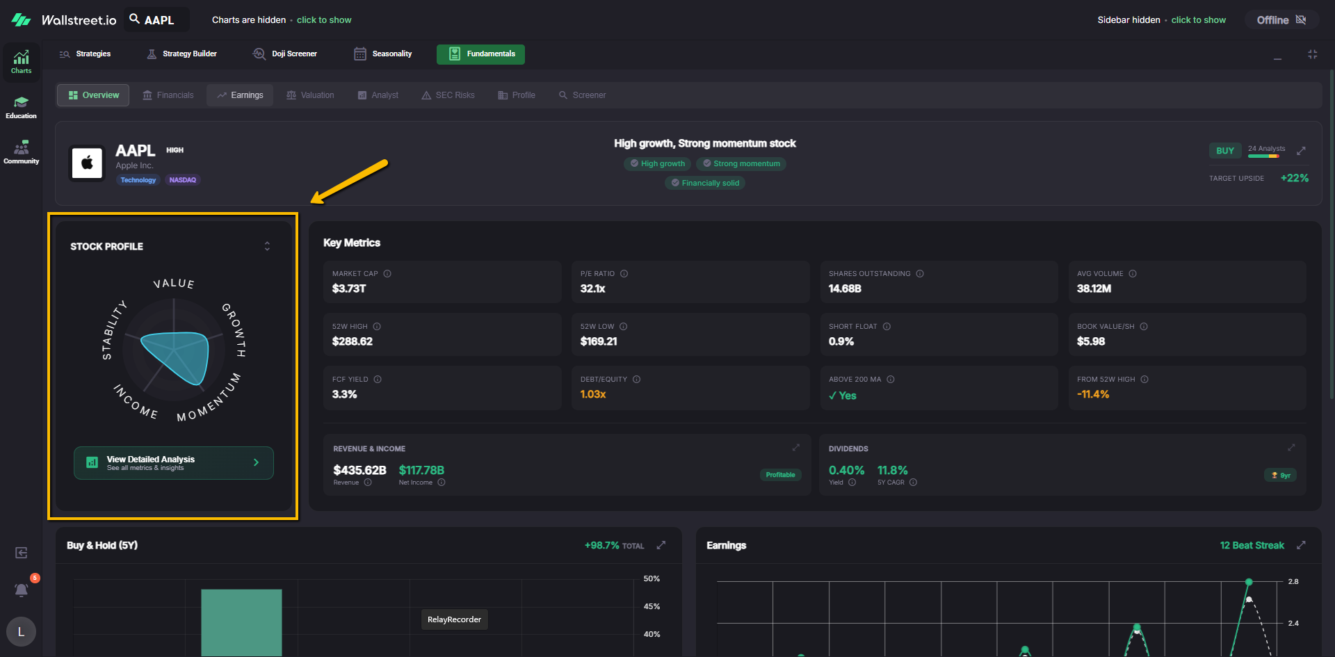
Each “arm” of the chart shows how strong that category is relative to the rest of the company’s own profile. A larger area in “Growth,” for example, means the company is scoring strongly on growth metrics, while a smaller area in “Value” suggests the stock is trading at a richer valuation.
The View Detailed Analysis button below this chart opens the expanded Stock Profile breakdown, where you can see the individual metrics that feed each category:
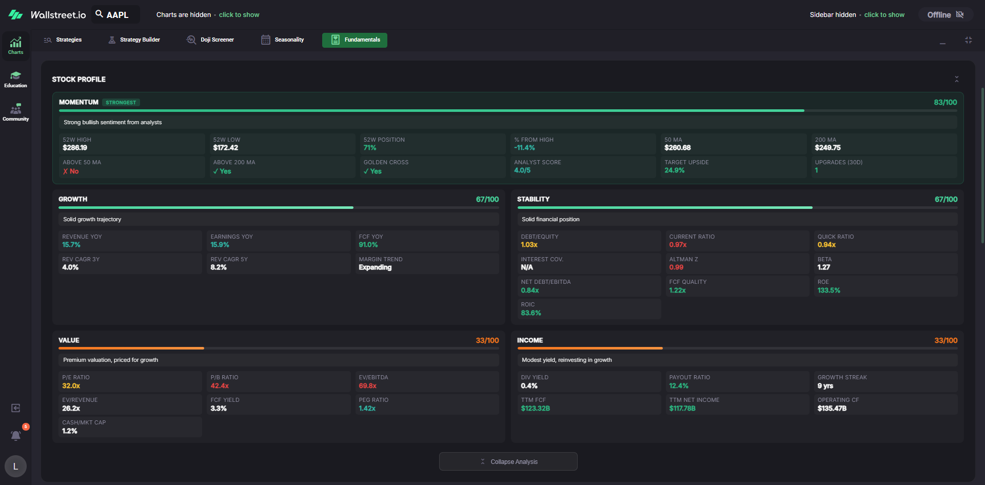
Here is how to read each band:
Momentum
The Momentum band describes how the stock is behaving in the market right now. You will typically see:
You can use this to gauge whether the trend, positioning, and sentiment are lining up with your strategy.
Growth
The Growth band summarizes how quickly the business itself is expanding. Typical metrics include:
Higher scores suggest the company is growing sales and profits at a healthy clip, with improving or stable margins.
Stability
The Stability band focuses on financial strength and balance sheet health. Metrics here often include:
A stronger Stability score suggests the company is less fragile when conditions get rough.
Value
The Value band tells you how richly or cheaply the market is currently pricing the stock relative to its fundamentals. It typically includes:
Higher Value scores indicate a more attractive valuation profile. Lower scores often mean the stock is carrying a premium relative to its own history or peers.
Income
The Income band summarizes how shareholder friendly the company is from a cash return perspective. You may see:
This band lets you quickly see whether the stock works as an income play or is primarily a growth or momentum story instead.
Key Metrics
To the right of the Stock Profile you will see a grid of Key Metrics. Examples include:
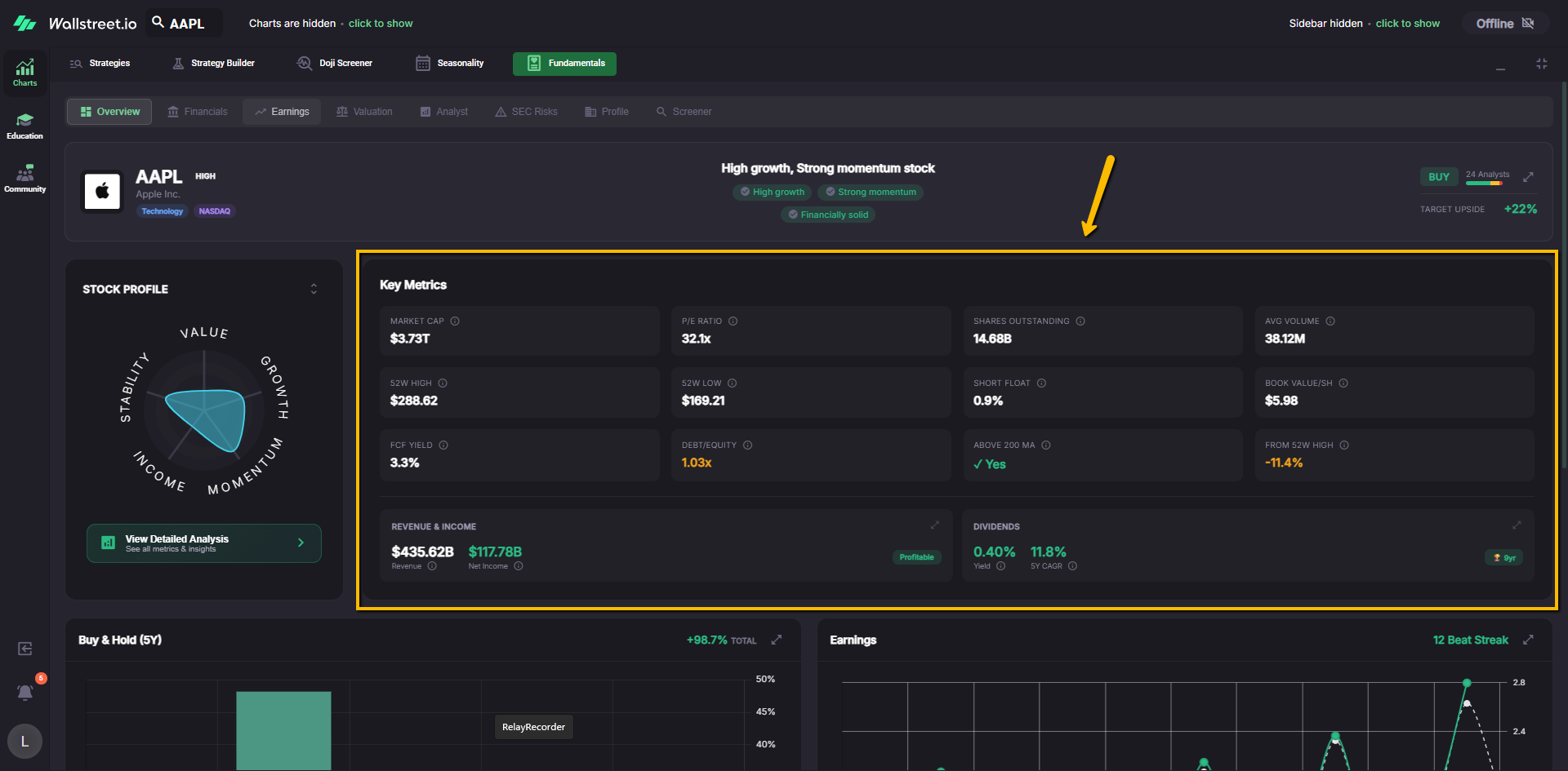
These are the “vital signs” of the stock. You use this block when you want a quick sense of size, liquidity, and basic valuation without diving into the detailed Financials tab.
Revenue & Income
Below the metric grid is a Revenue & Income panel. It highlights trailing twelve month revenue and net income, so you can see at a glance whether the company is bringing real dollars in the door and how much of that is dropping to the bottom line.
Dividends
Next to Revenue & Income you will see a Dividends panel that focuses on:
This section is useful when you want to know whether the stock pays shareholders today and whether that payout has been growing or shrinking.
Buy & Hold (Profitability) chart
Further down, the Buy & Hold panel shows how a simple “buy and hold the stock” approach would have performed over different periods.
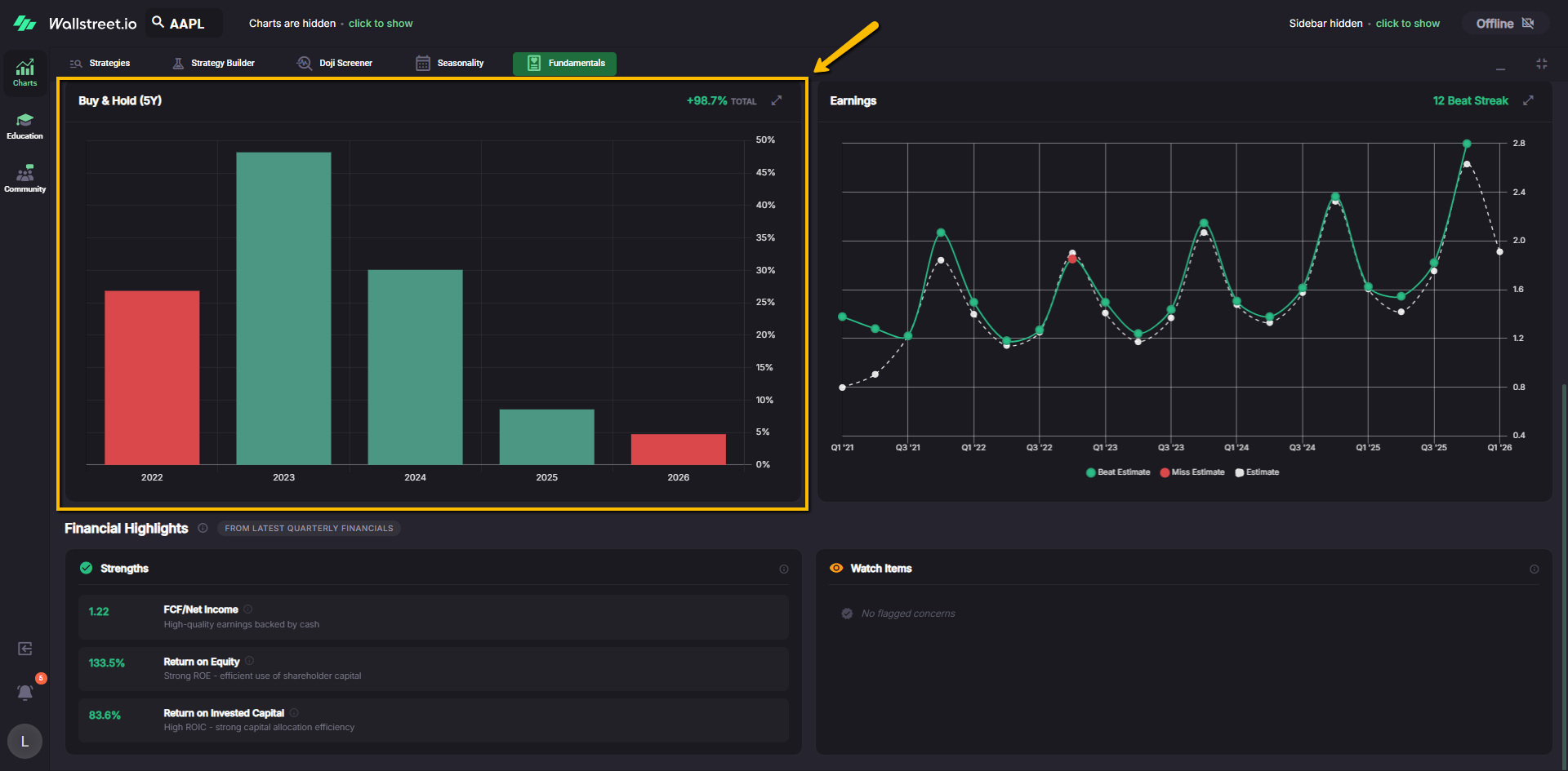
By default this panel typically shows a 5 year view with bars labeled by year and a Total Return figure in the corner that summarizes cumulative performance over that window.
You can use this section to answer questions like “How bumpy has this ride really been over time” and “What did a simple hold do over the last decade compared to this year’s strategy result.”
Earnings mini chart
To the right of the Buy & Hold chart is an Earnings chart that plots quarterly earnings per share (EPS):
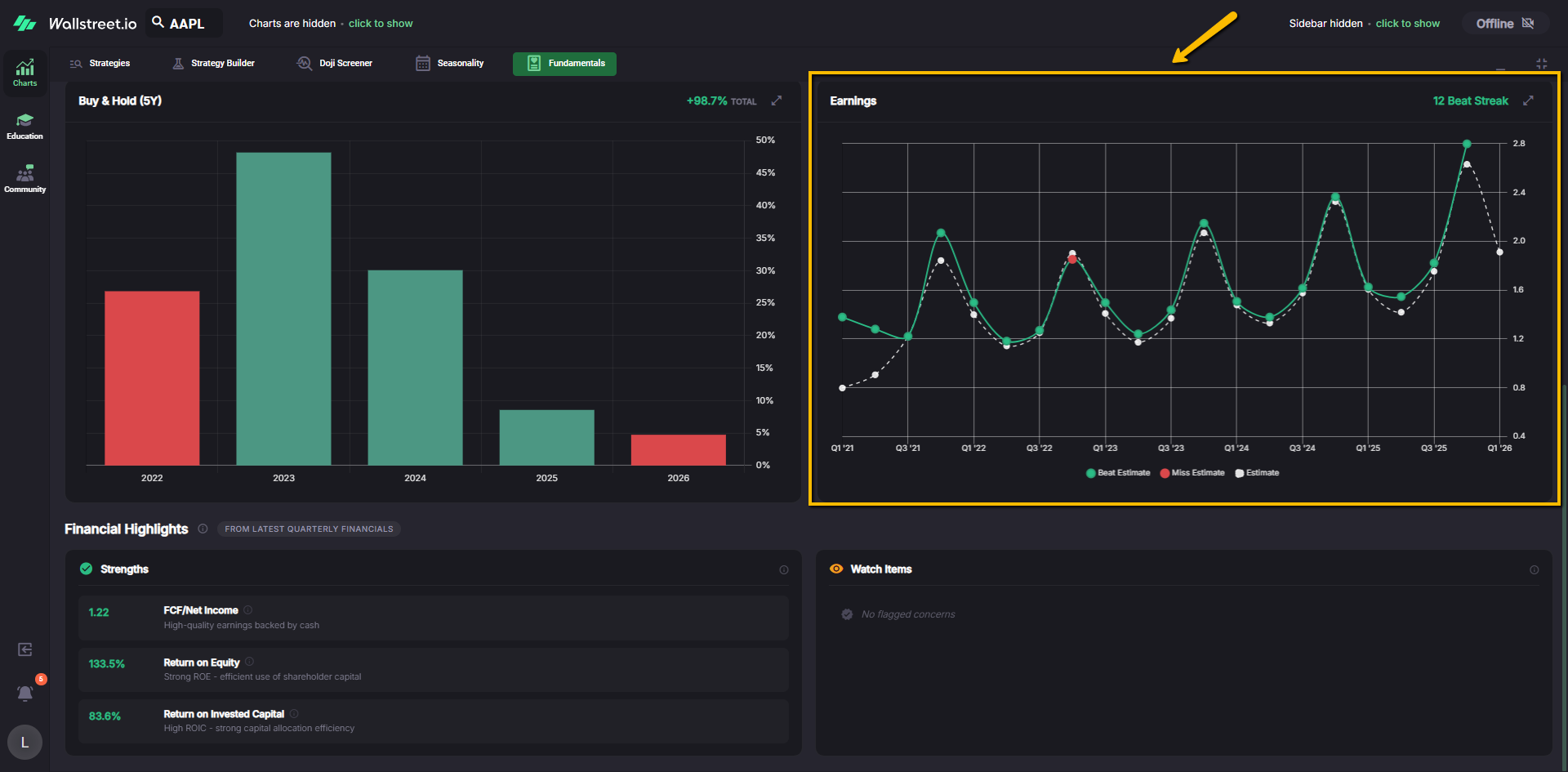
Hovering on a point opens a tooltip with the actual EPS, the estimate, and the difference between them. This helps you see whether the company tends to underpromise and overdeliver, or whether earnings are choppy and unpredictable.
Financial Highlights
At the bottom of the Overview tab you will find Financial Highlights, often labeled as coming from the latest quarterly financials. This section is split into:
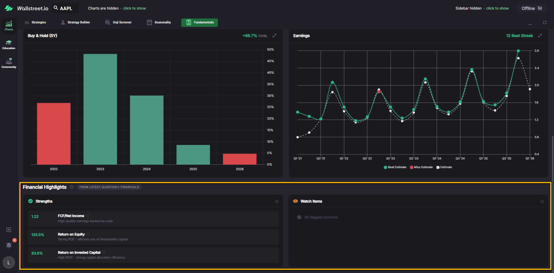
Each row shows a metric label, a numeric value, and a short one line interpretation so you can quickly scan what is working well and what deserves caution.
Financials tab
The Financials tab is where you go when you want to walk through the company’s financial statements without leaving the platform.
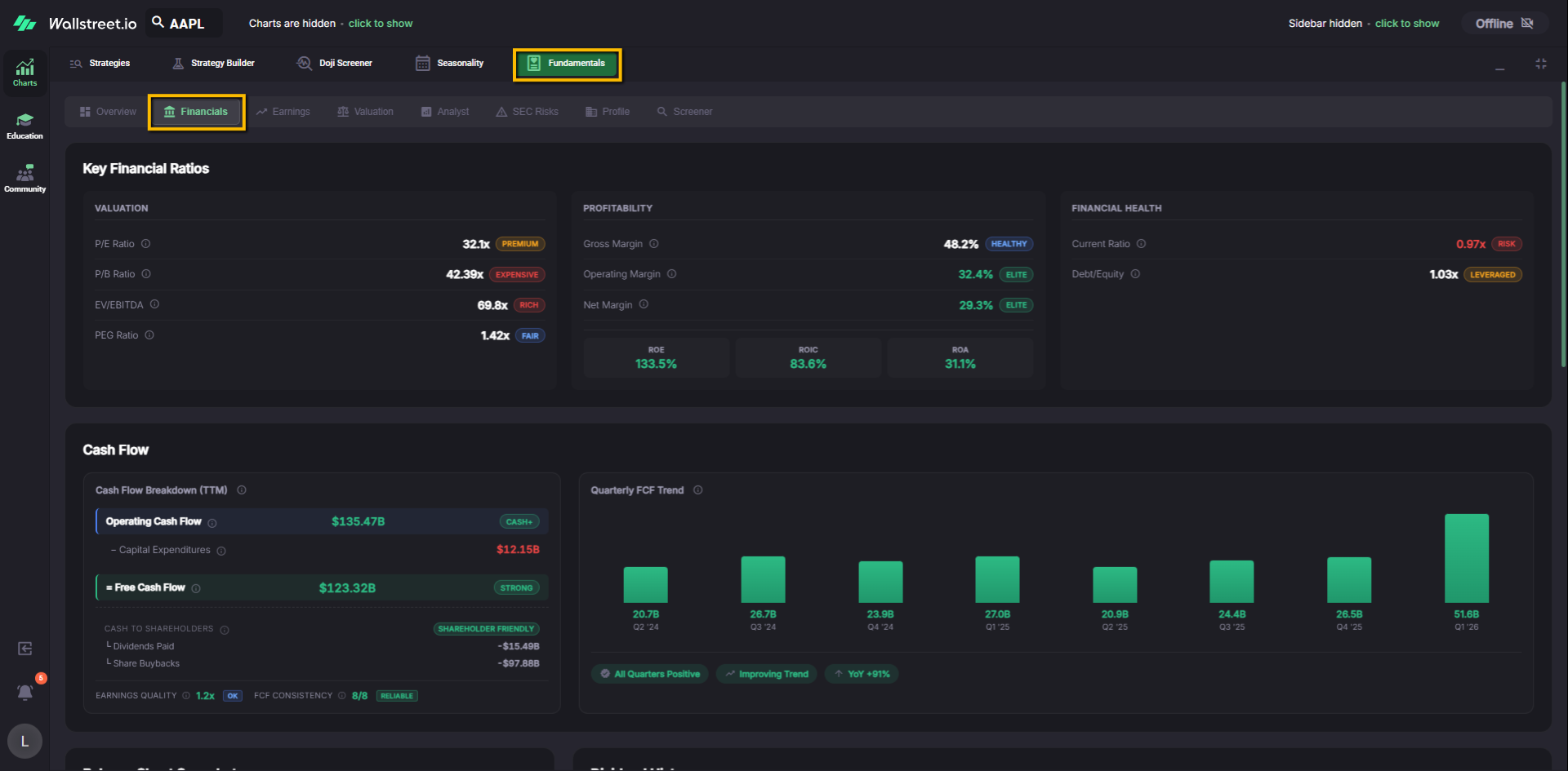
Key Financial Ratios
At the top you will see three blocks:
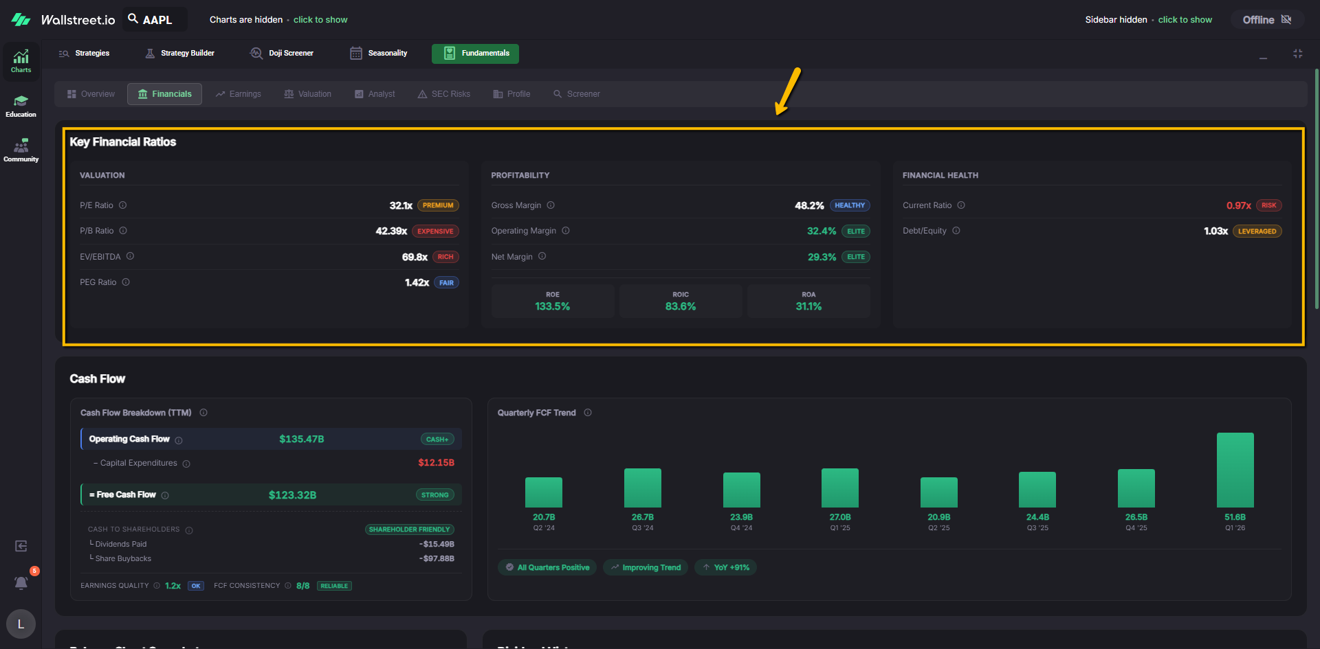
This section gives you a compact read on price, profitability, and solvency.
Cash Flow
The Cash Flow block usually has two parts:
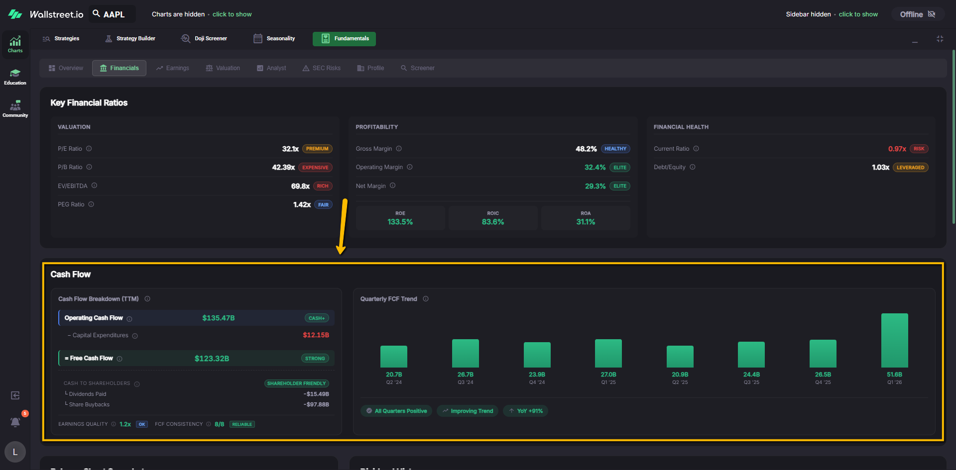
This is where you answer, “Is this company consistently generating real cash, and is that trend getting better or worse?”
Balance Sheet Snapshot
The Balance Sheet Snapshot panel summarizes:
You can use this snapshot to understand how heavily the company leans on debt and how much flexibility it has.
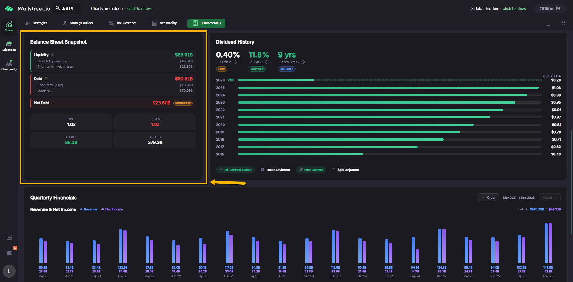
Dividend History
The Dividend History panel shows:
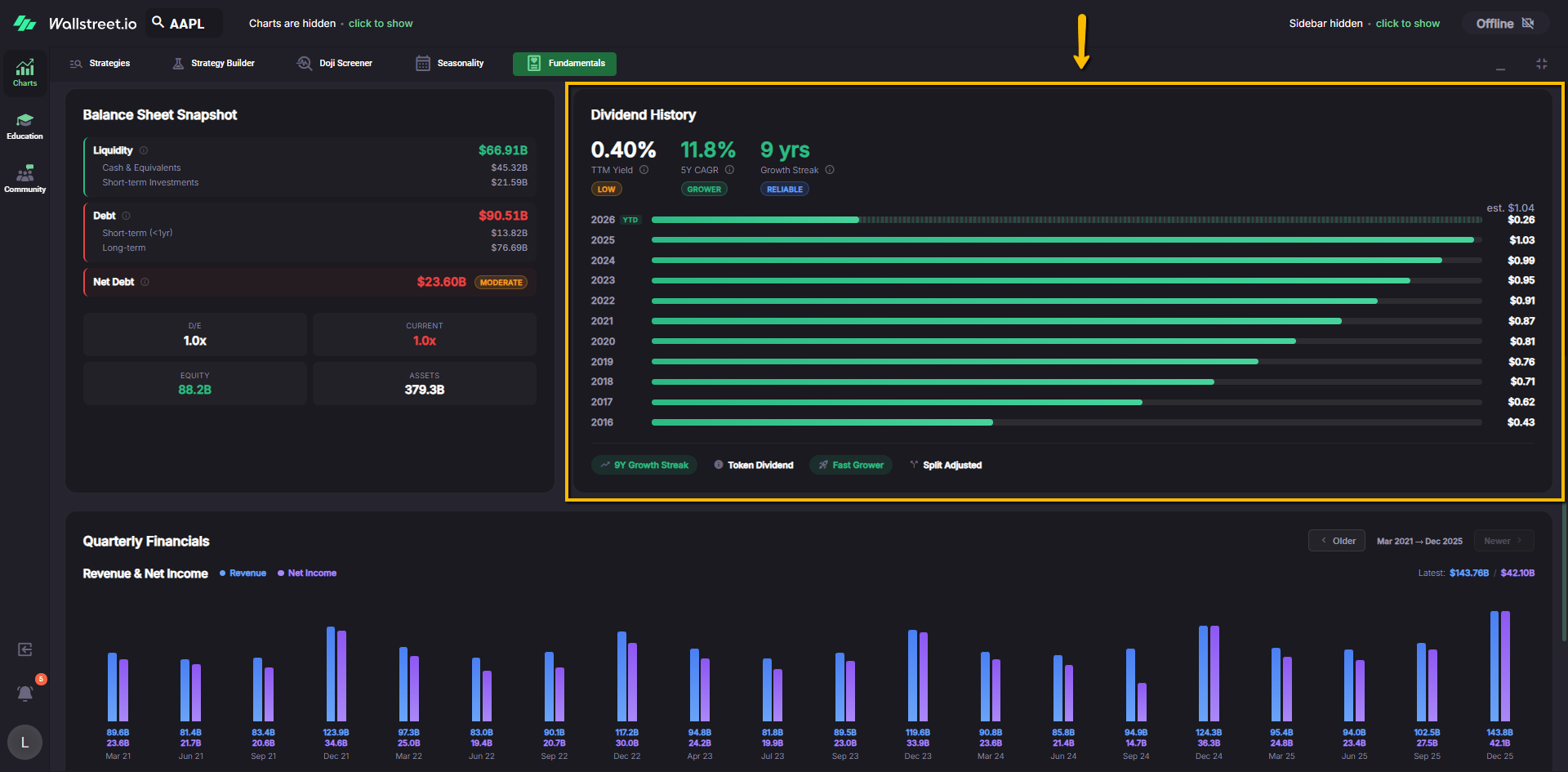
Badges at the bottom highlight patterns such as a token dividend, shrinking payouts, recent cuts, or upcoming ex dividend dates. This helps you quickly spot whether the dividend story is improving, stable, or deteriorating.
Quarterly Financials
The Quarterly Financials section charts Revenue and Net Income by quarter. Navigation controls (Older / Newer) let you move through time when the history is longer than the visible window.
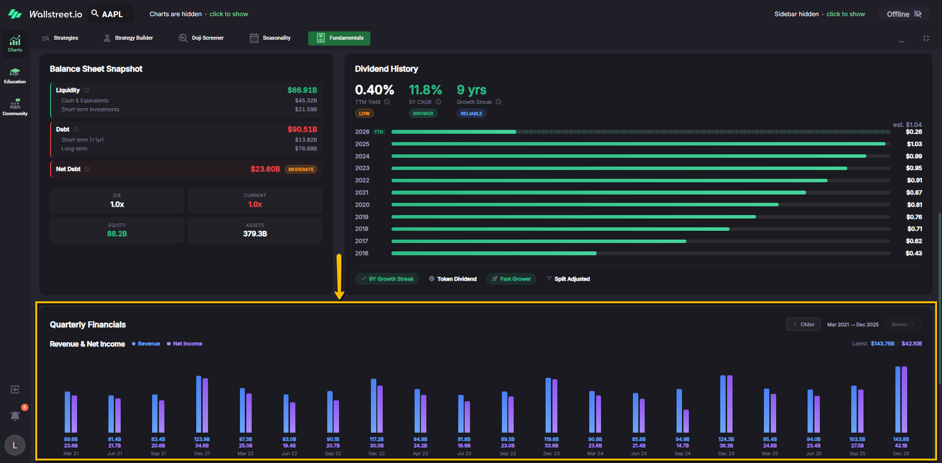
Use this view to connect dots between earnings seasons, revenue cycles, and the charts you see elsewhere on the platform.