Our Charting Tools have been meticulously developed to cater to both beginner and experienced traders alike, aiding you in interpreting complex market patterns and strategizing accordingly.
This guide is a one-stop resource to help you ensure that you can effectively unlock and leverage the powerful insights these tools provide.
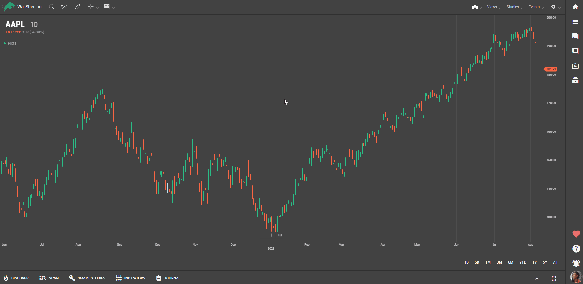
Symbol Lookup
To find an instrument:
Select the magnifying glass icon or the symbol input field.Enter the instrument symbol (“AAPL” in the example below):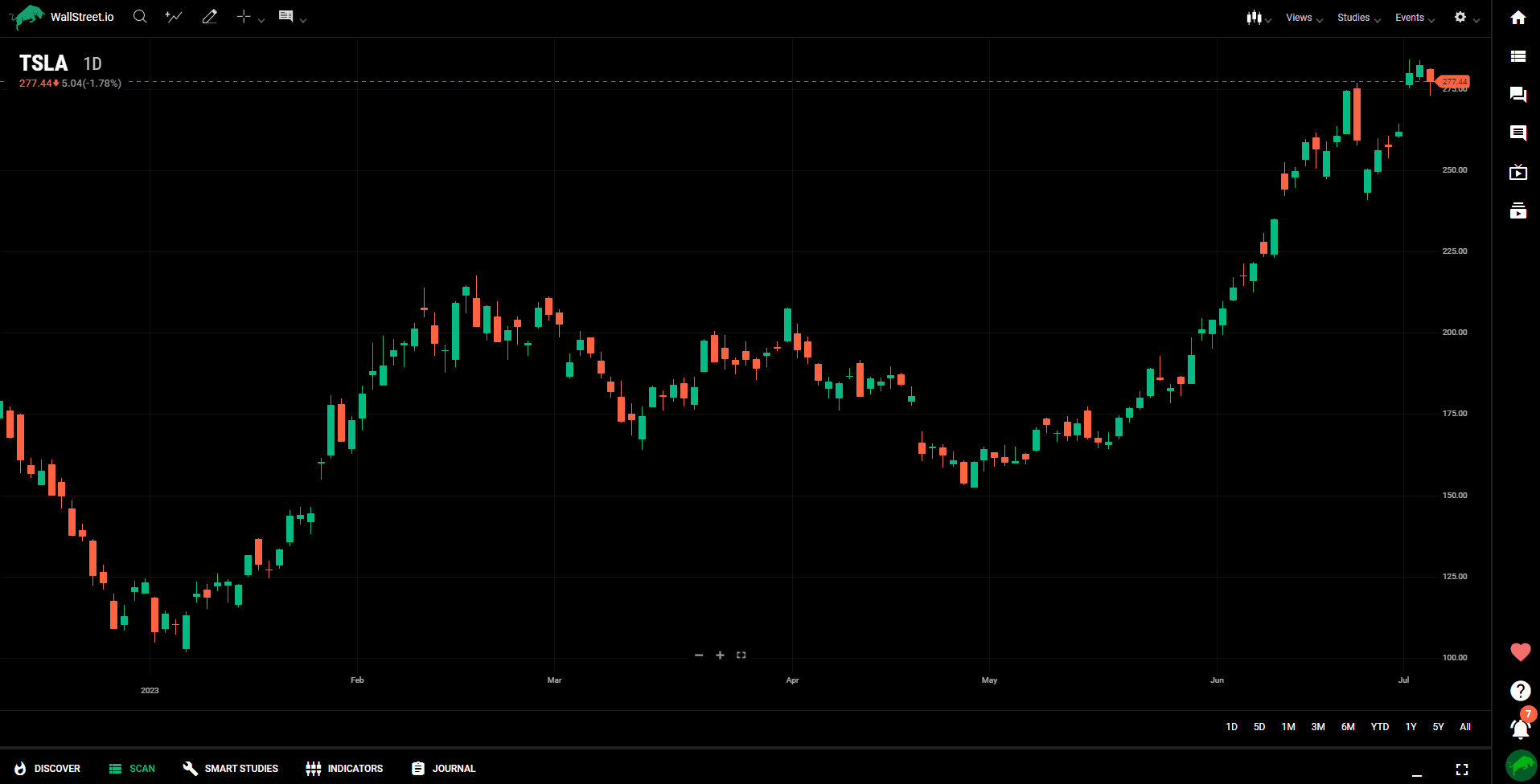 Select an instrument from the list, or press Enter to select the symbol in the text input field.
Add Comparison
Adding a Comparison Chart:
To compare a symbol (like AAPL) to another (like the financial sector SPY), click on the Add Comparison icon in the upper left-hand corner, and type in the symbol you want to compare. Here, you can select a color for the comparison chart.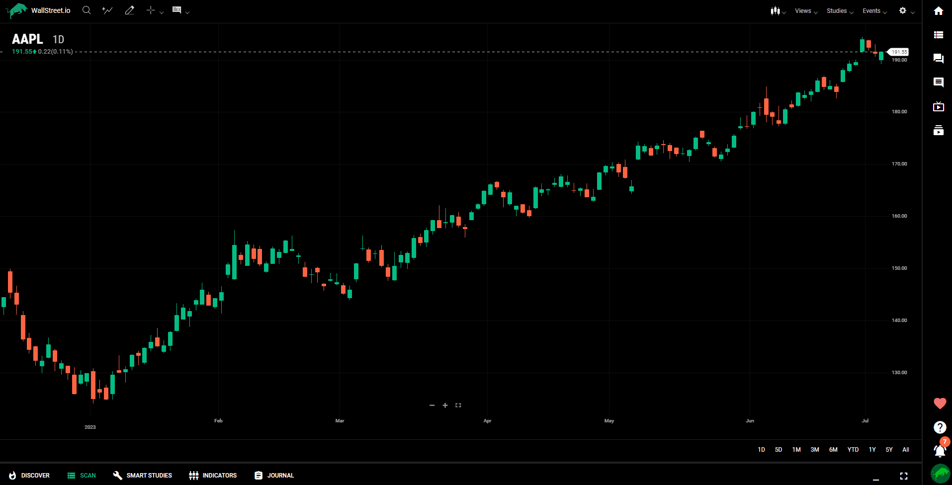 Adding Multiple Comparison Symbols:
To add multiple comparison symbols at a time, simply type in the symbols you want to add, separated by commas. Click 'add comparison' for each one to add them to the chart.
Adding Multiple Comparison Symbols:
To add multiple comparison symbols at a time, simply type in the symbols you want to add, separated by commas. Click 'add comparison' for each one to add them to the chart.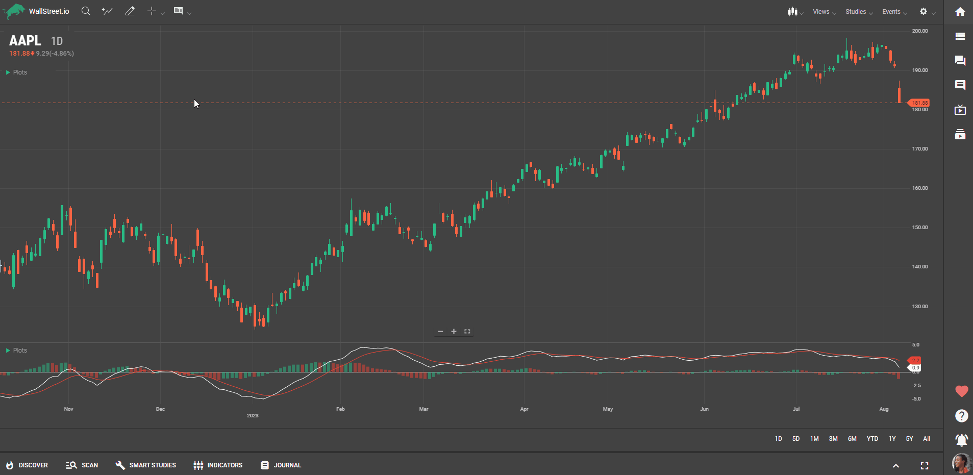 Understanding Comparison Charts:
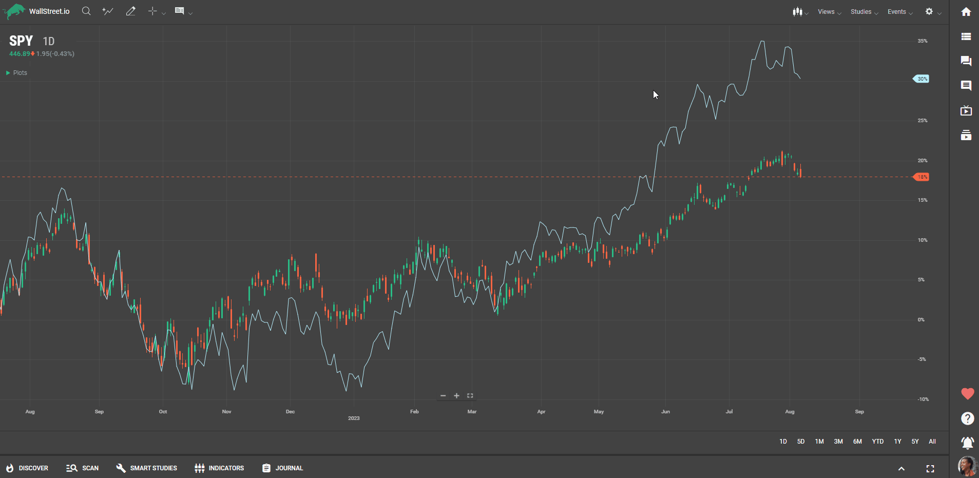
Comparisons always start at the left-most edge of the screen and share a percentage-based scale. This is useful for analyzing how different sectors or stocks have performed compared to a benchmark over a specific period (like year-to-date).
Understanding Comparison Charts:
Comparisons always start at the left-most edge of the screen and share a percentage-based scale. This is useful for analyzing how different sectors or stocks have performed compared to a benchmark over a specific period (like year-to-date).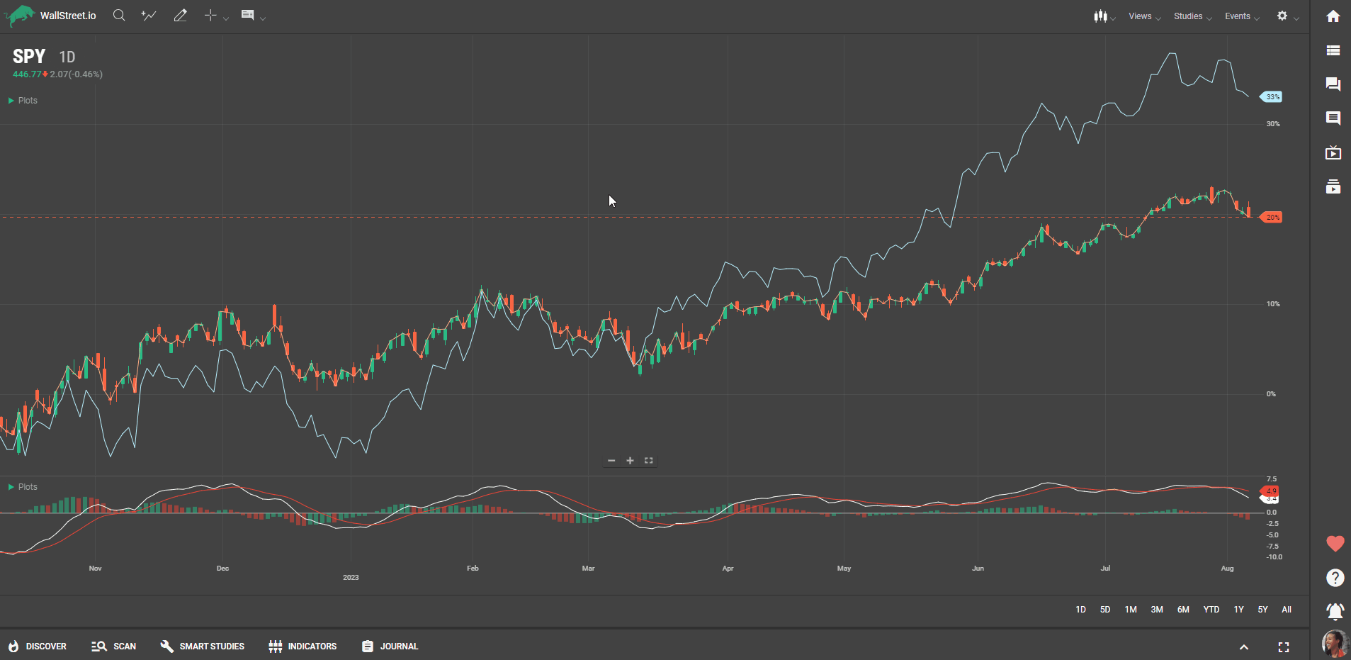 Giving Comparison Plots Their Own Price Scale:
Like studies, if you hover over one of the comparison plots and long press, you can give it its own price scale. This will only affect the selected comparison plot.
Giving Comparison Plots Their Own Price Scale:
Like studies, if you hover over one of the comparison plots and long press, you can give it its own price scale. This will only affect the selected comparison plot.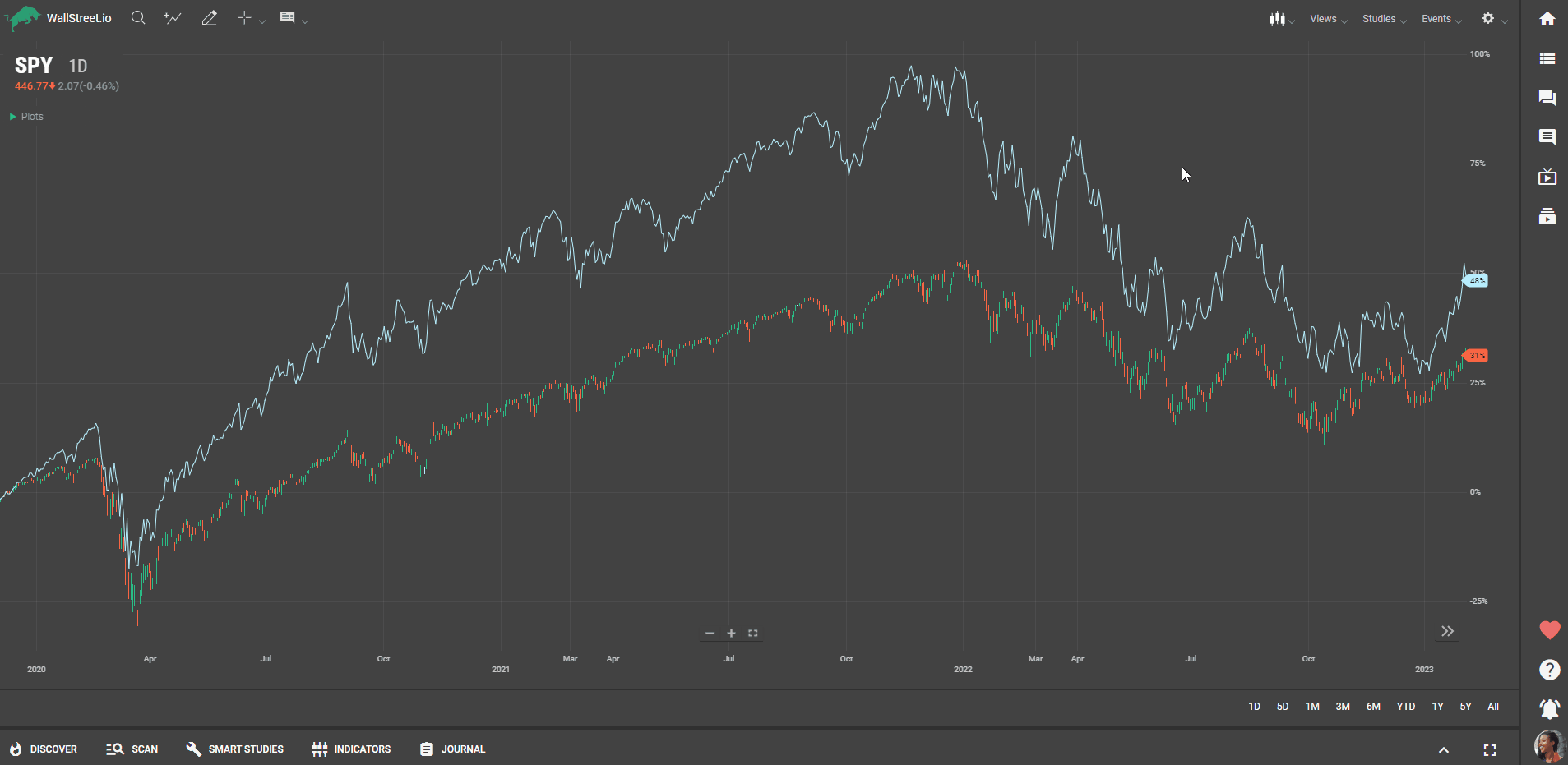 Deleting a Comparison Chart:
To delete the Comparison chart, simply right-click the line to delete the comparison.
Drawing Tools
Select the Drawing Tools icon (upper left corner of the chart)Click on one of the drawings available on the Drawing Palette on the left to select it.On the Charting Area, click on the data point you want the drawing to start. While holding the mouse button, drag the cursor to the desired endpoint or position for the drawing. For trend lines, this means dragging the line to the next data point or relevant position on the chart.Release the mouse button to finalize the drawing.Optional: You may be able to adjust line thickness, color, style, transparency, or add text labels to provide further information or annotations by using the Drawing Style Palette.
For the full Drawing Tools How-To guide, click here.
Using the Info Option
The 'Info' option allows you to view the open, high, low, and close data, as well as the date, closing price, and volume for each candle. The 'Tooltip' option provides a simpler box with values of the indicators, such as RSI and Moving Average, in case they’re activated.
Using Crosshair and Heads Up Display
Activate 'Crosshair' and then 'Show Heads Up Display' to get a comprehensive view of all the data for each candle.