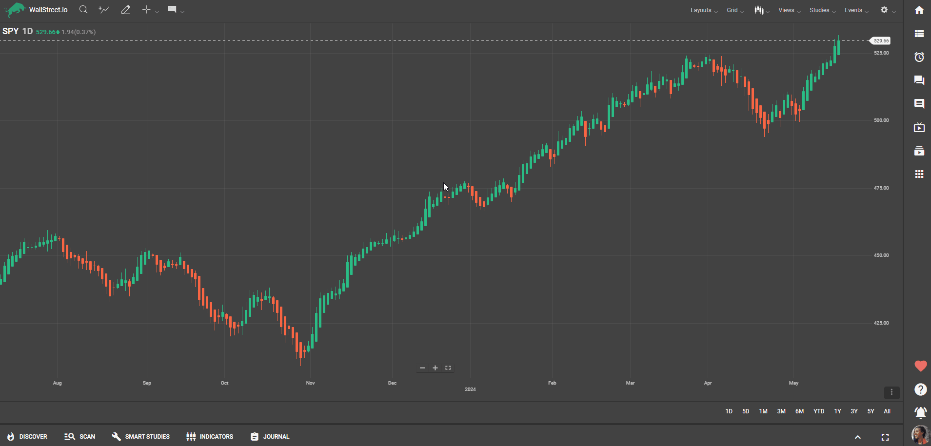
Accessing the Financial Window
On the Navigation Bar, click on the Watchlist widget and locate the Financial Window, the section that appears below the Watchlist.
There you can find information about financial instruments, such as the sector, market cap, industry, average volume, and the exchange it trades on. If an earnings date is confirmed, this will also be displayed.
TIP: Click on All Strategies to be taken to the Scan Tab, where you can view all strategies for that ticker symbol.
Understanding Seasonality
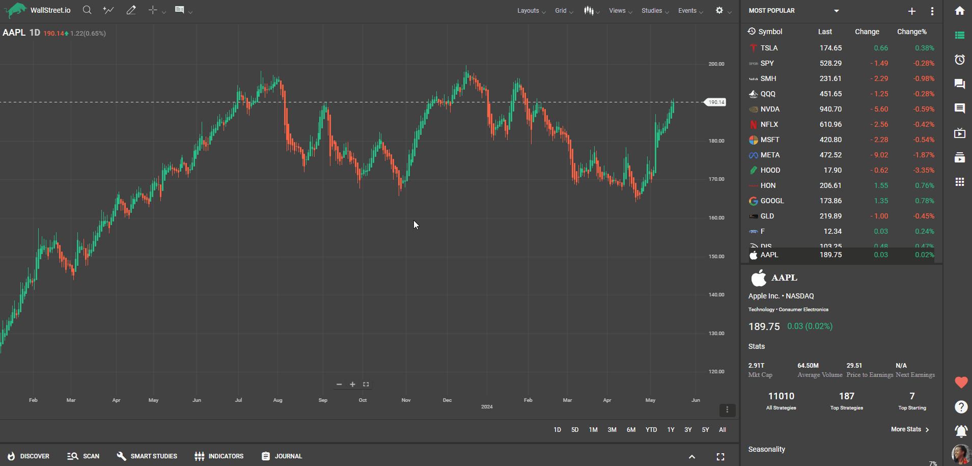
When you click on a symbol within a watchlist, you will see some information about it appear in the Financial Window section.
If you scroll down a little further, you’ll find the seasonality graphs over the last 10 years. Click on “more seasonality” to get a full-screen view.
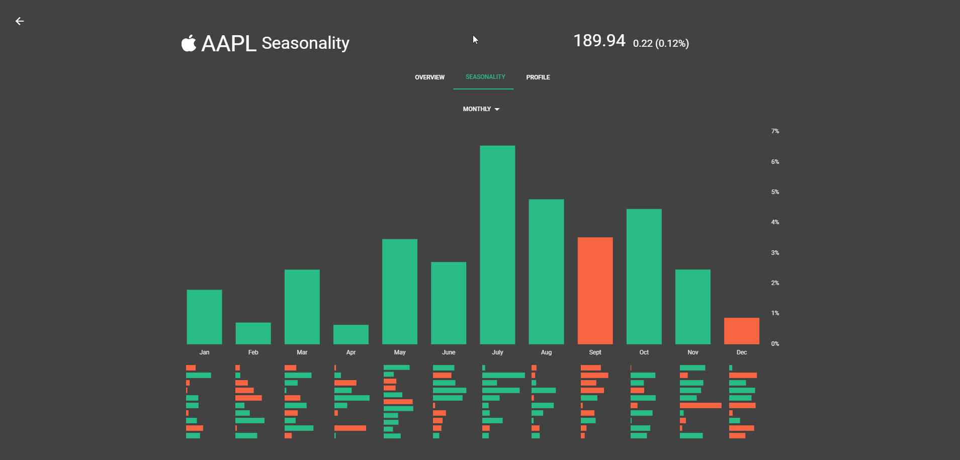
Reviewing Seasonality Charts
The chart shows big green and red vertical bars with smaller horizontal ones below each. Hover over a month like March and a pop-up shows the average percentage performance for every March over the last 10 years.
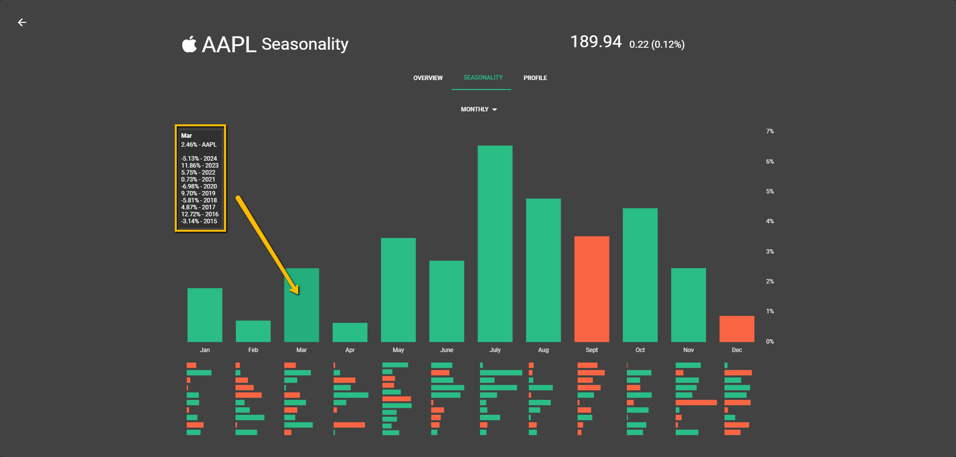
The horizontal bars visually represent that breakdown, helping you understand the consistency of the performance over the years. You can switch to 'yearly' or 'weekly' views to see the performance over different time frames.
💡Understanding Basic Information in the Financial Window
💡In the "Financial Window," you will find an icon, symbol, and the name of the instrument, as well as the exchange it trades on. The current price, 24-hour net change, and 24-hour percent change are also displayed.
💡Use this information to understand the performance of the symbol and devise your trading strategy.
💡Accessing More Stats in the Financial Window
💡After reviewing the basic information, look for a button labeled "More Stats".
💡Click on "More Stats" to view more detailed information about your selected symbol.
💡Here you will find data such as the Open, High, Low, and Close prices, along with information about the sector, industry, and market cap.
💡Find more detailed statistics like the Price-to-Earnings ratio, Earnings Per Share, and Shares Outstanding.
💡Review the Year High, Year Low, Next Earnings Announcement, Average Price 50MA, and Average Price 200MA.
💡Utilize these additional stats to gain a deeper understanding of your selected symbol and further refine your trading strategy.
💡Understanding and Applying Crowd-Sourced Trading Strategies on Wallstreet.io
💡In the Financial Window, scroll down to find the crowd-sourced trading strategies available for the specific symbol you're interested in. These strategies are derived from the collective trading decisions of Wallstreet.io's user base, giving you a glimpse of market sentiment.
💡Review the listed strategies, paying particular attention to their past performance and reliability, on the View Stats panel.
💡Click on a strategy to get more detailed information, including its historical performance and the principles behind it.
💡Consider adopting strategies that align with your own investment objectives and risk tolerance, by reviewing the Smart Studies tab.
💡Regularly check back to stay updated with new and emerging strategies from our community.
💡 Leveraging the Scan Tab for Efficient Strategy Review
💡After reviewing the basic information about a symbol in the Financial Window, locate and click on "All Strategies".
💡This will take you to the Scan Tab, where you can review and compare all the available strategies for the symbol.
💡Use the Filter Tool on the Scan Tab to sort and filter strategies based on your investment preferences.
💡Click on the wrench icon next to a strategy to be redirected to the Smart Studies tab to view its specifics and understand how it works.
💡Compare the performance, risk, and principles of the strategies to find those that align with your trading approach.
💡Use the Scan Tab regularly to keep an eye on new strategies and monitor the performance of those you're interested in.
💡Interpreting and Using Price-to-Earnings Ratios on Wallstreet.io
💡On the Financial Window, you can find the Price-to-Earnings (P/E) ratio for your selected symbol.
💡The P/E ratio is a valuation ratio calculated by dividing the current market price per share by the earnings per share.
💡A high P/E ratio could indicate that the market has high expectations for a company's future earnings growth, while a low P/E might suggest the opposite.
💡Use the P/E ratio in conjunction with other financial metrics to make informed decisions about a company's value and potential for future growth.
💡Keep in mind the P/E ratios can vary significantly between industries, so it's most useful when comparing companies within the same sector.
💡Regularly check the P/E ratio as it will change with the company's share price and earnings.
💡Making the Most of the Next Earnings Announcement Information
💡In the Financial Window, check if the 'Next Earnings Announcement' date if it has been confirmed.
💡This date tells you when the company will next release its earnings report, a significant event that can cause significant price volatility.
💡Plan your trades around this date, as companies often experience increased trading volume and price changes in response to their earnings announcements.
💡Use this information in conjunction with the company's past earnings and the market's expectations to predict possible market reactions.
💡Consider holding off on making major trading decisions until after the earnings announcement if you are risk-averse.
💡Regularly check back to stay updated with the latest confirmed earnings dates.
💡Understanding and using Moving Averages (50MA and 200MA) on Wallstreet.io
💡Navigate to Wallstreet.io and log into your account.
💡In the Financial Window, click on “More Stats” to find the 'Avg. Price 50MA' and 'Avg. Price 200MA'. These are the 50-day and 200-day moving averages.
💡Moving averages are used to analyze price trends by smoothing out price fluctuations and allowing you to see the overall price trend over a certain period.
💡The 50-day moving average represents the average closing price over the past 50 days, while the 200-day moving average represents the average closing price over the past 200 days.
💡Generally, when the price is above the moving average, it indicates a bullish trend, and when it's below, it suggests a bearish trend.
💡When the 50-day moving average crosses above the 200-day moving average, it's called a "Golden Cross" and is seen as a bullish sign. Conversely, when the 50-day moving average crosses below the 200-day moving average, it's called a "Death Cross" and is considered bearish.
💡Use these moving averages in conjunction with other technical analysis tools to confirm trends and make trading decisions.